
Hiding and Revealing Mobile Content with the ASP.NET MVC Responsive Panel

Summarize with AI:
The Telerik UI for ASP.NET MVC Responsive Panel makes it ridiculously easy to hide part of your UI (and get it back) on small screens.
When it comes to creating a responsive UI that does the right thing on all the various devices your users interact with, you need controls that will “do the right thing” out of the box. And, of the various controls in your UI, it’s the UI components that take up more space that you’re most concerned with. The Telerik UI for ASP.NET MVC Chart, for example, because the whole point of having a chart is to display information with clarity.
I’ve got two solutions here: one that I think you should do all the time and a more sophisticated solution for a more interactive UI.
Keeping the Size Right
The good news here is that, by default, the ASP.NET MVC Chart (a server-side wrapper for the kendo-chart widget) will resize itself to display in the space available to it on your user’s screen. However, the chart doesn’t adjust its size or position as screen size or orientation changes.
Essentially this means that you’ll get the “right” size when your chart initially displays, but if, for example, the user switches from portrait to landscape, the chart won’t update its display.
There’s a simple solution for addressing this. If you have a chart that begins with this:
<kendo-chart name="MyChart">
  …more…
Then just add this code to your page, substituting in whatever is in your chart’s name attribute where I have MyChart in this code:
<script>
$(window).on('resize', function ()
{
  $("#MyChart").css("width", "100%")
    .data("kendoChart").resize();
}
);
</script>
With this code in place, your chart will now redisplay in the correct size as your browser changes shape or size. You should, I think, include this code in any page where you’re displaying a chart (I’m going to assume this code is in place for the rest of this post, for example).
More Interactivity
But now, I’m going to take advantage of a more sophisticated solution for handling a UI with a chart: leveraging the Responsive Panel for ASP.NET MVC (a server-side wrapper for the Kendo UI Responsive Panel widget). The Responsive Panel lets you automatically tuck content out of the way as the user’s screen gets smaller, replacing that content with a button that allows the user to display the hidden content.
That means, for example, you can have a grid and a chart on the page and have the chart disappear when space gets tight … but still make the chart available when the user wants it. This UI for example, has a grid, followed by a chart, followed by some additional information.
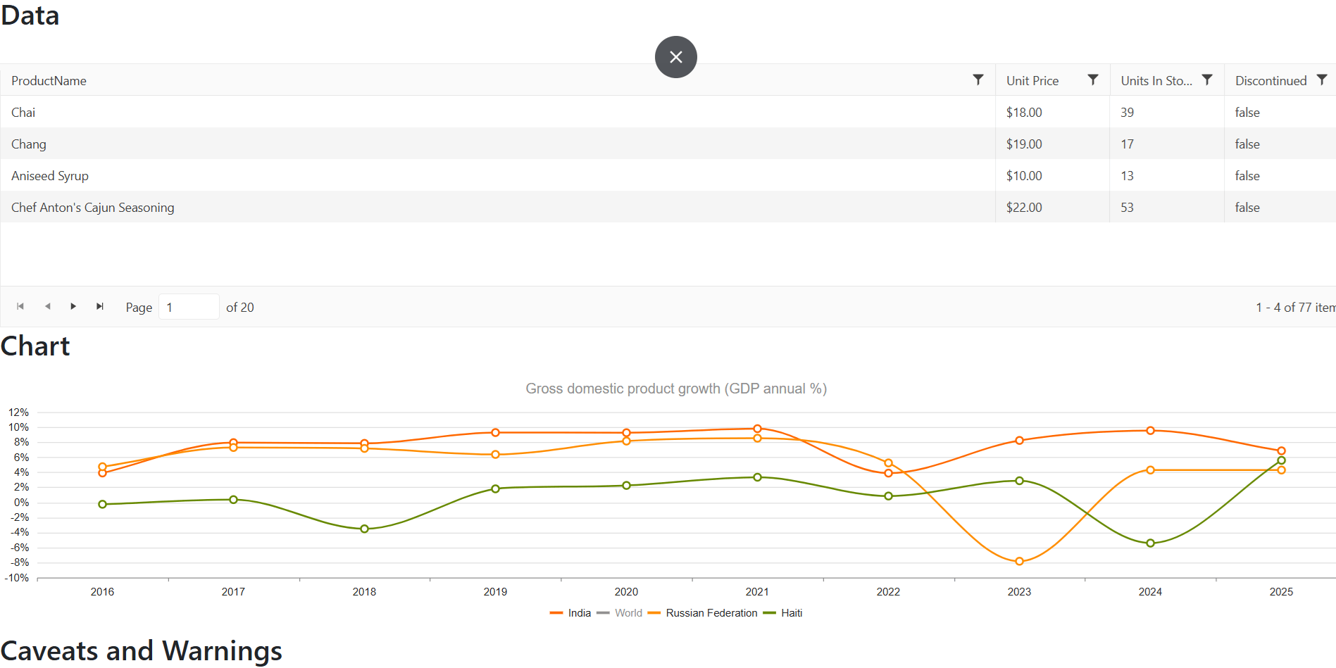
With the Responsive Panel, I can have that chart disappear on smaller screens to free up space for the other sections while giving the user the ability to bring back the chart on demand. And that turns out to be ridiculously easy to implement.
Integrating the Responsive Panel
In my example, my initial layout would look something like this:
<h2>Data</h2>
<kendo-grid name="MyGrid">
  …grid…
</kendo-grid>

<h2>Chart</h2>
<kendo-chart name="MyChart">
  …chart…
</kendo-chart>

<h2>Caveats and Warnings</h2>
  …content…
To have the chart disappear when space gets tight, all I have to do is wrap my chart (and any related content) in the Responsive Panel tag helper. You just need to set three attributes on the panel’s tag helper:
name: Whatever name you want to use to refer to the grid.breakpoint: The width, in pixels, when the panel should disappear.orientation: This is where the content will appear and can be any one oftop,bottom,leftorright. Feel free to experiment, but you probably want top.
This example will cause my chart to disappear from the screen when the screen width is less than 700 pixels:
  …grid…
</kendo-grid>

<kendo-responsivepanel name="MyPanel"
  breakpoint="700"
  orientation="top">

  <h2>Chart</h2>
  <kendo-chart name="MyChart">
    …chart…
  </kendo-chart>

</kendo-responsivepanel>

<h2>Caveats and Warnings</h2>
  …content…
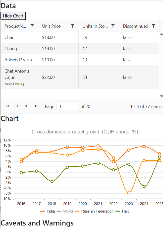
Finally, somewhere on the page (and outside of the responsive panel), add a button to hide and display the panel, assigning it the CSS class rule k-rpanel-toggle so that the panel can find it. Something like this would work:
<button id="panelButton" class="k-rpanel-toggle">
  Show Chart
</button>
<br/>
<kendo-repsonsivepanel …
Now, with those changes, when the window gets too small (whether because the user has adjusted the size of their browser window, the user is viewing the page on a smartphone or the user rotates out of landscape mode into portrait mode on their tablet), your chart will get out of the way and be replaced by your button:
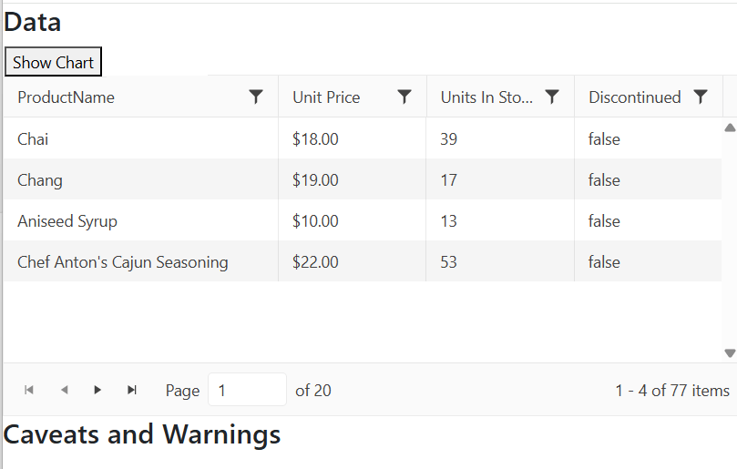
If the user clicks the button, the panel content (my chart, in this case) reappears, sized to fit in the appropriate space. When the chart is displayed, clicking the button will tuck the content back away.
Enhancing the UI
There are a couple of enhancements you might want to make. First, the caption I have on my button—“Show Chart” —isn’t really appropriate once the panel appears because clicking the button will now hide the chart. I could go with a more generic caption on the button (e.g., just “Chart”), or I could change the caption on the button when the chart is visible.
Second, there might also be scenarios where I want to open (or close) the panel from my application’s client-side code. If, for example, if I’m allowing my user to change data in the grid, I might want to redisplay the chart after the user saves their changes so that users can see a visual representation of their changes. I can do both of those things with a little bit of code.
To handle updating the button’s caption, I add some jQuery-enabled code to run when my page is ready to display. In that code, I grab references to the button that controls my panel and the panel itself. With those references, I can use the panel’s bind method to wire up functions that the button’s caption as the panel’s open and close events fire (jQuery’s text function will let me change the button’s caption).
Here’s what that code looks like:
  $( () => {
    let btn = $("#panelButton");
    let panel = $("#MyPanel").data("kendoResponsivePanel");
      panel.bind("open", () => btn.text("Hide Chart")  );
      panel.bind("close", () => btn.text("Show Chart")  );
    }
) ;
For my other scenario (opening or closing the panel from my code), I can just call the panel’s open or close function. There’s one caveat here, though: if you are opening or closing the panel from an interactive event (e.g., an onclick event), your function must accept the event’s default parameter and call the parameter’s stopPropogation function. Typical code would look like this:
const OpenPanel = (e) => {
  e.stopPropagation();
  $("#MyPanel").data("kendoResponsivePanel").open();
}
Of course, as with all the Telerik UI for ASP.NET MVC components, there’s more you can do here if you want. Rather than provide your own button, for example, the panel will generate a hamburger menu for you. This demo demonstrates that and integrates the panel with a sidebar that slides in from the side of the screen.
But if all you need is to get some content out of the way when space gets tight, you’ve got all you need to make that happen.
Try all this out yourself with a free 30-trial of the Telerik UI for ASP.NET MVC library:

Peter Vogel
Peter Vogel is both the author of the Coding Azure series and the instructor for Coding Azure in the Classroom. Peter’s company provides full-stack development from UX design through object modeling to database design. Peter holds multiple certifications in Azure administration, architecture, development and security and is a Microsoft Certified Trainer.
Related Posts
Comments
All articles
Topics
Web MobileMobile
Desktop
Design
Productivity
People
