
Discovering Multiple Ways to Create Popups in .NET MAUI

Summarize with AI:
In this article, I will tell you about some ways to improve your .NET MAUI applications through the use of custom popups. Let’s get started!
Creating a Sample Page
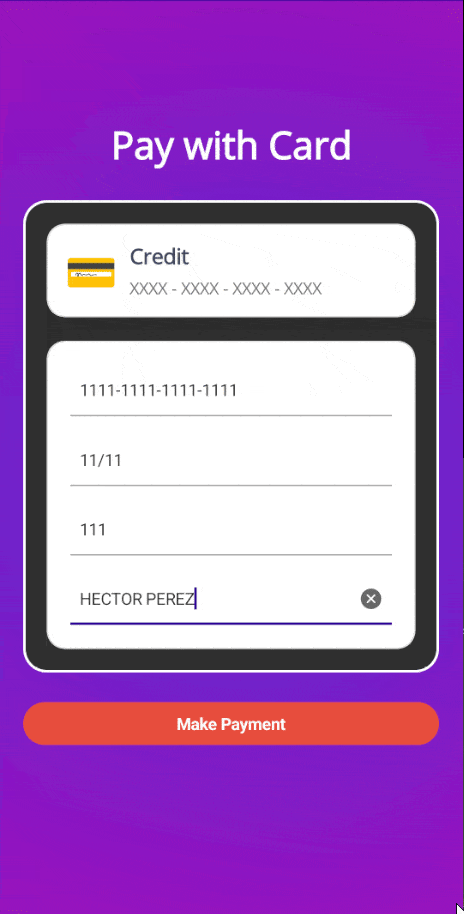
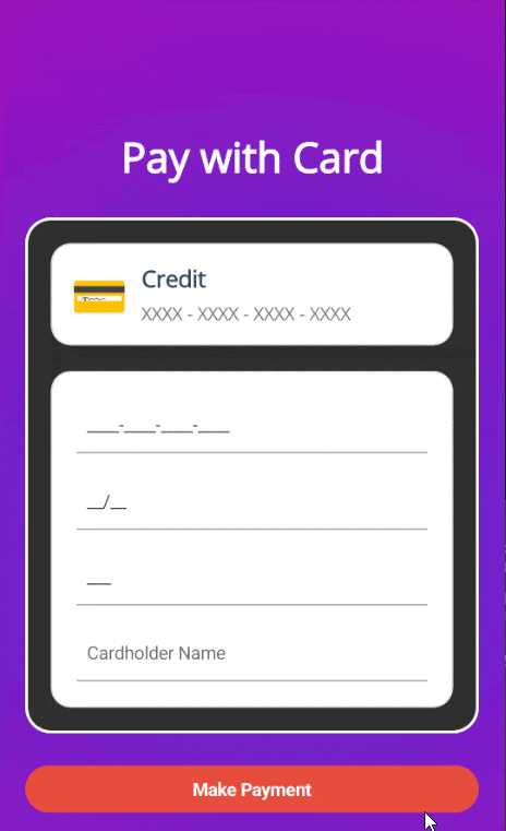
Let’s suppose you have a page that processes payments, where you want to implement the use of pop-up modals or windows, which you can replicate by following these steps:
- Create a new project using the
.NET MAUI Apptemplate without selecting the Include sample content option. - Follow Steps 1-4 of the official installation guide to configure the Telerik controls we will use on the sample page. We are using Progress Telerik UI for .NET MAUI controls because they provide a more professional look to the application and include controls like
RadTextMaskedEntry, which allows masking input fields, ideal for data like card numbers, expiration dates, etc. - In the
MainPage.xamlfile, replace the ContentPage content with the following:
<ContentPage.Background>
    <RadialGradientBrush Center="0.5,0.5" Radius="1.0">
        <GradientStop Offset="0.0" Color="#512BD4" />
        <GradientStop Offset="1.0" Color="#D600AA" />
    </RadialGradientBrush>
</ContentPage.Background>

<ScrollView>
    <Grid Padding="20">
        <VerticalStackLayout Spacing="25" VerticalOptions="CenterAndExpand">
            <Label
                FontAttributes="Bold"
                FontSize="32"
                HorizontalOptions="Center"
                Text="Pay with Card"
                TextColor="White" />

            <telerik:RadBorder
                Padding="20"
                BackgroundColor="#2E2E2E"
                BorderColor="White"
                BorderThickness="2"
                CornerRadius="20">
                <VerticalStackLayout Spacing="20">
                    <telerik:RadBorder
                        Padding="15"
                        BackgroundColor="White"
                        BorderColor="#E0E0E0"
                        BorderThickness="1"
                        CornerRadius="15">
                        <telerik:RadBorder.Shadow>
                            <Shadow
                                Brush="Black"
                                Opacity="0.1"
                                Radius="2"
                                Offset="0,10" />
                        </telerik:RadBorder.Shadow>
                        <Grid
                            ColumnDefinitions="Auto, *"
                            ColumnSpacing="10"
                            RowDefinitions="Auto, Auto">
                            <Label
                                Grid.RowSpan="2"
                                FontSize="36"
                                HorizontalOptions="Center"
                                Text="💳"
                                VerticalOptions="Center" />
                            <VerticalStackLayout Grid.Column="1" Spacing="5">
                                <Label
                                    FontAttributes="Bold"
                                    FontSize="18"
                                    Text="Credit"
                                    TextColor="#34495E" />
                                <Label Text="XXXX - XXXX - XXXX - XXXX" TextColor="#757575" />
                            </VerticalStackLayout>
                        </Grid>
                    </telerik:RadBorder>
                    <telerik:RadBorder
                        Padding="20"
                        BackgroundColor="White"
                        BorderColor="#E0E0E0"
                        BorderThickness="1"
                        CornerRadius="15">
                        <VerticalStackLayout Spacing="15">
                            <telerik:RadTextMaskedEntry
                                x:Name="CardNumberEntry"
                                Keyboard="Numeric"
                                Mask="####-####-####-####"
                                Placeholder="Card Number"
                                TextColor="#333" />
                            <telerik:RadTextMaskedEntry
                                x:Name="ExpDateEntry"
                                Keyboard="Numeric"
                                Mask="##/##"
                                Placeholder="MM/YY"
                                TextColor="#333" />
                            <telerik:RadTextMaskedEntry
                                x:Name="CvvEntry"
                                Keyboard="Numeric"
                                Mask="###"
                                Placeholder="CVV"
                                TextColor="#333" />
                            <telerik:RadEntry
                                x:Name="CardHolderEntry"
                                Placeholder="Cardholder Name"
                                TextColor="#333" />
                        </VerticalStackLayout>
                    </telerik:RadBorder>
                </VerticalStackLayout>
            </telerik:RadBorder>

            <telerik:RadButton
                x:Name="PayButton"
                BackgroundColor="#E74C3C"
                Clicked="PayButton_Clicked"
                CornerRadius="25"
                FontAttributes="Bold"
                HorizontalOptions="FillAndExpand"
                Text="Make Payment"
                TextColor="White" />

            <Label
                x:Name="StatusLabel"
                FontAttributes="Italic"
                FontSize="16"
                HorizontalOptions="Center"
                Text=""
                TextColor="White" />
        </VerticalStackLayout>
    </Grid>
</ScrollView>
- Finally, replace the contents of the
MainPage.xaml.csfile with the following code:
public partial class MainPage : ContentPage
{
    public MainPage()
    {
        InitializeComponent();
    }

    private async void PayButton_Clicked(object sender, EventArgs e)
    {
        PayButton.IsEnabled = false;
        await Task.Delay(3000);
        PayButton.IsEnabled = true;
        await DisplayAlert("Success", "Your payment was processed successfully.", "OK");
    }
}
If you run the application now, you will see a nice graphical interface that simulates processing for 3 seconds before displaying a DisplayAlert indicating that the task was successfully executed:
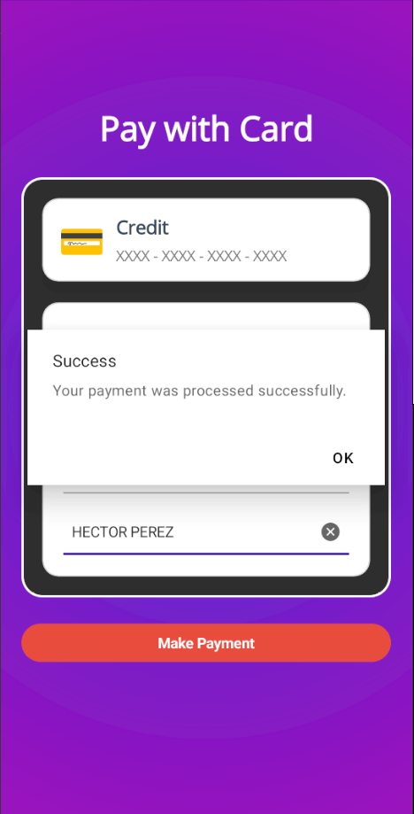
During this time, the user might think something went wrong since there is no visual indicator that something is happening behind the scenes. Let’s improve this behavior by adding popups to the app.
Creating Popups Using .NET MAUI Popup from Telerik
The first solution I want to show you involves using the .NET MAUI Popup control from Progress Telerik, which has several advantages:
- You can display it in any position within your mobile or desktop app.
- You can show it as modal or non-modal.
- It includes animations that you can customize for showing and hiding the popup.
Let’s see how to create popups using this amazing control.
Creating the Popup
To create the popup, we need to create an instance of RadPopup with the desired content. Personally, I like to show dynamic loaders to users, so I will add a Lottie animation to the popup. To do this, I installed the SkiaSharp.Extended.UI.Maui package, adding the use of the UseSkiaSharp method to the builder inside MauiProgram.cs:
...
builder
    .UseMauiApp<App>()
    .UseSkiaSharp()
    .UseTelerik()
...
Next, I customized the popup with a Grid as the container for the Lottie animation, demonstrating the flexibility of the RadPopup control:
<ContentPage
   ...
    xmlns:lottie="clr-namespace:SkiaSharp.Extended.UI.Controls;assembly=SkiaSharp.Extended.UI">
    ...
    <ScrollView>
        <Grid Padding="20">
                <telerik:RadPopup.Popup>
                    <telerik:RadPopup
                        x:Name="popup"
                        OutsideBackgroundColor="#E6000000"
                        Placement="Center"
                        VerticalOffset="8">
                        <Grid>
                            <lottie:SKLottieView
                                HeightRequest="300"
                                HorizontalOptions="Center"
                                RepeatCount="-1"
                                Source="animation.json"
                                WidthRequest="300" />
                        </Grid>
                    </telerik:RadPopup>
                </telerik:RadPopup.Popup>
            ...
    </ScrollView>
</ContentPage>
In the code above, the OutsideBackgroundColor property specifies the color of the layer that separates the Popup from the page content, often used to block user interaction with controls. Additionally, the Placement property allows you to specify how the popup aligns with its placement target, which defines an element relative to which the popup is positioned when opened.
To control the visibility of the popup, we can use the IsOpen property, assigning a value of true or false:
private async void PayButton_Clicked(object sender, EventArgs e)
{
    popup.IsOpen = true;
    PayButton.IsEnabled = false;
    await Task.Delay(3000);
    PayButton.IsEnabled = true;
    popup.IsOpen = false;
    await DisplayAlert("Success", "Your payment was processed successfully.", "OK");
}
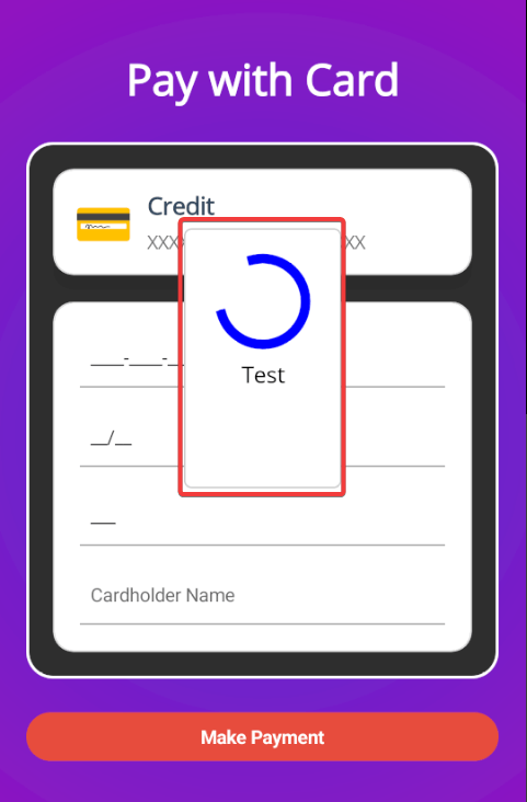
With the changes above, the popup would be displayed as follows:
It is important to note that the popup content appears centered because we placed it as the primary element within the main Grid. If we change the popup’s location to the VerticalStackLayout containing the credit card information as follows:
<VerticalStackLayout
    x:Name="cardContainer"
    Grid.Column="1"
    Spacing="5">
    <telerik:RadPopup.Popup>
        <telerik:RadPopup
            x:Name="popup"
            OutsideBackgroundColor="#E6000000"
            Placement="Center"
            PlacementTarget="{x:Reference cardContainer}"
            VerticalOffset="8">
            <Grid>
                <lottie:SKLottieView
                    HeightRequest="300"
                    HorizontalOptions="Center"
                    RepeatCount="-1"
                    Source="animation.json"
                    WidthRequest="300" />
            </Grid>
        </telerik:RadPopup>
    </telerik:RadPopup.Popup>
    <Label
        FontAttributes="Bold"
        FontSize="18"
        Text="Credit"
        TextColor="#34495E" />
    <Label Text="XXXX - XXXX - XXXX - XXXX" TextColor="#757575" />
</VerticalStackLayout>
The popup appears positioned within the VerticalStackLayout. This happens because it automatically determines that this is its PlacementTarget:
If you do not want to depend on a location within the XAML code to position your Popup, you can manually define the PlacementTarget property with a reference to the control to which the popup will be aligned. For example:
<telerik:RadPopup
    x:Name="popup"
    OutsideBackgroundColor="#E6000000"
    Placement="Center"
    PlacementTarget="{x:Reference cardContainer}"
    VerticalOffset="8">
Finally, the Telerik Popup control offers the IsModal property. If you set this property to true, the background content will be fully blocked, preventing the user from interacting with it, whereas if it is set to false, the popup can be dismissed by the user clicking outside of it.
Creating Popups Using .NET MAUI Community Toolkit Popup
If you want to use the .NET MAUI Community Toolkit to create popups, first install the CommunityToolkit.Maui NuGet package. Then, navigate to the MauiProgram.cs file and add the following line to the builder:
builder
    .UseMauiApp<App>()
    .UseMauiCommunityToolkit()
    ...
With this, we are ready to create the popup. For this approach, you can create a new file in the project using the .NET MAUI ContentView (XAML) template. Inside the new page, add the namespace reference for the toolkit and change the page type to Popup. Finally, define the content as shown in the following example:
<toolkit:Popup
    x:Class="MauiPopupsDemo.Popups.PaymentLoader"
    xmlns="http://schemas.microsoft.com/dotnet/2021/maui"
    xmlns:x="http://schemas.microsoft.com/winfx/2009/xaml"
    xmlns:lottie="clr-namespace:SkiaSharp.Extended.UI.Controls;assembly=SkiaSharp.Extended.UI"
    xmlns:toolkit="http://schemas.microsoft.com/dotnet/2022/maui/toolkit">
    <Grid>
        <lottie:SKLottieView
            HeightRequest="300"
            HorizontalOptions="Center"
            RepeatCount="-1"
            Source="animation.json"
            WidthRequest="300" />
    </Grid>
</toolkit:Popup>
Since we changed the page type in the XAML file, we must also change the type it inherits in the code-behind:
public partial class PaymentLoader : Popup
{
    public PaymentLoader()
    {
        InitializeComponent();
    }
}
Once we have built the popup, we can use the available extension methods to show and hide it. In our case, we will do this in the payment completion method as follows:
private async void PayButton_Clicked(object sender, EventArgs e)
{
    var popup = new PaymentLoader();
    this.ShowPopup(popup);
    PayButton.IsEnabled = false;
    await Task.Delay(3000);
    PayButton.IsEnabled = true;
    popup.Close();
    await DisplayAlert("Success", "Your payment was processed successfully.", "OK");
}
When you run the application, you can see that the popup appears and disappears correctly when the task is complete:
Here, a custom implementation is needed to add an overlay that darkens the background content while the popup is displayed. This serves as a modal behavior and complements the CanBeDismissedByTappingOutsideOfPopup property, which prevents the user from dismissing the popup by tapping outside of it.
Creating Popups Using Mopups
The Mopups library is an open-source project that has evolved significantly since its first version. To install it, add the Mopups NuGet package to your .NET MAUI project, and then navigate to the MauiProgram.cs file and add the ConfigureMopups method:
builder
    .UseMauiApp<App>()
    ...
    .ConfigureFonts(fonts =>
    {
        fonts.AddFont("OpenSans-Regular.ttf", "OpenSansRegular");
        fonts.AddFont("OpenSans-Semibold.ttf", "OpenSansSemibold");
    })
    .ConfigureMopups();
This plugin includes a series of methods within the PreBakedMopupService class that you can use to quickly display popups. For example, to display a loader, you can use the WrapTaskInLoader method as follows:
private async void PayButton_Clicked(object sender, EventArgs e)
{
    await PreBakedMopupService.GetInstance().WrapTaskInLoader(Process(), Colors.Blue, Colors.White, new List<string> { "Processing..." }, Colors.Black);
    await DisplayAlert("Success", "Your payment was processed successfully.", "OK");
}

private async Task Process()
{
    PayButton.IsEnabled = false;
    await Task.Delay(3000);
    PayButton.IsEnabled = true;
}
With the implementation above, we get a popup as shown below:
If you want to use your own popup design, you need to create a new page (in my example, it is named PaymentLoaderMopups.xaml) that inherits from PopupPage, as shown in the following example:
<popups:PopupPage
    x:Class="MauiPopupsDemo.Popups.PaymentLoaderMopups"
    xmlns="http://schemas.microsoft.com/dotnet/2021/maui"
    xmlns:x="http://schemas.microsoft.com/winfx/2009/xaml"
    xmlns:lottie="clr-namespace:SkiaSharp.Extended.UI.Controls;assembly=SkiaSharp.Extended.UI"
    xmlns:popups="clr-namespace:Mopups.Pages;assembly=Mopups">
    <Grid>
        <lottie:SKLottieView
            HeightRequest="300"
            HorizontalOptions="Center"
            RepeatCount="-1"
            Source="animation.json"
            WidthRequest="300" />
    </Grid>
</popups:PopupPage>
Meanwhile, PaymentLoaderMopups.xaml.cs would look like this:
public partial class PaymentLoaderMopups : PopupPage
{
    public PaymentLoaderMopups()
    {
        InitializeComponent();
    }
}
To use the new popup, we can utilize MopupService.Instance, which contains a set of methods for performing operations with the popup, such as showing and hiding it. In the following example, we show the popup for 3 seconds and hide it after processing is complete:
private async void PayButton_Clicked(object sender, EventArgs e)
{
    await MopupService.Instance.PushAsync(new PaymentLoaderMopups());
    await Task.Delay(3000);
    await MopupService.Instance.PopAsync();
    await DisplayAlert("Success", "Your payment was processed successfully.", "OK");
}
Once again, you need to handle an overlay that appears and disappears while the popup is active. Similarly, I recommend thoroughly checking the repository page, as you will find several examples there to work with the plugin in a more advanced manner.
Conclusion
Throughout this tutorial, you have learned three ways to create popups in .NET MAUI, customizing them as much as you need. It’s your turn to take action and provide a better user experience by implementing popups in your projects.
If you would like to try out Telerik UI for .NET MAUI, you can get started with the free trial today!

Héctor Pérez
Héctor Pérez is a Microsoft MVP with more than 10 years of experience in software development. He is an independent consultant, working with business and government clients to achieve their goals. Additionally, he is an author of books and an instructor at El Camino Dev and Devs School.
Related Posts
Comments
All articles
Topics
Web MobileMobile
Desktop
Design
Productivity
People
