Democratize Data Through Simplicity with the New WinForms Sparkline

Summarize with AI:
We introduced the new WinForms Sparkline control in the Telerik UI for WinForms R3 2019 release. It is lightweight, compact and aims to present key information with excellent performance. Meet RadSparkline.
Sparkline Usage
The Sparkline control represents a highly compacted chart. It is super useful to highlight trends especially when screen space is limited. The control can easily display the variation of some measurement or stock price move.
Series Types
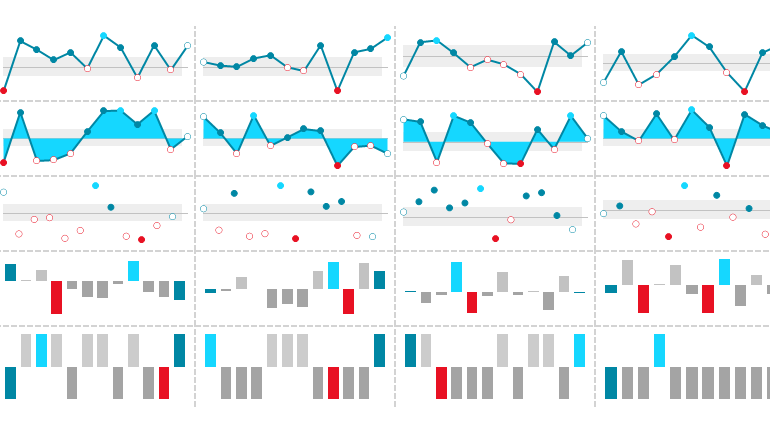
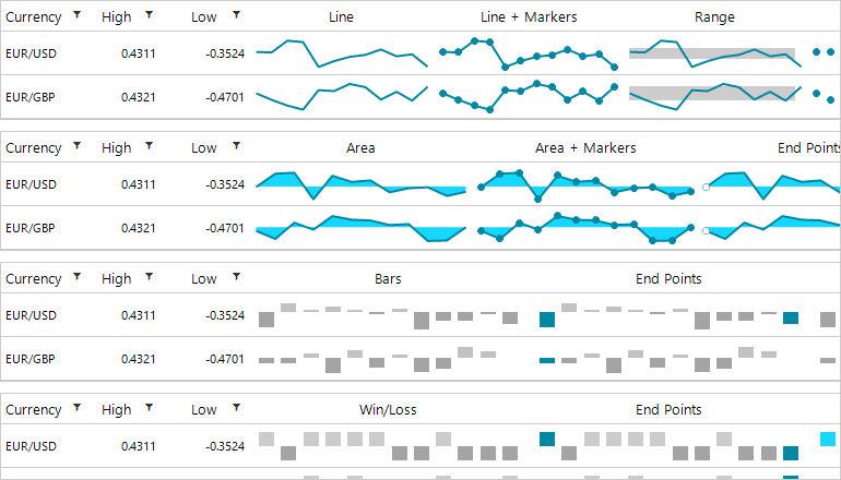
RadSparkline supports five different series types, each presenting the information in a meaningful yet compact manner. The series becomes really powerful when it is combined with the built-in indicators. Trends are highlighted in a user-friendly way and they can be perceived in a single glance.
Area
The data points are connected to form a line and an area enclosed by the points path and the zero line.
Bar
This series is used to visualize data points as bar blocks where the height of each bar denotes the magnitude of its value.
Line
All of the data points are connected to form a line.
Scatter
This series identifies the position of each data point using two numerical values along the horizontal and vertical axes.
Win/Loss
All of the bars have an equal height and the view is divided into top and bottom halves.
The Area, Bar and Win/Loss series define a BaselineValue property determining where exactly the viewport will be divided into top and bottom halves. By default, the view is split at the 0 value. The property is quite useful in the SparkWinLossSeries where one can define a value different than 0 to indicate wins and losses.
Consuming Data
It is super easy for the RadSparkline control to come to life. All you need to do is add data to it, whether you use data-binding or manually generated points, the API is straightforward both ways.
Data Binding
The control can be data-bound through the added series. Data-binding is implemented following the standard WinForms model with DataSource and ValueMember properties. The series can connect to any object which inherits from IList, IListSource (such as DataTable or DataSet), IBindingList (such as BindingList) or IBindingListView (such as BindingSource).
Unbound Mode
There is also an option to manually add data through the DataPoints property of the series.
SparkBarSeries barSeries = new SparkBarSeries();barSeries.DataPoints.Add(new CategoricalSparkDataPoint(10));// Or simplybarSeries.DataPoints.Add(10);Indicators
RadSparkline exposes a convenient API to highlight significant data points. The indicators are a great way to bring user attention to a certain part of the trend such as highlighting high and low points, negative points or the first and the last points.
Switching indicators on or off is really easy as there are specific properties for each indicator. It is also possible to change and customize the colors, border widths and even the shape.
SparkLineSeries series = new SparkLineSeries();series.ShowHighPointIndicator = true;series.ShowLowPointIndicator = true;series.HighPointBackColor = Color.DarkRed;series.HighPointBorderWidth = 3;series.HighPointBorderColor = Color.Yellow;series.HighPointSize = new SizeF(20, 20);series.LowPointShape = new StarShape(5, 5);series.LowPointBackColor = Color.DarkGreen;// Add data pointsthis.radSparkline1.Series = series;
Besides the indicators, user attention can be also drawn to a particular area of the chart with spark annotations, the available ones are GridLine and PlotBand. With the former you can display lines at a certain location based on the axis values, while with the latter you can indicate an entire area – from the beginning to the end of the vertical or horizontal axis
Null Values
You can also define how null values added as data points will be handled by the control. In certain scenarios one may need to simply skip them and show an empty space on the view port while in other scenarios it would make sense to treat them as 0. This setting is controlled by the RadSparkLine.EmptyPointBehavior property.
Tooltips
Each of the data points can display a tooltip upon moving the mouse over. Tooltips are quite useful, and they will display the data point 's value. It is also possible to customize their text by handling the DataPointTooltipTextNeeded event on the tool tip controller.
Printing and Exporting
The control features convenient methods for exporting the sparkline control to an image or sending it to the printer.
this.radSparkline1.ExportToImage(@"..\..\spark.png", new Size(200, 200));this.radSparkline1.PrintPreview();Extensibility
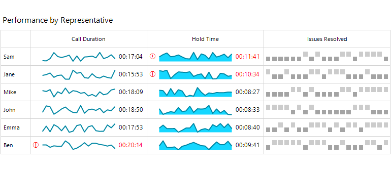
As our controls are built on top of TPF it is really easy to use the main spark element in other controls. It is decoupled from the RadSparkline control which is basically a host of the RadSparklineElement. For example, you can add the element inside RadRibbonBar and have a cool chart which can be updated dynamically.
RadSparklineElement sparklineElement = new RadSparklineElement();SparkBarSeries sparkBarSeries = new SparkBarSeries();sparkBarSeries.ShowHighPointIndicator = true;sparkBarSeries.ShowLowPointIndicator = true;sparkBarSeries.ShowNegativePointIndicators = true;sparkBarSeries.ShowFirstPointIndicator = true;sparkBarSeries.ShowLastPointIndicator = true;Random rand = new Random();for (int i = 0; i < 10; i++){ sparkBarSeries.DataPoints.Add(this.rand.Next(-100, 100));}sparklineElement.Series = sparkBarSeries;this.radRibbonBarGroup1.Items.Add(sparklineElement);Sparkline Grid Column
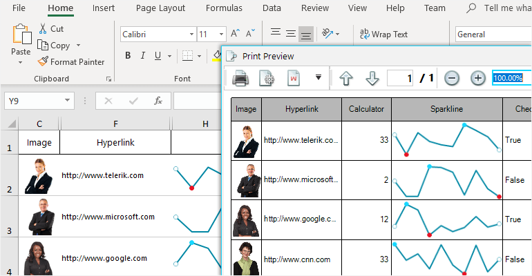
The RadSparklineElement is well integrated into RadGridView as part of the GridViewSparklineCellElement used by the GridViewSparklineColumn. In other words, RadGridView can now show chart data in a dedicated column. As the grid uses UI virtualization, having large amounts of data in the spark cells should not impact performance. The useful indicator related properties are exposed on the grid column and later propagated to the dynamically generated RadSparklineElement.
GridViewSparklineColumn sparkLineColumn = new GridViewSparklineColumn();sparkLineColumn.SeriesType = SparkSeriesType.Line;sparkLineColumn.Name = "Line";sparkLineColumn.FieldName = "Line";sparkLineColumn.HeaderText = "SparkLineColumn";sparkLineColumn.ShowHighPointIndicator = true;sparkLineColumn.ShowFirstPointIndicator = true;sparkLineColumn.ShowLastPointIndicator = true;sparkLineColumn.ShowNegativePointIndicators = true;this.radGridView1.Columns.Add(sparkLineColumn);
Data can be populated in the column as long as the grid is data bound to an object which has a property exposing an array of numbers pointing to the sparkline column. Another way is to handle the SparkDataNeeded event which gets raised whenever data needs to be synced to the cell. Of course, it is also possible to setup the grid in unbound mode and manually add the sparkline cell`s values.
Printing and Exporting in RadGridView
The sparkline column is also aware of the Document Processing Libraries, utilized by the grid exporting engine. The column is natively exported to Excel, PDF and HTML. The sparkline cells can be also printed. This is achieved using the element`s built-in export to image API.

Try it Out
To try out the new Telerik UI for WinForms Sparkline control, all you need to do is to download and install the latest bits. Existing users can get them in your accounts, and if you are new you can get a free 30 day trial here to check it out.
We'd love to hear how this all works for you, so please let us know your thoughts by visiting our Feedback portal or by leaving a comment below.
Hristo Merdjanov
Hristo joined the company in 2014 after graduating from Telerik Academy. He has been part of the WinForms team ever since. Hristo is passionate about the native technologies and WinForms in particular. Besides programming Hristo loves travelling, especially to the beach. He is also a keen tennis player.


