DataGrids Are For... Financial Analysts

Summarize with AI:
As a financial analyst, you need the ability to explore your organization’s data—the DataGrid from Progress Telerik and Kendo UI gives you that ability.
If you are a financial analyst, your responsibility is to “understand the numbers”—not just in terms of what “the numbers” tell you about the past but what those numbers can tell you about the future. That understanding drives your ability both to make informed decisions yourself and to support others in making informed decisions.
As a financial analyst, you work with a variety of data from multiple sources, some of them external (market information, financial forecasts) and many of them internal (budgets, financial statements and other organization data). Essentially, you turn data into information so that information can drive decisions by becoming business intelligence.
Each of your organization’s applications manages part of your organization’s data and, as a result, can provide data that you need for that process. A data exploration tool, embedded in an application’s user interface or as a standalone tool, can automatically bring together the information for any area of business. That commitment to a set of data can eliminate the time needed to extract, transform and load the data that a more general-purpose financial analysis tool (e.g., Cube) requires. You just open the application and there’s your data, ready for you to work with.
That’s only useful to you, however, if the application’s user interface goes beyond simple transaction management—if the application includes a tool that enables you to work with and explore the data embedded in the application. You need a tool that, among other things, can:
- Work with data from a wide variety of sources
- Handle large amounts of data but remain responsive (you don’t want to have to wait on your data being displayed so that you can work on it)
- Format the data to highlight key issues
- Give you the ability to change the data display as you’re working with the data to support whatever analysis you need
- Integrate support for Large Language Models to let you leverage AI analytics
- Export the data so that you can use it in other tools
- Support looking at the “big picture” while also letting you drill down into the essential detail
And, critically, you need a tool that works “the way you expect” so you don’t have to figure out how to use the tool and can concentrate on the data the grid delivers.
The Progress Telerik and Kendo UI DataGrid does all those things. (See the Blazor DataGrid Demo for example.) Some of those features are available in any implementation of the grid (“works the way you expect,” for instance). Some features will require you to specify to the application’s developers how you want the grid to work.
If, for example, you want the DataGrid to work with a data source that includes lot of rows, you’ll want developers to enable the DataGrid’s “load on demand” feature. Similarly, if you’re going to be working with data that others will be updating, you’ll want your grid to be implemented using observables that let you see those changes as early as possible.
The Initial Display
Typically, for example, you’ll want to have the DataGrid configured so that, as you open the application, the grid retrieves the data that you normally expect to work with. But if you’ll need to look at several different data sources as part of analyzing the data, then you’ll also want to have the DataGrid configured to allow you to dynamically switch to that other data.
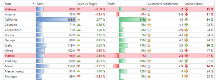
For that initial display, you can also have your grid act as a dashboard that highlights cells (or whole rows) that signal key issues. If there are specific values that you want highlighted in the grid, you can have those values built in. But, if you want, you can also have the ability to change the values/thresholds used to highlight the data you’re interested in.
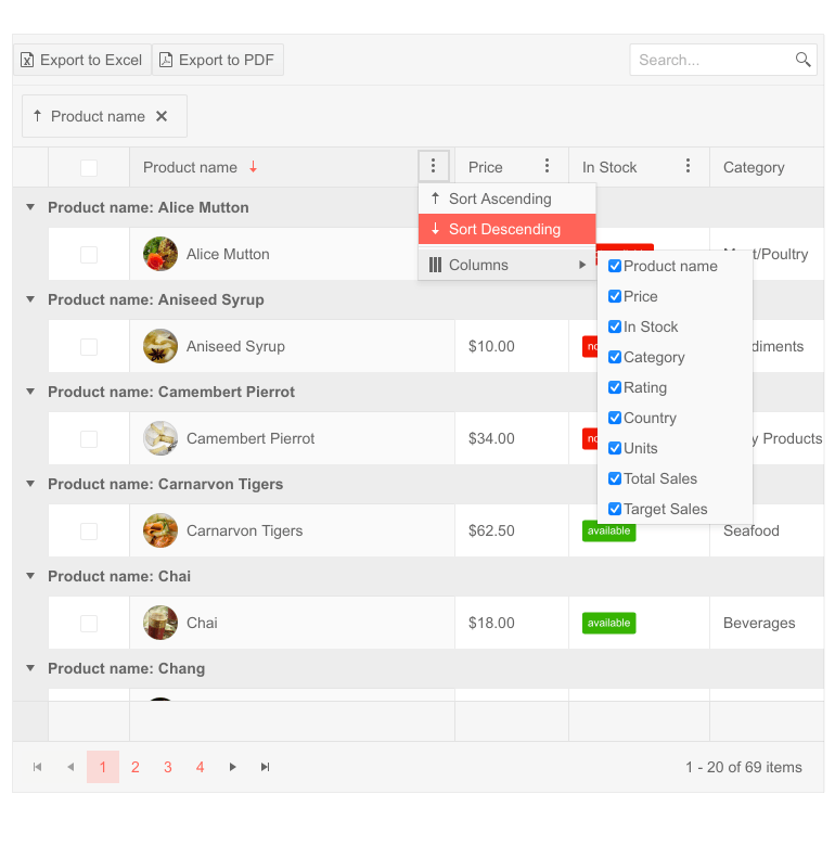
You can, of course, sort the grid’s rows into the order you need. But you can also, at any time, reorder the grid’s columns (or suppress columns) to pull together the data you’re interested right now.
And, also by default, you can filter the grid to show just the rows you need for a particular analysis. You can filter by arbitrary values (e.g., “variances greater than 5%”) or have a checkbox option for specific columns that makes it easier to select the rows you want. The DataGrid’s toolbar also includes a search textbox that you can use to find specific rows.
Supporting Multiple Configurations
That’s already multiple options and, as a result, a lot of opportunities for you to dynamically reconfigure the DataGrid as you’re working with it. Fortunately, you can also have the DataGrid save and restore your configuration settings so that you can quickly switch between different grid configurations as you need them.
AI Support
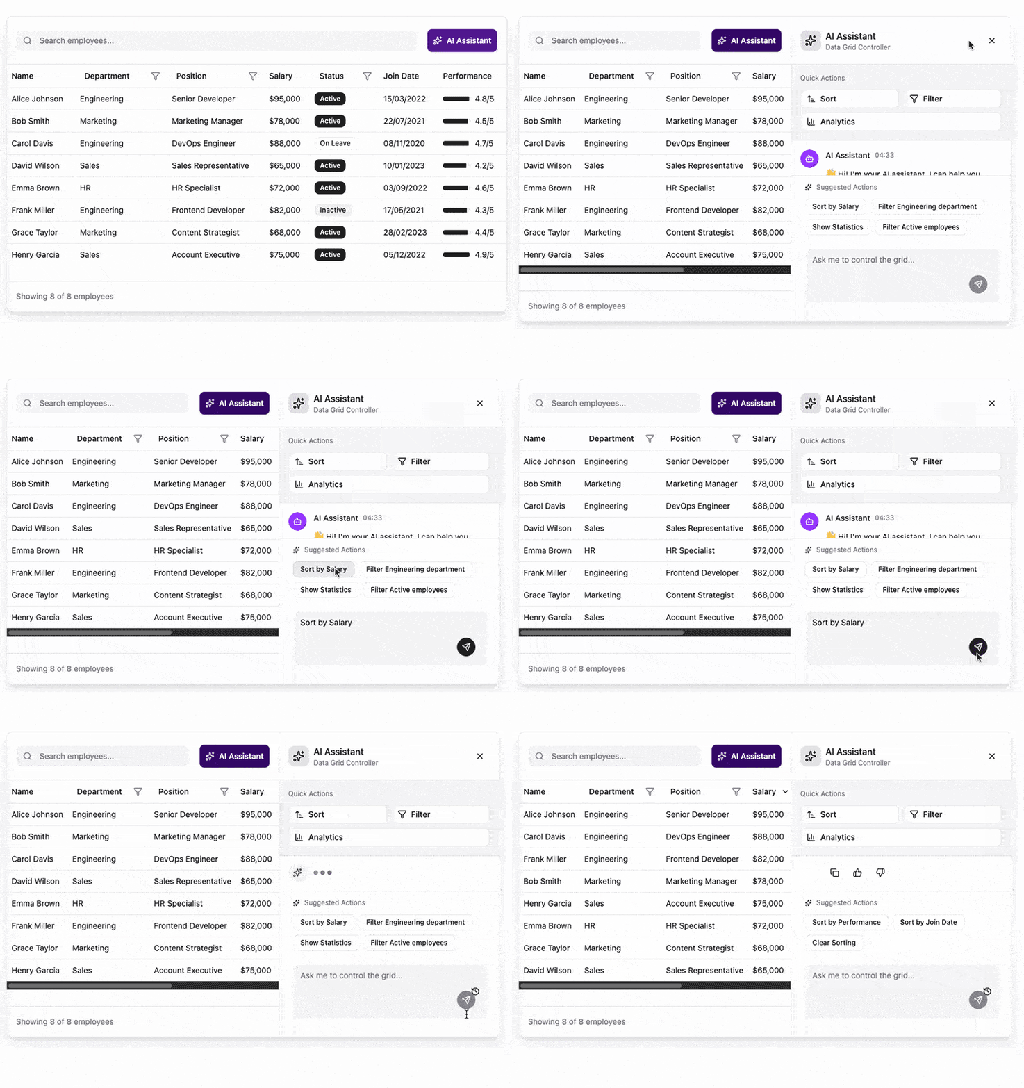
In the modern world, you’ll also want to decide how much of the grid’s AI support you’ll want to have enabled. The DataGrid gives you multiple ways to access AI processors:
- The AI Toolbar for Data Operations lets you use plain language commands to explore your data through filtering, grouping and sorting
- The AI Toolbar for Highlighting lets you flag rows that meet complicated conditions
- The AI Assistant adds a column to your table with a button that opens an AI prompt window to let you ask any question that makes sense
Grouping and Aggregating Data
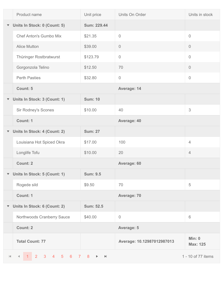
The DataGrid also lets you organize rows into meaningful groups. You can, as you’re viewing the data, select the rows that you want to group or drag/drop columns or rows to create the groups you need. (See Grouping options for KendoReact Grid as an example.)
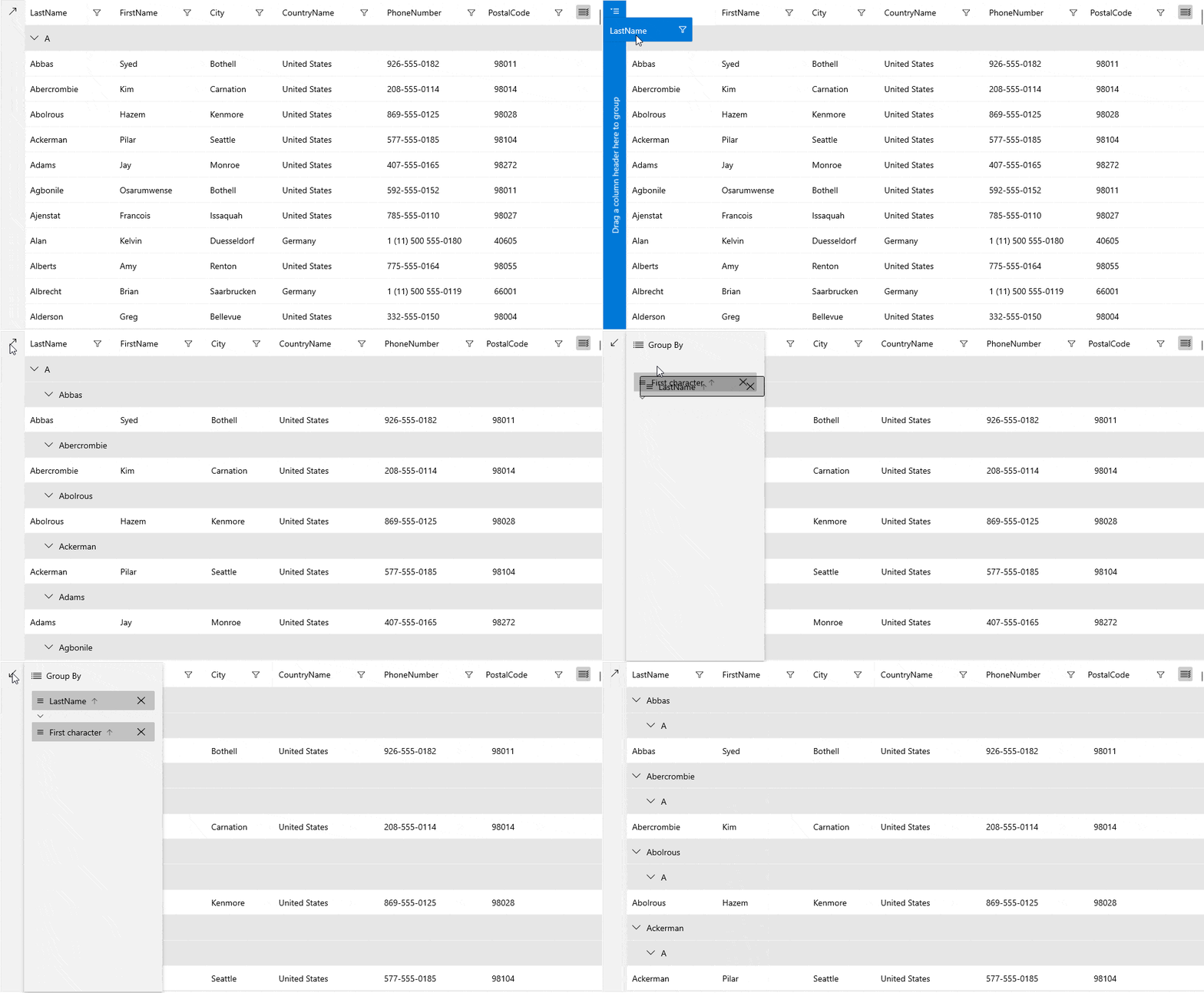
Once you create groups, you can include displays of aggregate values for those groups. But you don’t have to create groups to get aggregate values. You can, as you’re working with the grid, select the rows and columns you want to be included in your aggregated values.
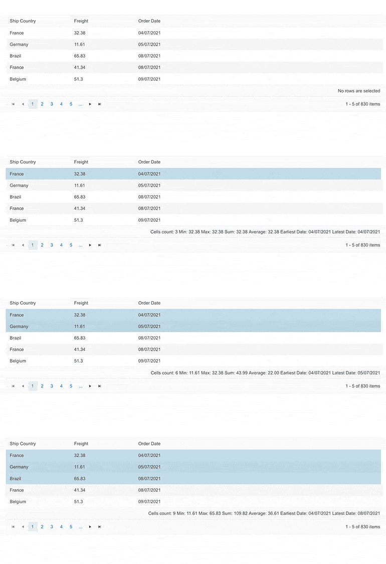
While the DataGrid supports the typical aggregate functions “out of the box” (e.g., count, sum, average, etc.), you can have more sophisticated aggregates integrated into your grids.
Drilling Down
You can also have the DataGrid configured as a hierarchy of high-level sections that you can drill down into to reveal nested, detailed data. You can have your data nested as many levels deep as you need, and each level can have its own, distinct set of columns and aggregates. Effectively, you can expand your high-level rows into a different grid of detail data that reflects your needs at each level.
Exporting Data
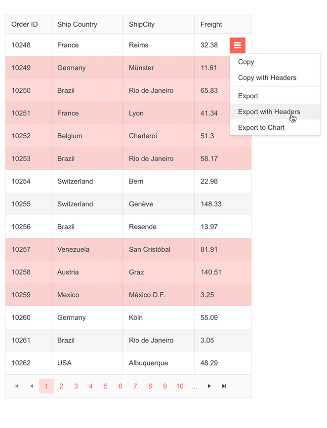
The DataGrid also supports exporting data in a variety of formats so you can integrate other tools into your analysis (or you can just copy grid data so you can paste into some other tool).
You’re not limited to copying or exporting all the data in the grid. While you’re working with the grid, you can select the rows and columns you want you want to export into another tool (or just share with others—the grid supports multiple export formats, including PDF). If your application is using the Telerik Chart control you can export your data straight into the chart for visualization.
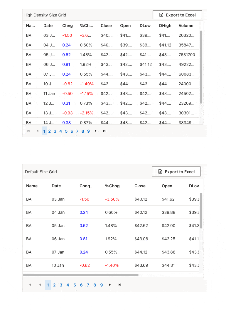
And, if you are using the DataGrid to facilitate selecting the data to export into some other tool, the grid supports a “high density” mode that packs more data on the screen. (See the Kendo UI for Angular Grid Grouping Display Modes page for example.)
As an analyst, you can’t really have too much data—provided, of course, your tools let you review and explore that data effectively. The Telerik DataGrid gives you a customizable window into the data for any application, turning the application itself into a tool for analyzing its own data. That enables you to create the business intelligence that drives better decisions, which is, after all, the purpose of being a financial analyst.
Check out the Telerik DevCraft suite of products to learn about the DataGrid in your favorite .NET or JavaScript flavor. And you can try out the whole suite free for 30 days.

Peter Vogel
Peter Vogel is both the author of the Coding Azure series and the instructor for Coding Azure in the Classroom. Peter’s company provides full-stack development from UX design through object modeling to database design. Peter holds multiple certifications in Azure administration, architecture, development and security and is a Microsoft Certified Trainer.
Comments
All articles
Topics
Web MobileMobile
Desktop
Design
Productivity
People