Building a High-Performant ERP Application with Xamarin.Forms, MvvmCross & Telerik UI for Xamarin

Summarize with AI:
Introducing Telerik ERP: Beautifully designed & high-performant enterprise application built with Telerik UI for Xamarin controls.
The Telerik ERP is a showcase Xamarin application designed to demonstrate a real-world mobile app scenario for enterprise resource management. The app is built entirely with the Telerik UI for Xamarin controls and provides users with a beautiful design and high-performant UI that enables its users to easily manage various customers and vendors transactions on the go, by displaying the latest updates and follow ups on orders, products, customers and much more.
The Telerik ERP demo app uses a combination of Microsoft’s Azure services and Entity Framework to host its data on the cloud, and an MVVM framework to present it on Android, iOS and UWP devices.
In this blogpost, we will walk you through the an overview of building the ERP application – from its backend and services, the MVVM layer to the Telerik UI for Xamarin controls that provide the modern and fluid user-experience.
The Backend Structure of Telerik ERP
The backend of the Telerik ERP application is hosted on Microsoft Azure Mobile Apps, which allows you to quickly cloud-enable your mobile app by storing its data online and giving you the necessary tools to access it. The framework provides everything you need right from the start.
The data of the application is split into two parts. First part contains only the business (structured) data and the second part contains the pictures (unstructured data) used in the application. Let’s start with the latter.
Hosting Unstructured Data
We are using Azure Blob storage for images, which provides us with a convenient way to serve them directly to the application, thus removing the hassle of having to save images into a database.
Hosting Business Data
On the business data side of things, we are using an ASP.NET application that connects to a SQL server database. This application is deployed to an Azure App Service to be accessible 24/7 from anywhere in the world. The code of the application can be found in the git repository.
The application uses Entity Framework’s code first approach to create the database. Inside the DataObjects folder you can find all entities that the application needs. Please note that they all derive from EntityData. This will help in data serialization\deserialization process.
As in a real-life application, the separate entities are interconnected. Our customer has a collection of addresses and a collection of orders. Having such relations can result in complications when it comes to loading the required information from the database. To avoid this, we have introduced custom TableControllers that can be found inside the Controllers folder. These controllers use a custom ActionFilterAttribute to control what additional information gets loaded when you execute a query to the database.
public class CustomerController : TableController<Customer>

    {

        protected override void Initialize(HttpControllerContext controllerContext)

        {

            base.Initialize(controllerContext);

            telerikerpContext context = new telerikerpContext();

            DomainManager = new EntityDomainManager<Customer>(context, Request);

        }


        // GET tables/Customer

        [ExpandProperty("Addresses")]

        public IQueryable<Customer> GetAllCustomers()

        {

            return Query();

        }


        // GET tables/Customer/48D68C86-6EA6-4C25-AA33-223FC9A27959

        [ExpandProperty("Addresses")]

        [ExpandProperty("Orders")]

        public SingleResult<Customer> GetCustomer(string id)

        {

            return Lookup(id);

        }

    }
Let’s take a deeper dive into the CustomerController.
You can see that the GetAllLCustomers() method has the ExpandProperty("Addresses") attribute. This will populate the addresses collection for each of the customers before returning result. The GetCustomer(string id) method will load the addresses as well as the orders of a single customer. If we didn’t have these controllers introduced, the EntityFramework would return empty collections for the addresses and orders and we would be forced to do additional roundtrips to the database to fetch them. Controllers allow us to do this in a single roundtrip.
To allow the EntityFramework to create, connect and modify the SQL database we have created a custom DbContext that can be found inside the Models folder. This context holds the separate DbSets that the application needs, the connection string to the database and configures the DbModelBuilder. Based on this context and the EntityDate objects, the EntityFramework autogenerates code which is used to create the database schema. This code is then wrapped in a migration which can be found in the Migrations folder. Executing this migration will prepare all tables in the database.
  public class telerikerpContext : DbContext

    {

        private const string connectionStringName = "Name=MS_TableConnectionString";


        public telerikerpContext() : base(connectionStringName)

        {

        }


        public DbSet<Customer> Customers { get; set; }

        public DbSet<CustomerAddress> CustomerAddresses { get; set; }

        public DbSet<Product> Products { get; set; }

        public DbSet<Vendor> Vendors { get; set; }

        public DbSet<Order> Orders { get; set; }

        public DbSet<OrderDetail> OrderDetails { get; set; }


        protected override void OnModelCreating(DbModelBuilder modelBuilder)

        {

            modelBuilder.Conventions.Add(

                new AttributeToColumnAnnotationConvention<TableColumnAttribute, string>(

                    "ServiceTableColumn", (property, attributes) => attributes.Single().ColumnType.ToString()));

        }

    }
The final step is to populate the database with actual data. This is achieved by a custom DbMigrationsConfiguration which allows us to override the Seed() method and control what data gets populated into the separate database tables.
internal sealed class Configuration : DbMigrationsConfiguration<telerikerpService.Models.telerikerpContext>

{

    public Configuration()

    {

        AutomaticMigrationsEnabled = false;

        SetSqlGenerator("System.Data.SqlClient", new EntityTableSqlGenerator());

        ContextKey = "telerikerpService.Models.telerikerpContext";

    }


    protected override void Seed(telerikerpService.Models.telerikerpContext context)

    {

        //  This method will be called after migrating to the latest version.


        if (!context.Customers.Any())

        {

            context.Customers.AddOrUpdate(SeedData.Customers);

            context.CustomerAddresses.AddOrUpdate(SeedData.CustomerAddresses);

        }


        if (!context.Products.Any())

        {

            context.Products.AddOrUpdate(SeedData.Products);

        }


        if (!context.Vendors.Any())

        {

            context.Vendors.AddOrUpdate(SeedData.Vendors);

        }


        if (!context.Orders.Any())

        {

            context.Orders.AddOrUpdate(SeedData.Orders);

            context.OrderDetails.AddOrUpdate(SeedData.OrderDetails);

        }

    }

}
Note that the actual initial data is stored in a static class which can be found in the App_Start folder.
Now that you have an idea about the backend, lets continue with the structure of the application itself. Let’s go through the UI and the MVVM framework at choice.
Telerik ERP: MVVM Framework & UIs
Telerik ERP is built using the Xamarin.Forms cross-platform mobile framework and the MVVM (Model-View-ViewModel) pattern. While Xamarin.Forms itself offers some features to get you started with MVVM, there are other libraries that will help you structure and optimize the code in an even better way. One such framework is MvvmCross. It is specifically developed for Xamarin and the mobile ecosystem.
In addition to all the features provided by Xamarin.Forms, MvvmCross provides functionalities like:
- ViewModel to ViewModel navigation – a support for passing and returning objects is provided as well.
- Built-in dependency injection, bindings and inversion of control.
- Extensive messaging
- Many classes that help building the application.
- Ability to change the native platform navigation.
When building our ERP sample application, we made sure to stick to the best programming practices by the worldwide Xamarin community – most of your will relate to building applications with MvvmCross.
We’ve walked you through the backend, the structure of the application, so what are we missing? Ah, yes! UI! On top of the code implementation sits the beautiful and highly-performant UI of the application built with the controls provided by Telerik UI for Xamarin. Let’s take a deeper dive into this final step of the application development lifecycle.
ERP MvvmCross Implementation
Application
The starting point of the ERP application is the ErpApplication class. This class inherits from the MvxApplication – a class provided by the MvvmCross framework. The main idea behind the custom application is to add additional configuration before it starts. For the ERP application, here all services get registered:
public class ErpApplication : MvxApplication

    {

        public override void Initialize()

        {

            CreatableTypes()

                .InNamespace(typeof(Services.IErpService).Namespace)

                .EndingWith("Service")

                .AsInterfaces()

                .RegisterAsLazySingleton();


            RegisterCustomAppStart<AppStart>();

        }

    }
Services
The AuthenticationService is used by the LoginPageViewModel, it takes the provided username and password and validates them. If authentication is successful, the main page is visualized. Currently the service does not have a specific implementation while login is executed. It is up to you to implement the desired functionality here:
public class AuthenticationService : IAuthenticationService

    {

        public string UserName { get; private set; }

        public Task<bool> IsAuthenticated()

        {

            // TODO: Cache authentication

            return Task.FromResult(false);

        }


        public Task<bool> Login(string username, string password)

        {

            this.UserName = username;

            // allows login with random username and password combination

            return Task.FromResult(true);

        }

    }
The ERPService then establishes the connection with the Database. Its main purpose is to execute the CRUD operations with the data provided by the database. Through its constructor an IMvxMessenger is injected.
public ErpService(IMvxMessenger messenger)

        {

            this.messenger = messenger;
This is a specific service provided by MvvmCross and its main purpose is to send messages to the ViewModels. In order to receive the messages, the ViewModel should inject the service as well, which enables you to subscribe to messages sent by the ERPService. Each ViewModel must call one of the Subscribe methods on the IMvxMessenger and must store the returned token in order to be able to successfully receive the messages.
ViewModels
A constructor injection is used for each ViewModel – this injection is used internally within MvvmCross when the ViewModels are created. The base class of each ViewModel is the MvcViewModel class. By inheriting from it the services could be provided to each ViewModel through injection.
The ViewModels are very important for the navigation in Xamarin.Forms when MvvmCross is used because of the ViewModel First Navigation. This means that we navigate from ViewModel to ViewModel and not from View to View. It ships with its own navigation system called IMvxNavigationService to navigate between these ViewModels. Almost every ViewModel has an injected IMvxNavigationService service through its constructor.
Let's have a look in one of the ViewModels that is part of the ERP application – the DashboardPageViewModel.
public class DashboardPageViewModel : MvxViewModel

    {

        public DashboardPageViewModel(Services.IErpService service, IMvxNavigationService navigationService)

        {

            this.service = service;

            this.navigationService = navigationService;

            this.AboutCommand = new MvxCommand(ShowAboutPage);

        }
As explained above the ViewModel inherits from the MvxViewModel and through its constructor an ERPService and IMvxNavigationService are injected. Inside the constructor only some fields and properties are assigned. The fetching of the data that is going to be visualized in the View part is happening in a specific method called Prepare. That method is again part of the base MvxViewModel. This is the initial point of the ViewModel. You can use this method to receive and store parameters. It is called every time a navigation is executed to the ViewModel. Here the data is fetched:
public async override void Prepare()

        {

            base.Prepare();


            IsBusy = true;

            await this.FetchData();

            if (await this.service.SyncIfNeededAsync())

            {

                await FetchData();

            }

            IsBusy = false;

        }

From that ViewModel navigation is only executed to the AboutPage. For that purpose, the injected navigation service is used – navigation happens from one ViewModel to another:
private void ShowAboutPage()

        {

            this.navigationService.Navigate<AboutPageViewModel>();

        }
Views
MvvmCross uses ViewModel first navigation, meaning that it navigates from ViewModel to ViewModel and not from View to View. This is acheved by following a naming convention.
However, for the ERP application we used another feature provided by MvvmCross – the generic implementation of the MvxContextPage where you can specify the exact ViewModel of the page.
Each View should inherit from the MvxContextPage instead of the Xamarin.Forms content page. Here is how the DashboardPage inherits from MvxContentPage:
public partial class DashboardPage : MvxContentPage<ViewModels.DashboardPageViewModel>, IMvxOverridePresentationAttributeHere, the ViewModel of the page is passed using the Generic version of the MvxContentPage. There are some built-in attributes through which the developer could define how a view will be displayed. Some of the existing attributes are used to tell the page that it is a Modal or is inside a NavigationView.
The Telerik ERP application has a unique look for desktop, tablets and phones that is achieved using custom presentation attributes. By implementing the IMvxOverridePresentationAttribute the developer can set a specific custom attribute for the page. For the DashboardPage for example if the application is visualized on phone the page is wrapped inside a navigation page while if it on desktop or tablet it isn’t:
public MvxBasePresentationAttribute PresentationAttribute(MvxViewModelRequest request)

        {

            if (Device.Idiom == TargetIdiom.Phone)

            {

                return new MvxTabbedPagePresentationAttribute(TabbedPosition.Tab) { WrapInNavigationPage = true };

            }

            else

            {

                return new MvxTabbedPagePresentationAttribute(TabbedPosition.Tab) { WrapInNavigationPage = false };

            }

        }
Additionally, to the different wrapping the page itself has a different look for Desktop and Phone:
<mcf:MvxContentPage.Content>

        <OnIdiom x:TypeArguments="ContentView">

            <OnIdiom.Phone>

                <cards:PhoneView/>

            </OnIdiom.Phone>

            <OnIdiom.Tablet>

                <cards:TabletView />

            </OnIdiom.Tablet>

            <OnIdiom.Desktop>

                <cards:TabletView />

            </OnIdiom.Desktop>

        </OnIdiom>

    </mcf:MvxContentPage.Content>
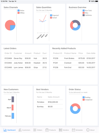
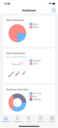
Here is how the page is visualized on both iPad and iPhone:
Now let’s take a deep look into the UI implementation of the page.
Views UI
The main heroes of the DashboardPage are two Telerik UI for Xamarin controls – the Chart and DataGrid.
Xamarin Charts
Telerik UI for Xamarin provides many different types of Charts and Series that are extremely flexible - some of them are presented and visualized in the DashboardPage.
With the Chart control, you can show trends and data using line charts, area charts and spline charts, or visualize data comparisons with bar charts, and even depict proportions with pie charts. The PieChart is the main hero in the DashboardPage.
The Sales channels data is presented using PieChart. The data is provided to the PieChart using the PieSeries. The series only need to have a provided ItemsSource in order to be able to visualize the data. The exact data comes from the DashboardPageViewModel that as explained fetches its data when Prepare method is executed:
<telerikChart:RadPieChart x:Name="pieChart" Grid.Row="1" Grid.Column="0">

            <telerikChart:RadPieChart.ChartBehaviors>

                <telerikChart:ChartSelectionBehavior SeriesSelectionMode="None" DataPointSelectionMode="None"/>

            </telerikChart:RadPieChart.ChartBehaviors>

            <telerikChart:RadPieChart.Series>

                <telerikChart:PieSeries ItemsSource="{Binding SalesChannels}" ShowLabels="false" ValueBinding="Value" LegendTitleBinding="Name" LabelBinding="Name"/>

            </telerikChart:RadPieChart.Series>

        </telerikChart:RadPieChart>
The legend that is visualized on the right side of the Xamarin pie chart is a separate control. That control makes it easy for you to provide description regarding the series which are visualized within the Chart. The ChartProvider should only be set to the Chart control whose series will be described in the Legend and the Legend will visualize the items out of the box. Using the LegendTitleBinding of the series you can specify the item that will be used as a title for the legend.
<telerikChart:RadLegend Grid.Row="1" Grid.Column="1" HeightRequest="200"

                                Style="{StaticResource LegendStyle}"

                                LegendProvider="{x:Reference Name=pieChart}"/>
The Sales Quantities is presented using another type of Xamarin Chart – the CartesianChart. Specifically here we have two LineSeries that visualize the expected and actual sales data. The visualization of several types of series is supported out of the box by the Chart control. For the CartesianChart we have specified axis as well – both horizontal and vertical. The CartesianChart plots data points in a coordinate system defined by its two axes. The axis itself provide information about the values of the points using ticks and text labels. On the right side of the chart a legend is visualized as well.
<telerikChart:RadCartesianChart x:Name="chart" Grid.Row="2" Grid.Column="0">

            <telerikChart:RadCartesianChart.ChartBehaviors>

                <telerikChart:ChartSelectionBehavior SeriesSelectionMode="None" DataPointSelectionMode="None"/>

            </telerikChart:RadCartesianChart.ChartBehaviors>

            <telerikChart:RadCartesianChart.Series>

                <telerikChart:LineSeries ItemsSource="{Binding ExpectedSalesQuantitues}" ShowLabels="false" DisplayName="Expected">

                    <telerikChart:LineSeries.ValueBinding>

                        <telerikChart:PropertyNameDataPointBinding PropertyName="Value"/>

                    </telerikChart:LineSeries.ValueBinding>

                    <telerikChart:LineSeries.CategoryBinding>

                        <telerikChart:PropertyNameDataPointBinding PropertyName="Name" />

                    </telerikChart:LineSeries.CategoryBinding>

                </telerikChart:LineSeries>

                <telerikChart:LineSeries ItemsSource="{Binding ActualSalesQuantitues}" ShowLabels="false" DisplayName="Actual">

                    <telerikChart:LineSeries.ValueBinding>

                        <telerikChart:PropertyNameDataPointBinding PropertyName="Value"/>

                    </telerikChart:LineSeries.ValueBinding>

                    <telerikChart:LineSeries.CategoryBinding>

                        <telerikChart:PropertyNameDataPointBinding PropertyName="Name" />

                    </telerikChart:LineSeries.CategoryBinding>

                </telerikChart:LineSeries>

            </telerikChart:RadCartesianChart.Series>

            <telerikChart:RadCartesianChart.HorizontalAxis>

                <telerikChart:CategoricalAxis LabelTextColor="Black" LabelFitMode="Rotate" />

            </telerikChart:RadCartesianChart.HorizontalAxis>

            <telerikChart:RadCartesianChart.VerticalAxis>

                <telerikChart:NumericalAxis LabelTextColor="White" Minimum="0" />

            </telerikChart:RadCartesianChart.VerticalAxis>

            <telerikChart:RadCartesianChart.Grid>

                <telerikChart:CartesianChartGrid MajorLinesVisibility="X" />

            </telerikChart:RadCartesianChart.Grid>

        </telerikChart:RadCartesianChart>
The Business Overview and Order Status data is visualized again with RadPieChart. Instead of PieSeries however a DonutSeries is used. The series visualizes the Chart in the shape of a donut. The inner empty space is set according to the InnerRadiusFactor property. Each data item is visually represented by a donut slice. There are no other differences comparing it to the PieChart visualized in the Sales Channels.
One more series is demonstrated in the page and this is the BarSeries that visualizes the New customers data.
A detailed information about the Chart control and all the series and axis it provides you find in the official documentation of the Telerik UI for Xamarin controls.
Xamarin Data Grid
The tables that are visualized on the page are implemented using another control from the suite – the Xamarin DataGrid control.
Most of the data on the Internet is stored in tables within a database. RadDataGrid for Xamarin provides the same abstraction over the data – it has Columns and Rows and the intersection of a Row and a Column - a Cell. The control supports different type of columns, selection modes, loading data on demand, a rich customization API and many more features.
In order to visualize a data using the DataGrid control its ItemsSource property should be set. By default, the control will generate columns out of the box using the provided type of data. If you want to manually declare the desired columns, the AutoGenerateColumns property should be set to false.
In the DashboardPage the DataGrid control is used to visualize the data for the latest orders, recently added products and the best vendors.
Here is how the DataGrid is declared for the best vendors part:
<telerikDataGrid:RadDataGrid Grid.Row="2" Grid.ColumnSpan="2" ItemsSource="{Binding BestVendors}"

                                     AutoGenerateColumns="false" Style="{StaticResource DataGridStyle}">

            <telerikDataGrid:RadDataGrid.Columns>

                <telerikDataGrid:DataGridTextColumn HeaderText="Name" PropertyName="Name" HeaderStyle="{StaticResource cellHeaderStyle}" />

                <telerikDataGrid:DataGridTextColumn HeaderText="Sales Amount" PropertyName="SalesAmount" CellContentFormat="{}{0:C}" HeaderStyle="{StaticResource cellHeaderStyle}" />

            </telerikDataGrid:RadDataGrid.Columns>

        </telerikDataGrid:RadDataGrid>
Some more information about the DataGrid control and all the features it provides you can find in our official documentation.
Xamarin Busy Indicator
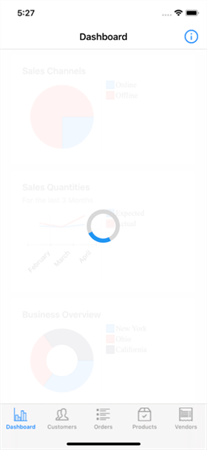
More of the beautiful and feature-rich Xamarin controls are used by some of the other pages of the application. For example when the application loads its data a BusyIndicator is visualized to notify that currently a long-running process is executing. The BusyIndicator control supports ten different animations (by the time of writing) right out of the box and can be customized with visuals of your own. Here is what we selected for the ERP application.
Advanced Xamarin ListView
RadListView is one of the most used Telerik UI For Xamarin controls that is used by the ERP application to visualize data. It provides the ability to bind to a data source and display templated collections of items in a nicely formatted list. Different types of layouts are supported as well, e.g. you can show the data as a vertical list or visualize the items in rows and columns using the ListViewGridLayout mode. This control supports a great variety of built-in features like grouping, sorting, filtering, reordering, item swipe, load on demand functionality (it speeds the initial loading of the page by rendering items that are visible before fetching the remaining items from the data source), a great customization APIs and many more.
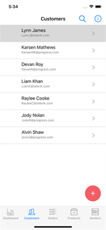
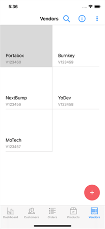
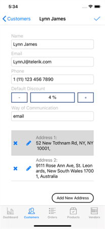
The filtering functionality of the RadListView is demonstrated by the ERP application in combination with the help of another Telerik UI for Xamarin control called RadEntry.
The Telerik Entry control provides the core functionality expected by any Entry, but it gives much more as well including the option to customize the look of the border around the input using the BorderStyle property.
The Xamarin Popup control is used by the pages to visualize dialogs with additional content on top of other controls from which the user can choose. The component provides a flexible API to easily control its behavior and makes possible the implementation of complex logic for a wide range of scenarios. You can make it modal (that makes the UI behind it inactive) if you need to or to change the animation that is used when the control is visualized and gets closed.
Many other controls like RadNumericInput, RadBorder, RadButton and RadPath are used by the pages.
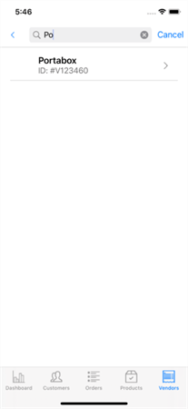
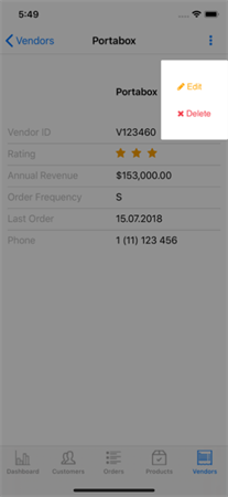
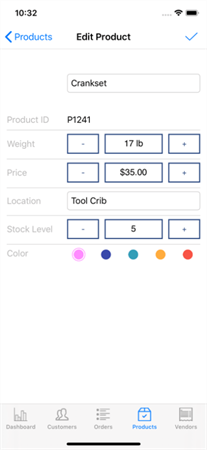
The Telerik NumericInput for Xamarin.Forms provides the ability to set or edit a specific double number either using the input field or by using the increase and decrease buttons. The Buttons used by the Numeric are RadButtons. RadButton provides all the core features expected by a Button control, but also add on top of it adds features like content alignment, background image support, functionality to make the button circular and more. At last, but not least is the RadBorder control. Using it you can place a border with specific thickness and corner radius around each Xamarin.Forms control.
Using Xamarin.Forms in a combination with MvvmCross and the Telerik UI for Xamarin controls we were able to build a beautiful, fast and feature-rich application that enables you to manage and grow your business with ease from every corner of the planet.
Conclusion
The Telerik ERP is more than a demo application – it’s a fully-functional, feature-rich cross-platform enterprise resource management app build with Telerik’s high-performant UI controls for Xamarin, Microsoft Azure’s services & the MvvmCross framework.
The application will enable its users to quickly and easily access and manage business critical information regarding relations with customers and vendors, business transactions, and the latest updates and follow-ups on products and orders. In todays’ complex and dynamic global economy, the Telerik ERP app is a must-have for any business that requires remote access and monitoring of their business information.
You want to take the Telerik ERP app for a test? Download the Telerik UI for Xamarin and head to github for the Telerik ERP source code.
Want to take a deep dive into all Xamarin.Forms Sample Applications by Telerik? Download our whitepaper!
The Ultimate Guide to Xamarin.Forms Mobile Development with Real-World Sample Applications

Atanas Popatanasov
Atanas Popatanasov is a Software Developer working on the Progress Telerik Xamarin and UWP team. He holds a bachelor's degree in Computer Systems and Technologies. In his spare time, Atanas loves reading programming books, to hang out with friends and to watch his favorite football team.
