Building a Food Store Using Kendo UI and Vue

Summarize with AI:
Our online fruit shop is a simple example of how applications can be built with ease using a library like Vue.js and Kendo UI’s components.
Kendo UI is a library used for developing applications at a relatively quicker pace with precision; it provides UI components for libraries like jQuery, Angular, React and Vue, and comes packed with numerous components for creating charts, data tables and drag-and-drop pages.
Vue.js is a frontend development framework for developing a range of applications on different platforms. Alongside its simple integration, detailed documentation and flexibility, Vue lets you extend the template language with your components. Vue also provides libraries for routing and state management, and we’ll be utilizing the latter in this article.
In this tutorial, we are building a marketplace using Vue and Kendo UI; our store presents users a range of delicious fruits; it also lets users add and remove items from the cart. We’ll build the store with aid from Kendo UI components, and a minimal server using Express to serve the products to the application.
To follow this tutorial, a basic understanding of Vue and Node.js is required. Please ensure that you have Node and npm installed before you begin.
If you have no prior knowledge of Vue, kindly follow the official documentation here. Come back and finish the article when you’ve gone through the documentation.
We’ll be using these tools to build out our application:
Here’s a demo of the final product:
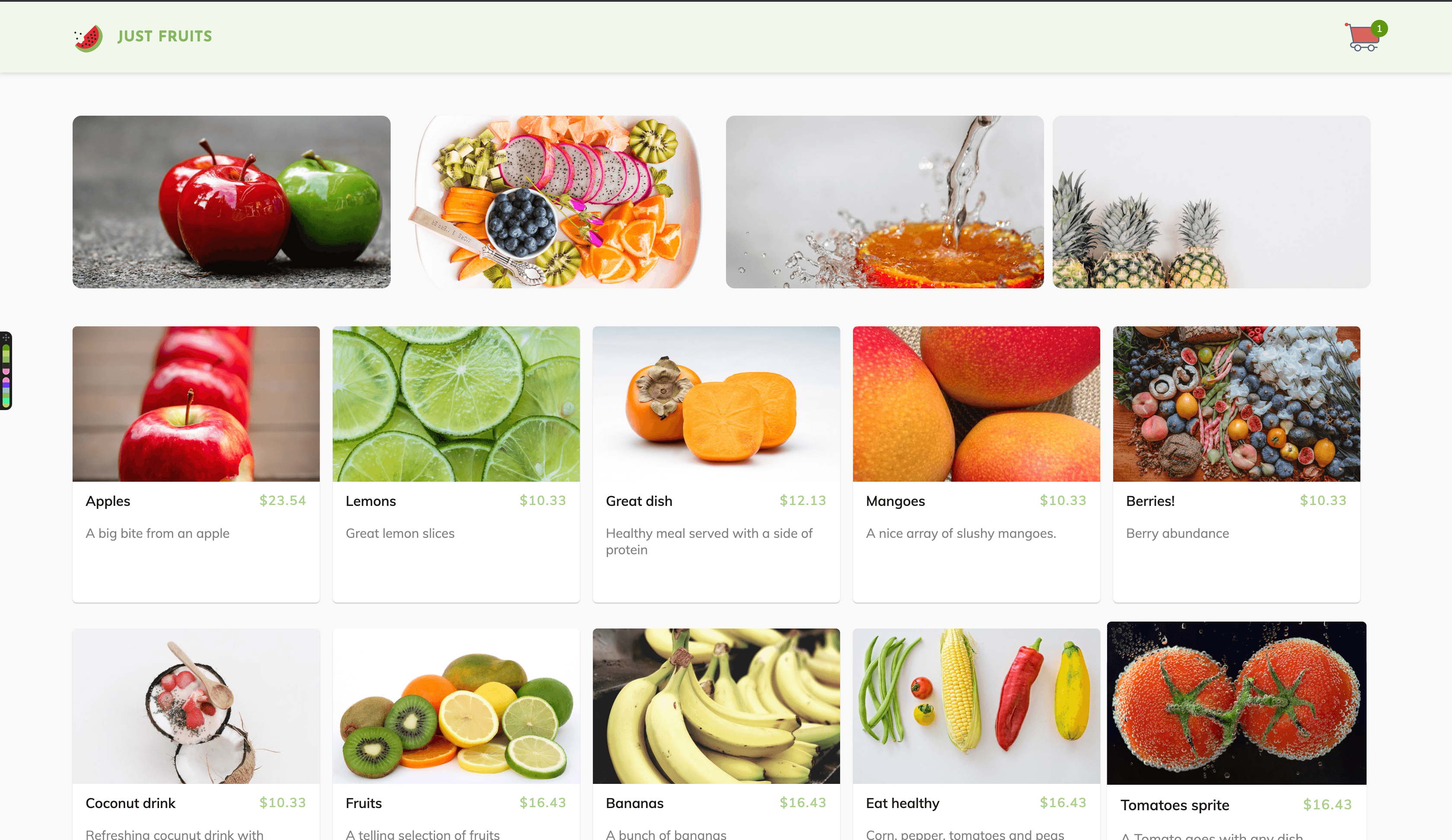
Initializing the Application and Installing Project Dependencies
To get started, we use the vue-cli to bootstrap our application. First, we’ll install the CLI by running npm install -g @vue/cli in a terminal.
To create a Vue project using the CLI, we’ll run the following command:
vue create vue-shop
After running this command, rather than selecting the default configuration, we’ll opt for the manual setup. We do this because we want to add a CSS preprocessor in our application and state management using Vuex. Follow the screenshot below:
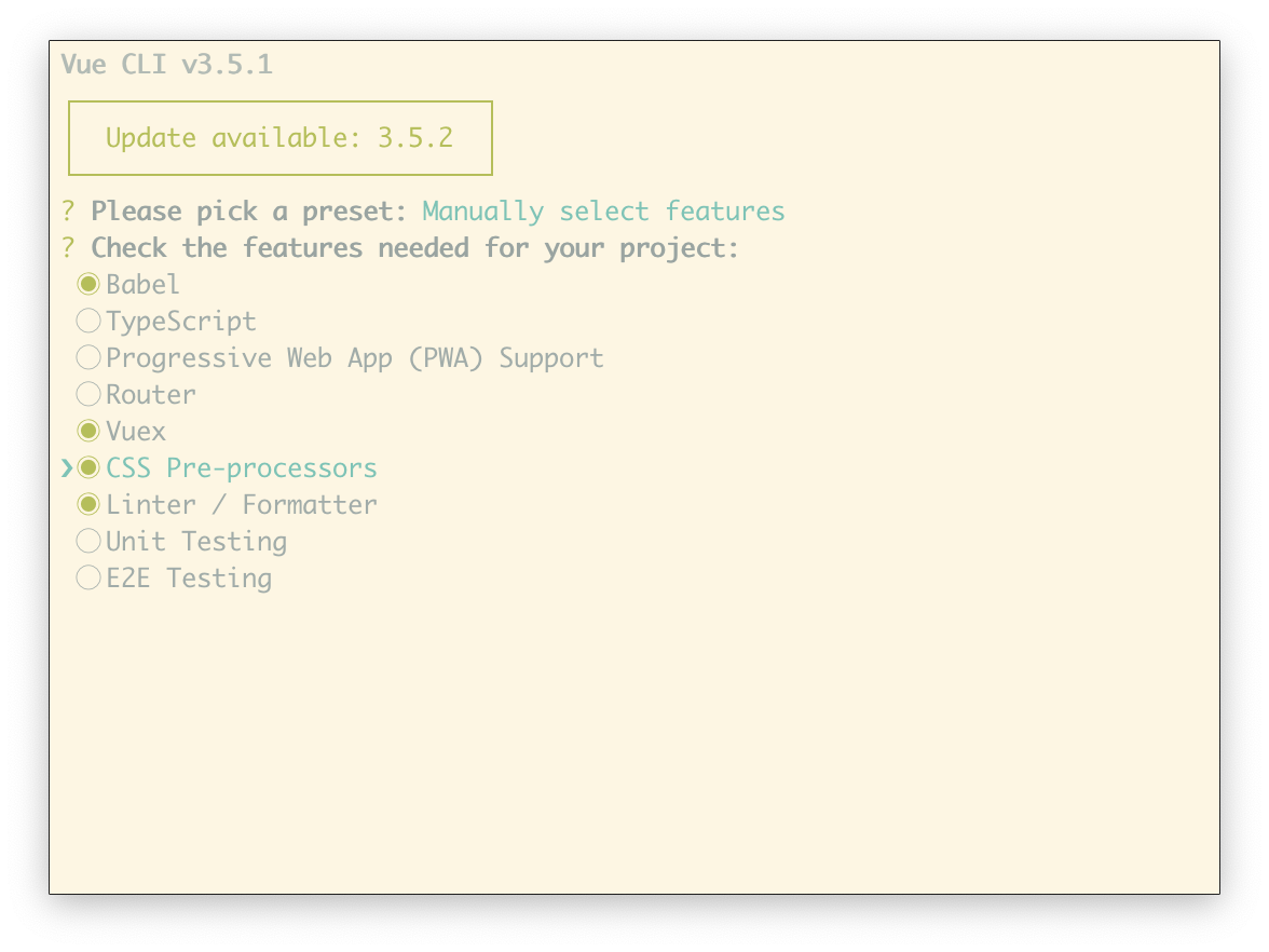
The rest of the prompts can be set up as it best suits you.
Next, run the following commands in the root folder of the project to install dependencies.
// install dependencies required to build the server
npm install express body-parser

// front-end dependencies
npm install @progress/kendo-theme-default
Start the app dev server by running npm run serve in a terminal within the root folder of your project.
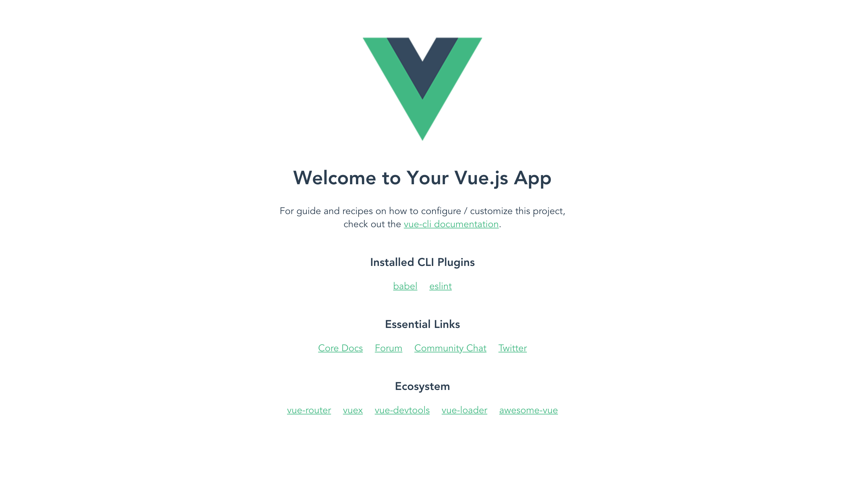
A browser tab should open on http://localhost:8080. The screenshot below should be similar to what you see in your browser:
Building our Server
We’ll build our server using Express. Express is a fast, unopinionated, minimalist web framework for Node.js.
Create a file called server.js in the root of the project and update it with the code snippet below
// server.js
const express = require('express');
const bodyParser = require('body-parser');

const app = express();
const port = process.env.PORT || 4000;
const products = require('./products');

app.use(bodyParser.json());
app.use(bodyParser.urlencoded({ extended: false }));
app.use((req, res, next) => {
  res.header('Access-Control-Allow-Origin', '*');
  res.header(
    'Access-Control-Allow-Headers',
    'Origin, X-Requested-With, Content-Type, Accept'
  );
  next();
});

app.get('/products', (req, res) => {
  res.json(products);
});

app.listen(port, () => {
  console.log(`Server started on port ${port}`);
});
The calls to our endpoint are coming in from a different origin. Therefore, we need to make sure we include the CORS headers (Access-Control-Allow-Origin). If you are unfamiliar with the concept of CORS headers, you can find more information here.
The configuration above is standard for Node applications, nothing particular to our app.
We’re creating a server to feed data to our application so we can see how Effects can be used to fetch external resources to populate the store.
Create a file named products.js that holds the products for our store. Open the file and populate it with the code below:
//fruits.js
module.exports = [
  {
    "name": "Apples",
    "price": 23.54,
    "image": "https://images.pexels.com/photos/39028/apples-fruit-red-juicy-39028.jpeg?cs=srgb&dl=apples-food-fruits-39028.jpg&fm=jpg",
    "description": "A big bite from an apple"
  },
  {
    "name": "Lemons",
    "price": 10.33,
    "image": "https://images.pexels.com/photos/1898261/pexels-photo-1898261.jpeg?auto=compress&cs=tinysrgb&dpr=2&h=400&w=400",
    "description": "Great lemon slices"
  },
  {
    "name": "Great dish",
    "price": 12.13,
    "image": "https://images.pexels.com/photos/37316/kaki-fruit-orange-subject.jpg?auto=compress&cs=tinysrgb&dpr=2&h=400&w=400",
    "description": "Healthy meal served with a side of protein"
  },
  {
    "name": "Mangoes",
    "price": 10.33,
    "image": "https://images.pexels.com/photos/918643/pexels-photo-918643.jpeg?auto=compress&cs=tinysrgb&dpr=2&h=400&w=400",
    "description": "A nice array of slushy mangoes."
  },
  {
    "name": "Berries!",
    "price": 10.33,
    "image": "https://images.pexels.com/photos/1334131/pexels-photo-1334131.jpeg?cs=srgb&dl=abundance-berries-close-up-1334131.jpg&fm=jpg&auto=compress&cs=tinysrgb&dpr=2&h=400&w=400",
    "description": "Berry abundance"
  },
  {
    "name": "Coconut drink",
    "price": 10.33,
    "image": "https://images.pexels.com/photos/1030973/pexels-photo-1030973.jpeg?cs=srgb&dl=berries-berry-chia-1030973.jpg&fm=jpg&auto=compress&cs=tinysrgb&dpr=2&h=400&w=400",
    "description": "Refreshing cocunut drink with strawberries"
  },
  {
    "name": "Fruits",
    "price": 16.43,
    "image": "https://images.pexels.com/photos/103662/background-bitter-breakfast-bright-103662.jpeg?cs=srgb&dl=citrus-close-up-food-103662.jpg&fm=jpg&auto=compress&cs=tinysrgb&dpr=2&h=400&w=400",
    "description": "A telling selection of fruits"
  },
  {
    "name": "Bananas",
    "price": 16.43,
    "image": "https://images.pexels.com/photos/1093038/pexels-photo-1093038.jpeg?auto=compress&cs=tinysrgb&dpr=2&h=400&w=400",
    "description": "A bunch of bananas"
  },
  {
    "name": "Eat healthy",
    "price": 16.43,
    "image": "https://images.pexels.com/photos/142520/pexels-photo-142520.jpeg?auto=compress&cs=tinysrgb&dpr=2&h=400&w=400",
    "description": "Corn, pepper, tomatoes and peas"
  },
  {
    "name": "Tomatoes sprite",
    "price": 16.43,
    "image": "https://images.pexels.com/photos/533288/pexels-photo-533288.jpeg?auto=compress&cs=tinysrgb&dpr=2&h=400&w=400",
    "description": "A Tomato goes with any dish"
  }
]
Note: Images are from https://pexels.com.
Start the server by running the following command in a terminal within the project folder:
node server.js
Home View
To get started, we’ll define the views for the application, starting from the home page. The home page houses the products grid. Create a file named Home.vue within the src/components folder. Open the file and update it using the snippets below. We’ll split the component snippets into three for the template, script and style.
First, the template. Copy the following content into the src/components/Home.vue file:
<!-- src/components/Home.vue -->
<template>
  <div class="main">
    <section class="banners">
      <div v-for="banner in banners" :key="banner.src">
        <img :src="banner.src" :alt="banner.alt">
      </div>
    </section>
    <section class="product-area">
      <!-- product grid area -->
    </section>
  </div>
</template>
In the snippet above, we’ve defined an area for the banners and product grid. The banner area houses four banner images. We’ll go about creating the product grid component later in the tutorial.
Styling the Home Component
Next, we’ll go about styling the home page, the banner area to be exact. We’ll give the images a defined height and give the container a max width.
<!-- src/components/Home.vue -->
<template>
  ...
</template>

<style lang="scss" scoped>
.main {
  width: 90%;
  margin: auto;
  padding: 20px 15px;
  margin-top: 30px;
  .banners {
    display: flex;
    align-items: center;
    justify-content: center;
    div {
      width: 26%;
      margin-right: 10px;
      img {
        height: 200px;
        width: 100%;
        max-width: 100%;
        border-radius: 10px;
        object-fit: cover;
      }
    }
  }
}
</style>
Next, we’ll create the banners data property with an array of images. Open the home.component.ts file and update it to be similar to the snippet below:
<template>
  ...
</template>

<style lang="scss" scoped>
  ...
</style>

<script>
export default {
  name: "Home",
  data() {
    return {
      banners: [
        {
          src:
            "https://images.pexels.com/photos/209339/pexels-photo-209339.jpeg?auto=compress&cs=tinysrgb&dpr=2&h=300&w=510",
          alt: "A tasty treat"
        },
        {
          src:
            "https://images.pexels.com/photos/247685/pexels-photo-247685.png?auto=compress&cs=tinysrgb&dpr=2&h=300&w=510",
          alt: "Chocolate covered pancakes"
        },
        {
          src:
            "https://images.pexels.com/photos/68899/pexels-photo-68899.jpeg?auto=compress&cs=tinysrgb&dpr=2&h=300&w=510",
          alt: "Burger and fries"
        },
        {
          src:
            "https://images.pexels.com/photos/165776/pexels-photo-165776.jpeg?auto=compress&cs=tinysrgb&dpr=2&h=300&w=510",
          alt: "Get ready to slice"
        }
      ]
    };
  },
};
</script>
Since we’ll be using external fonts, we’ll update the public/index.html file with a link tag:
<!-- public/index.html -->
<!DOCTYPE html>
<html lang="en">
  <head>
    <meta charset="utf-8">
    <meta http-equiv="X-UA-Compatible" content="IE=edge">
    <meta name="viewport" content="width=device-width,initial-scale=1.0">
    <link rel="icon" href="<%= BASE_URL %>favicon.ico">
    <link href="https://fonts.googleapis.com/css?family=Josefin+Sans:600,700|Muli:400,600,700" rel="stylesheet">
    <title>vue-shop</title>
  </head>
  <body>
    <noscript>
      <strong>We're sorry but vue-shop doesn't work properly without JavaScript enabled. Please enable it to continue.</strong>
    </noscript>
    <div id="app"></div>
    <!-- built files will be auto injected -->
  </body>
</html>
Then we’ll select Muli as our default font family; we’ll also negate the default padding and margin on the body and html elements. Open the App.vue file and update the style area with the following content:
<!-- App.vue -->
<template>
  ...
</template>

<script>
  ...
</script>

<style>
  body,
  html {
    margin: 0;
    padding: 0;
    font-family: "Muli", sans-serif;
    background-color: whitesmoke;
  }
</style>
Next, we’ll create and render a Header component in our application before we start working on the product grid.
Header Component
The header component displays the application logo and the number of items in the cart. We computed the cart value from the Vuex store.
Create a file Header.vue within the src/components folder. Open the file and follow the three-step process of creating the component below:
First, we’ll create the template section:
<!-- src/components/Header.vue -->
<template>
  <header>
    <div class="brand">
      <img src="../assets/logo-2.svg" alt="avatar">
      <h5>Just fruits</h5>
    </div>
    <div class="nav">
      <ul>
        <li>
          <img src="../assets/cart.svg" alt="cart">
          <span class="badge" v-if="cart.length > 0">{{ cart.length }}</span>
        </li>
      </ul>
    </div>
  </header>
</template>
Next, we’ll style the header within the style section. Update the file using the snippet below:
<!-- src/components/Header.vue -->
<template>
  ...
</template>


<style lang="scss" scoped>
header {
  display: flex;
  background-color: white;
  margin: 0;
  padding: 5px 5%;
  color: whitesmoke;
  box-shadow: 0 2px 4px 0 rgba(0, 0, 0, 0.1);
  background: rgb(242, 247, 236);
  .brand {
    flex: 1;
    display: flex;
    align-items: center;
    img {
      height: 35px;
      border-radius: 50%;
      margin-right: 17px;
    }
    h5 {
      font-family: "Josefin Sans", sans-serif;
      font-size: 17px;
      margin: 0;
      letter-spacing: 0.4px;
      color: rgb(83, 158, 17);
      opacity: 0.7;
      text-transform: uppercase;
    }
  }
  ul {
    list-style: none;
    padding-left: 0;
    display: flex;
    li {
      display: flex;
      align-items: center;
      position: relative;
      img {
        width: 40px;
      }
      .badge {
        height: 20px;
        width: 20px;
        font-size: 11px;
        color: white;
        background-color: rgb(83, 158, 17);
        display: flex;
        justify-content: center;
        align-items: center;
        position: absolute;
        top: 0;
        right: -10px;
        border-radius: 50%;
      }
    }
  }
}
</style>
Finally, we’ll include the script section:
<template>
  ...
</template>

<style lang="scss" scoped>
  ...
</style>

<script>
  export default {
  name: "Header",
  computed: {
    cart() {
      // we'll get the cart from the VueX store. The store will be created later in the article
    }
  }
};
</script>
App Component
After creating the Home and Header components, the next step is to render the components in the root App component. Open the App.vue File within the src/ directory. Update the template section to render both Header and Home, components and the script section to create the cart property.
<!-- src/App.vue -->

<template>
  <div id="app">
    <main>
      <Header/>
      <div class="app-home">
        <Home />
      </div>
    </main>
  </div>
</template>

<script>
import Home from "./components/Home";
import Header from "./components/Header";
export default {
  name: "app",
  components: {
    Home,
    Header
  },
};
</script>

<style>
  ...
<style>
Start the application server by running the following command: npm serve.
Then navigate to http://localhost:8080 on your browser, you should see something similar to the screenshot below:
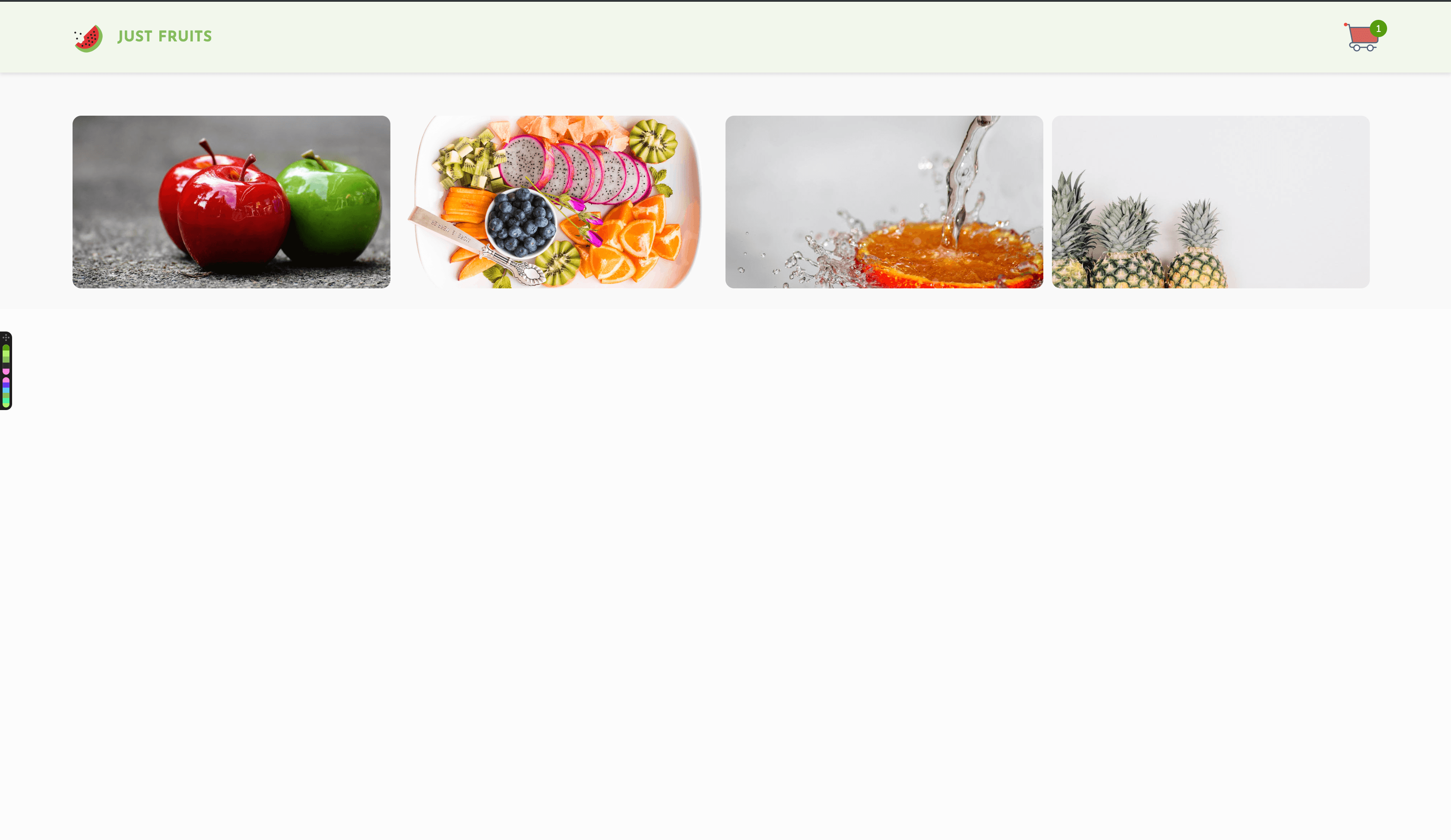
Note: Make sure to use your own preferred images here.
Next, we’ll set up the Vuex store by creating the default state of the application and defining actions and mutations for the application.
Managing the State of the Application
To ensure the best practice for the application and to make sure the application adopts a unidirectional flow of data, we’ll be making use of the Vuex library. Vuex is a state management library for Vue.js applications. It serves as a store for all the components in an application; it ensures that the state can only be mutated predictably.
The Vue-CLI already generates the store.js file for us, so all we need to do is set the initial state of our application and create the mutations and actions required to update the state correctly.
Open the src/store.js file and update the content following the snippet below:
// src/store.js

import Vue from 'vue';
import Vuex from 'vuex';
Vue.use(Vuex);
export default new Vuex.Store({
  state: {
    items: [],
    cart: [],
  },
  mutations: {
    loadSuccess(state, payload = []) {
      state.items = [...state.items, ...payload];
    },
    addToCart(state, item = {}) {
      state.cart = [...state.cart, item];
    },
    removeFromCart(state, item = {}) {
      state.cart = [
        ...state.cart.filter((product) => product.name !== item.name),
      ];
    },
  },
  actions: {
    loadItems({ commit }, items) {
      commit('loadSuccess', items);
    },
    addToCart({ commit }, item) {
      commit('addToCart', item);
    },
    removeFromCart({ commit }, item) {
      commit('removeFromCart', item);
    },
  },
});
First, we have to define the initial state of the application; our application displays a list of items and also allows users to add and remove items from the cart, so the initialState of our application features an empty array of items and an empty cart array.
Actions are typically used to describe events in the application when an event is triggered; a corresponding event is dispatched to handle the triggered events. Actions are similar to mutations in Vue.js; the difference is that actions commit mutations.
In the snippet above, we created three actions:
loadItems: We dispatch this action when we wish to populate the store with items from the server.addToCart: TheaddToCartaction is dispatched to add an item to the cart; it commits a mutation of similar name.removeFromCart: This action takes an item as a second argument and removes it from the cart.
Mutations are pure functions that transition your application’s state from one to the next. It is similar to an event, meaning it gets a type and a handler. The handler function is where we transition the state of the application.
In the snippet above, we defined three mutation functions:
loadSuccess: Within this method is where we load theitemsarray with the products fetched from the server.addToCart: TheaddToCartmethod takes an item and adds it to thecartarray.removeFromCart: This method gets anitemand filters it out of thecart.
Next, we’ll create the component to render the products and also work on the add to cart functionality. Stay tuned.
Products List View
Create the following files within the src/components directory: Product.vue for rendering individual product cards, and ProductList.vue for rendering a list of product cards.
After creating these files, open the Product.vue file and update with the code below. First the template section:
<!-- src/components/Product.vue -->

<template>
  <div class="product">
    <div class="product-image-holder">
      <img :src="product.image" :alt="product.name" class="product-image">
    </div>
    <div class="product-details">
      <p class="product-details__name">{{ product.name }}</p>
      <p class="product-details__price">${{ product.price }}</p>
    </div>
    <div class="product-description">
      <p>{{ product.description }}</p>
    </div>
    <div class="product-actions">
      <button class="product-actions__add" @click="addToCart(product)" v-if="!inCart">
        <span class="k-icon k-i-shopping-cart"></span>
      </button>
      <button class="product-actions__remove" @click="removeFromCart(product)" v-if="inCart">
        <span class="k-icon k-i-shopping-cart"></span>
      </button>
    </div>
  </div>
</template>
Here we have two buttons for adding to and removing an item from the cart. A flag inCart is used to determine which of the buttons to display. We also used Kendo UI’s icon set to define the cart icon button. Kendo UI has a rich set of icons that are available here. They are easy to configure and customize.
Let’s style the component by adding a style section within the component file:
<!-- src/components/Product.vue -->
<template>
  ...
</template>

<style lang="scss" scoped>
%button {
  border-radius: 50%;
  display: flex;
  justify-content: center;
  align-items: center;
  height: 32px;
  width: 32px;
  cursor: pointer;
  &:hover {
    transform: scale(1.1);
  }
  img {
    width: 16px;
    height: 16px;
  }
}
.product {
  box-shadow: 0 1px 1px 0 rgba(0, 0, 0, 0.2);
  border-radius: 5px;
  margin: 0 15px 30px 0;
  width: 286px;
  max-height: 400px;
  height: 320px;
  background: white;
  &:hover {
    transform: scale(1.05);
    .product-actions {
      display: flex;
    }
  }
  &-image {
    max-width: 100%;
    width: 300px;
    border-top-right-radius: 5px;
    border-top-left-radius: 5px;
    height: 180px;
    object-fit: cover;
  }
  &-details {
    display: flex;
    justify-content: space-between;
    padding: 8px 15px;
    &__price {
      font-weight: 600;
      color: #88C058;
      opacity: 0.7;
      font-size: 15px;
      letter-spacing: 1px;
      margin: 0;
    }
    &__name {
      opacity: 0.9;
      font-weight: 600;
      margin: 0;
    }
  }
  &-description {
    padding: 10px 15px;
    p {
      opacity: 0.5;
      margin: 0;
      font-size: 15px;
    }
  }
  &-actions {
    display: none;
    justify-content: flex-end;
    padding: 0 15px;
    &__add {
      @extend %button;
      border: 2px solid rgba(0, 0, 0, 0.3);
    }
    .k-icon {
      color: rgb(52, 186, 219);
      font-size: 18px;
    }
    &__remove {
      @extend %button;
      border: 2px solid rgba(0, 0, 0, 0.3);
      .k-icon {
        color: orangered;
        font-size: 18px;
      }
    }
  }
}
</style>
Next, we’ll add the script section to create the variables and methods used in the template section.
<!-- src/components/Product.vue -->
<template>
  ...
</template>

<style lang="scss" scoped>
  ...
</style>

<script>
export default {
  name: "Product",
  props: ["product"],
  data() {
    return {
      inCart: false
    };
  },
  methods: {
    addToCart(item) {
      this.$store.dispatch("addToCart", item);
      this.inCart = true;
    },
    removeFromCart(item) {
      this.$store.dispatch("removeFromCart", item);
      this.inCart = false;
    }
  }
};
</script>
The Product component takes a single prop product; this object contains details of the product we render.
The addToCart method takes one parameter (item); we dispatch this method with an item to add to cart. After dispatching the item, we set inCart property to true. This flag is for displaying the “Add to cart” button when true and the “Remove from cart” button when false.
Meanwhile, the removeFromCart method dispatches an item to be removed from the cart and updates the inCart property to false.
Next, we’ll render the Product component in the ProductList component. Open the ProductList.vue file and update the template section to render the Product similar and the script area to listen for custom events from the Product component:
<!-- src/components/ProductList.vue -->
<template>
  <div class="product-list">
    <Product
      v-for="product in products"
      :product="product"
      :key="product.id"
    />
  </div>
</template>

<script>
import Product from "./Product";
export default {
  name: "ProductList",
  props: ["products"],
  components: {
    Product
  },
};
</script>

<style lang="scss" scoped>
.product-list {
  padding: 10px 0;
  margin-top: 30px;
  display: flex;
  flex-wrap: wrap;
}
</style>
The product list component receives a products array from the Home component. It then loops through the products array using the Product component to render each item in the array.
After making this change, the next step is to render the product list component in the Home.vue component. We’ll also update the Home component to fetch products from the server and the Header component to subscribe to the cart.
Open the Home.vue file and render the product list component within the element with the product-area class attribute:
   <!-- src/component/Home.vue -->

    <template>
      <div class="main">
        <section class="banners">
          ...
        </section>
        <section class="product-area">
          <ProductList
            :products="products"
          />
        </section>
      </div>
    </template>

    <style lang="scss" scoped>
     ...
    </style>

    <script>
    import ProductList from "./ProductList";
    export default {
      name: "Home",
      components: {
        ProductList
      },
      data() {
        return {
          banners: [
            ...
          ]
        };
      },
     async mounted() {
        const res = await fetch("http://localhost:4000/products");
        const products = await res.json();
        this.$store.dispatch("loadItems", products);
      },
      computed: {
        products() {
          return this.$store.state.items;
        }
      }
    };
    </script>
First, we fetch the products by making a request to the server using the Fetch API in the mounted component lifecycle. After successfully fetching the products, we dispatch an event to populate the store with the products returned from the server.
Also, we subscribed to the items property in the store; this keeps our component in sync with the Vuex store.
Finally, we’ll update the Header component to subscribe to the store’s cart array; this updates the header with the number of items in the cart.
    <!-- src/components/Header.vue -->

    <template>
      ...
    </template>

    <style lang="scss" scoped>
      ...
    </style>

    <script>
    export default {
      name: "Header",
      computed: {
        cart() {
          return this.$store.state.cart;
        }
      }
    };
    </script>
After this change, if you visit http://localhost:8080, you should see all the latest changes we’ve made, including the ability to add and remove an item from the cart. You should also see the number of items in cart when an item is added or removed from the cart.
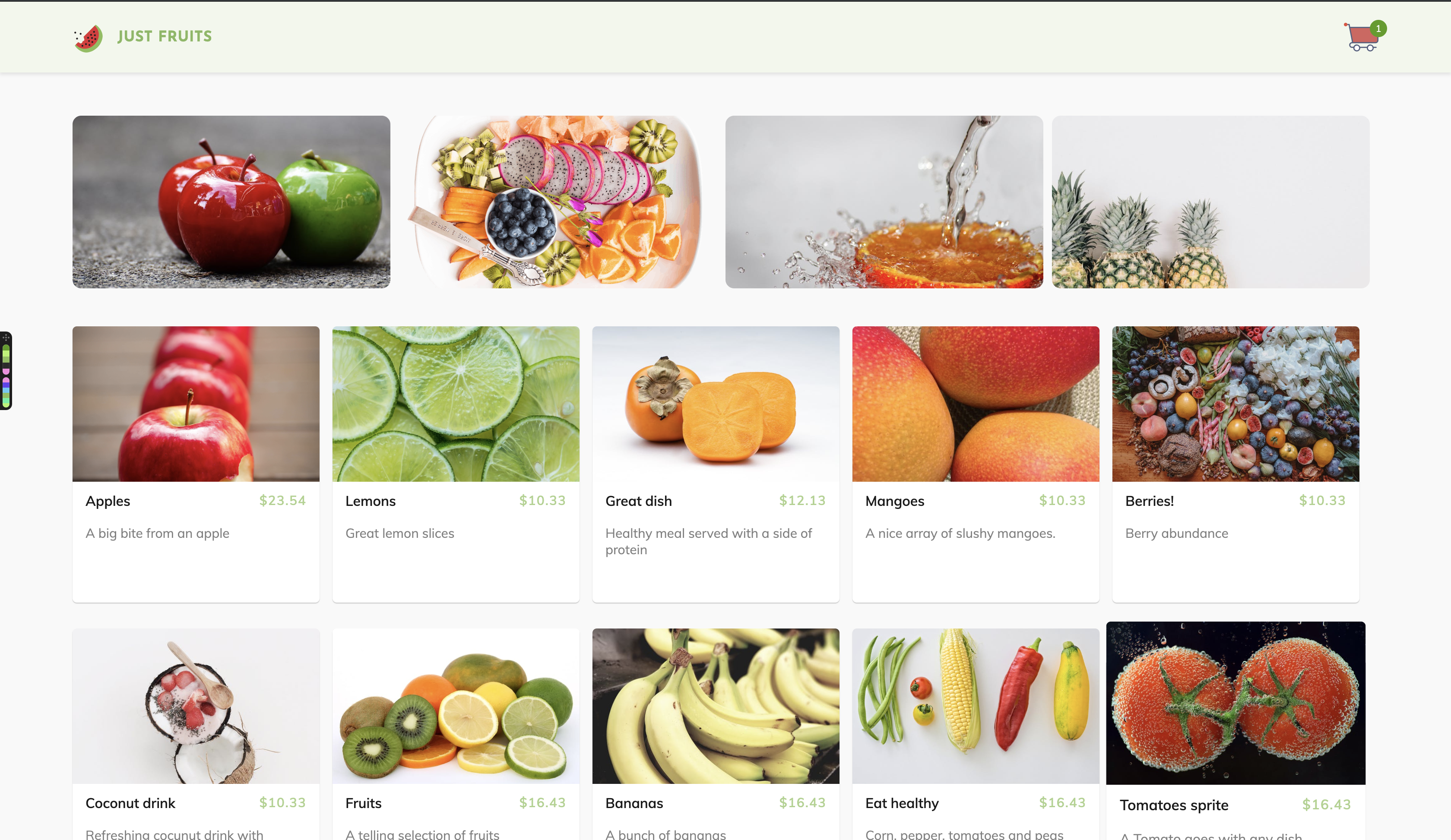
Note: Ensure both the Vue dev server is running on port 8080 and the server is running on port 4000.
Conclusion
In this tutorial, we have created an online fruit shop that serves the freshest of fruits. We utilized Vuex to manage the state of our application. Our store is a simple example of how applications can be built with ease using a library like Vue.js and Kendo UI’s components.

Christian Nwamba
Chris Nwamba is a Senior Developer Advocate at AWS focusing on AWS Amplify. He is also a teacher with years of experience building products and communities.
