Building a CRM with Xamarin.Forms and Azure, Part 2

Summarize with AI:
This is the second installment in a tutorial series that shows you how to build a cross platform CRM application with Azure Web App, Azure Cognitive Services and Telerik UI for Xamarin.
You can find Part One of our series here, where we built the backend. In Part Two, we'll build the UI with Telerik UI for Xamarin. You can also skip ahead to Part Three of the series, where we train a LUIS AI model using Telerik UI for Xamarin's Conversational UI.
Before we get started building our beautiful UI, we’ll want to add the assembly references and NuGet packages for the tools and components we’ll want to use. Let’s start with Telerik UI for Xamarin.
Installing Telerik UI for Xamarin
There are two primary routes to add Telerik UI for Xamarin to the projects; NuGet packages or locally installed assemblies. I use the NuGet package for this demo, but let me walk you through both options:
Option 1—Telerik NuGet Server
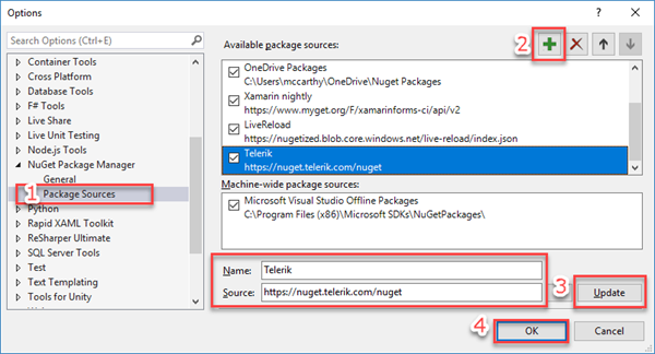
The Telerik NuGet packages are available from the Telerik NuGet server, and you’ll need to add this server to your Package Sources list. We have easy to follow instructions in the Telerik NuGet Server documentation. Here’s a screenshot to give you a high-level look at how to add a source in Visual Studio:
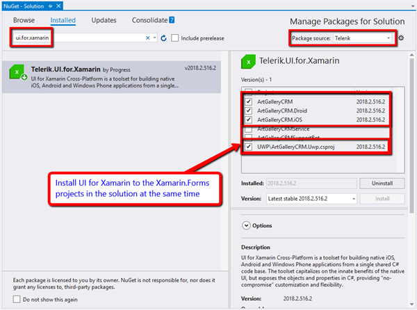
Once you’ve added the server to your package sources list, you can right click on the solution and select “Manage NuGet Packages for Solution.” This will let you install a package to multiple projects at the same time. When the NuGet Package Manager appears, do the following:
- Select the “Telerik” as the Package source and then
- Filter by “Telerik.UI.for.Xamarin”
- Select the Xamarin.Forms projects
- Click install
You’re now ready to start using the UI for Xamarin controls!
The NuGet package installation is our recommended approach. It is faster to get started and thanks the NuGet Package Manager dependency resolution, it will install the other required dependencies for UI for Xamarin (e.g. Xamarin SkiaSharp packages and required Xamarin Android Support Library packages).
Option 2 - Installed Assembly References
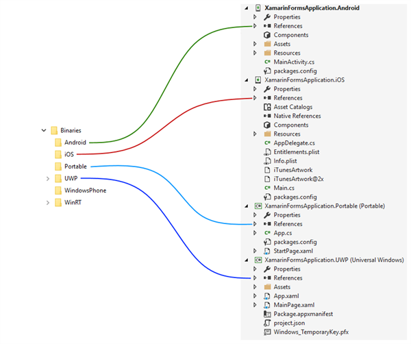
If you choose the assembly reference route, you can find the assemblies for each project is conveniently named folders in the Telerik UI for Xamarin installation folder. The default path is:
C:\Program Files (x86)\Progress\Telerik UI for Xamarin [version]\Binaries
Within the Binaries folder, you’ll find sub-folders to correspond to project types. Each of these folders contains the assemblies that should be added to the project.
Pick and Choose Assembly References
If you’re only using one or two controls and don’t plan on using the Linker to remove unused assemblies from the compiled app package, you can pick and choose individual assemblies from those folders.
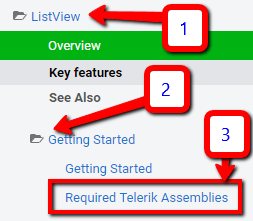
To know what the required assemblies are for each control, review the control’s “Required Telerik Assemblies” article. You’ll find that every control has this article underneath the “Getting Started” folder. As an example, here’s the location of the RadListView’s Required Telerik Assemblies article:
So that you can get started building your UI as soon as possible, I recommend adding them all when first getting started so that you can be up and running quickly. Then after the project is done, you can go back and remove unused assemblies if necessary.
As I mentioned in the Option 1 section above, there are a couple dependencies. If you choose the assembly reference route, you’ll need to explicitly add these NuGet packages. Let's go through them both now.
SkiaSharp Dependency
Several of the UI for Xamarin controls have a dependency on Xamarin’s SkiaSharp libraries. Add the following packages to the projects:
- SkiaSharp (v 1.68.0 to all projects)
- SkiaSharp.Views (v 1.68.0 to all projects except class library)
- SkiaSharp.Views.Forms (v 1.68.0 to all projects)
Xamarin Android Support Libraries
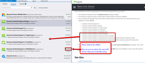
The native Android controls need a few Xamarin Android Support Libraries to operate properly. Go to the Required Android Support Libraries article to see the full list. You only install these to the Android project and they should be the same Android SDK version.
Now that Telerik UI for Xamarin’s references have been added, let’s move on to the Azure Mobile Service Client SDK.
Azure Mobile Service Client SDK
One of the main reasons we started with the download starter app is because the Microsoft Azure Mobile Client SDK NuGet package is already installed and has a TodoItemManager class that uses the SDK to interact with the back-end.
Open the class library project’s Constants.cs file and notice that the service URL will already be set in the ApplicationURL property, like this:
public static class Constants
{
    // Replace strings with your Azure Mobile App endpoint.
    public static string ApplicationURL = "https://YOUR_URL.azurewebsites.net";
}
Now it’s time to start wiring up the Xamarin.Forms class library project to be able to communicate with our new backend! The first thing we need to do is get our models defined.
Data Models
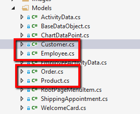
Notice the TodoItem.cs data model that comes with the project. Before deleting this, you can use it as a template for the four data model classes you need to interact with the back end:
These classes should have the same properties as the entity models in the server application, but with some extra properties that I define in a shared base class:
public class BaseDataObject : ObservableObject
{
    public BaseDataObject()
    {
        Id = Guid.NewGuid().ToString();
    }

    [JsonProperty(PropertyName = "id")]
    [Ignore]
    public string Id { get; set; }

    [JsonProperty(PropertyName = "createdAt")]
    [Ignore]
    public DateTimeOffset CreatedAt { get; set; }

    [UpdatedAt]
    [Ignore]
    public DateTimeOffset UpdatedAt { get; set; }

    [Version]
    [Ignore]
    public string AzureVersion { get; set; }
}
Service Classes
With the models defined, we now turn our attention to the TodoItemManager class. This is the workhorse that syncs data between Azure and the app, but also manages the offline database syncing if you enabled it.
For the Art Gallery CRM app, we need four “manager classes.” Instead of having multiple methods or complicated overloads, I created an interface that defines those CRUD operations:
public interface IDataStore<T>
{
    Task<bool> AddItemAsync(T item);

    Task<bool> UpdateItemAsync(T item);

    Task<bool> DeleteItemAsync(T item);

    Task<bool> PurgeAsync();

    Task<T> GetItemAsync(string id);

    Task<string> GetIdAsync(string name);

    Task<IReadOnlyList<T>> GetItemsAsync(bool forceRefresh = false);

    Task<bool> PullLatestAsync();

    Task<bool> SyncAsync();
}
We also need a way to share a single instance of the MobileServiceClient, otherwise we’d need to have separate instances of the client in each service class which would unnecessarily increase the app’s memory footprint.
One option we can use is to place the MobileServiceClient reference in the App class to make the same instance available to all the services.
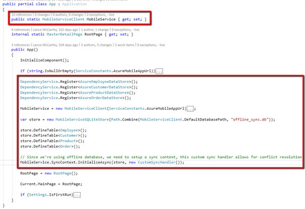
With the interface defined, and the MobileServiceClient reference available globally, we can start implementing a DataStore service class for each entity model.
As an example, here’s the Customer entity’s DataStore. In the constructor, we just set the reference for the CustomersTable and the interface-required methods can interact with that reference.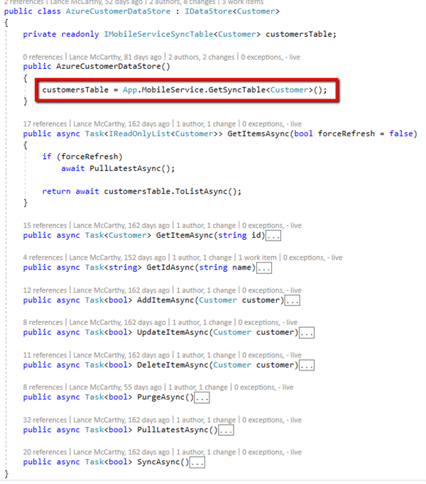
The example above shows how straightforward it is using the MobileServiceClient to interact with the backend service. The SDK will make the call to the controller and return the items as a strongly typed list of Customer items!
Views and ViewModels
With the data layer ready, we can now start working on the UI. The starter app has a single page with a ListView that was populated with a list of TodoItems using a code-behind approach. We’re going to need a more robust way to move around the app, as well as view and edit data.
We can either use a Tabbed style or a MasterDetail style page layout. I decided to go with MasterDetail as it makes more sense to have top-level pages in the MasterPage (the side pane) and the drill-down pages (details and edit) in the DetailPage.
The top-level pages I want are:
- Employees
- Customers
- Products
- Orders
- Shipping
- Help
- About
To keep this blog post from turning in to a book, I’ll use only the Employees table to demonstrate and implement concepts, views and view models.
I’ll also skip explaining general Xamarin.Forms concepts when there is already a good tutorial in the Xamairn documentation that I can provide a link for. The Master-Detail scenario is one example of such a concept. You can find the setup in this Xamarin.Forms Master-Details tutorial.
From this point on in the article, assume the Master-Detail infrastructure is in place and we’re adding pages to that setup. You can also reference the demo’s source code on GitHub to follow along.
I used a naming convention where the list, detail and edit view models use the same name as the pages. This makes it easy to follow the responsibility of the view models:
- EmployeesPage & EmployeesViewModel
- EmployeeDetailsPage & EmployeeDetailViewModel
- EmployeeEditPage & EmployeeEditViewModel
Let’s get started creating our UI!
EmployeesViewModel
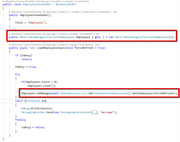
I sometimes like to start with the view model so that we can make sure we have the properties we need to populate the view. This is rather straightforward, a single ObservableCollection to hold the items and a Task to load the data into the collection:
Note: In many places throughout the app, I use an ObservableRangeCollection. This is the same as an ObservableCollection except that you can add many items but only cause one CollectionChanged notification which results in better databinding performance.
Let’s look at how the items are retrieved from Azure:
await DependencyService.Get<IDataStore<Employee>>().GetItemsAsync(forceRefresh);
This will call the method on the DataStore service class for the Employee entity. All the heavy lifting is neatly packed away either in the SDK itself or in the service class and keeps the view model very readable!
EmployeesPage
With the view model ready, we can move on to the UI and our first Telerik UI for Xamarin controls! I want not only to be able to list the employees, but also quickly filter them. We can do this with a combination of Telerik UI for Xamarin controls:
- RadAutoComplete to filter the Employees
- RadListView to display the filtered results
- RadBusyIindicator to show a busy overlay while data operations are occurring
Here’s the collapsed XAML to show the high-level layout:
RadListView and RadEntry
With the BindingContext of the page set to an instance of the EmployeesViewModel, we have an Employees property that will contain the list returned from the backend. We will use that as the ItemsSource of the RadListView:
<dataControls:RadListView ItemsSource="{Binding Employees}"
                          Style="{StaticResource BaseListViewStyle}"
                          Grid.Row="1">
Now we need to create an ItemTemplate for the RadListView to display the Employee properties we need, the name and the photo. The BindingContext of the ItemTemplate is the individual employee object in the FilteredItems collection. Therefore, we can bind a Label’s Text property to “Name” and bind an Image control’s Source property to “PhotoUri.”
Now we can move on to the filtering using RadEntry and its Text property:
<input:RadEntry x:Name="FilterEntry"
                  Text="{Binding SearchText, Mode=TwoWay}"
                  WatermarkText="Search"
                  Margin="20,10,10,0">
The Text is bound to the SearchText property from the EmployeesViewModel, where the filtering logic is implemented using the ApplyFilter method. This method executes custom filtering and then updates the Employees collection so that only filtered items are present and visualized in the RadListView:
public string SearchText
{
    get => _searchText;
    set
    {
        SetProperty(ref _searchText, value);
        this.ApplyFilter(value);
    }
}
RadBusyIndicator
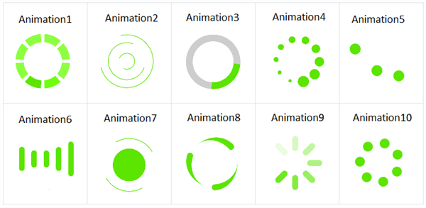
Now let’s look at the RadBusyIndicator. This control offers a nice set of custom animations out of the box, but you can also create your own custom animations if you need to. Since this app is for a professional audience, I went with Animation6. See the Animations documentation article for more details, here’s a list of the built-in animations.
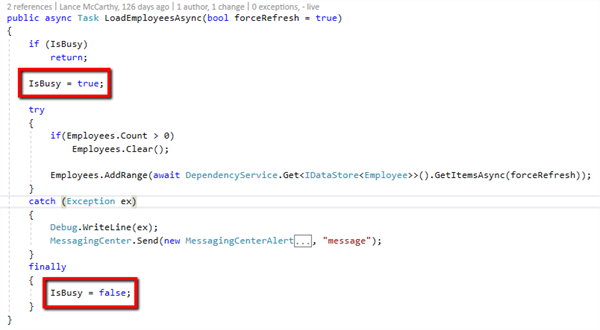
Therefore, we can bind IsBusy to the RadBusyIndicator’s IsVisible and IsBusy properties:

Note: You can use the BusyIndicator in one of two ways; as an overlay like I do in this demo or use the control’s Content property. In this scenario, we want to use the overlay option because the BusyIndicator’s Content is removed the visual tree when it’s busy, which is not something you want to do with data bound controls.
Finally, we want the user to be able to select an item in the RadListView and navigate to the EmployeeDetailsPage. We accomplish this by using a ListViewUserCommand for ItemTap.
<dataControls:RadListView ItemsSource="{Binding Employees}"

                          Style="{StaticResource BaseListViewStyle}"

                          Grid.Row="1">

            <dataControls:RadListView.Commands>

                <commands:ListViewUserCommand Id="ItemTap"

                                              Command="{Binding ItemTapCommand}" />

            </dataControls:RadListView.Commands>

<dataControls:RadListView>
The EmployeesViewModel's ItemTapped action is passed ItemTapCommandContext, which allows us to pass the selected employee to a new instance of EmployeeDetailPage.
private async void ItemTapped(ItemTapCommandContext context)

{

    if (context.Item is Employee employee)

    {

        await this.NavigateForwardAsync(new EmployeeDetailPage(new EmployeeDetailViewModel(employee)));

    }

}
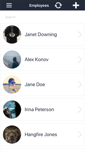
Here’s what the result looks like at runtime on iOS
EmployeeDetailViewModel
When the view model is constructed, we have the value of the employee passed in as a constructor parameter. With this, we set the SelectedEmployee right away:
public class EmployeeDetailViewModel : PageViewModelBase
{
    public EmployeeDetailViewModel(Employee item = null)
    {
        this.SelectedEmployee = item;
        ...
    }

    public Employee SelectedEmployee
    {
        get => this._selectedEmployee;
        set => SetProperty(ref this._selectedEmployee, value);
    }
    ...
}
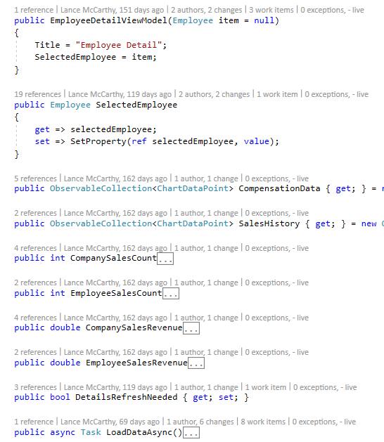
I also want to generate data about this employee to populate charts, gauges and other nice UI features. To support this, I’ve added collections to hold chart data points, and other data, along with a Task to load and calculate the data.
Let’s take a closer look at LoadDataAsync, this is where I do the calculations that result in the values used for the view’s chart and gauges.
There are two collections, one for compensation and one for sales revenue. The former we can calculate using the SelectedEmployee’s values:
var bonusPercentage = (double)rand.Next(10, 20) / 100;
var benefitsPercentage = (double)rand.Next(5, 15) / 100;
var baseSalaryPercentage = 1 - bonusPercentage - benefitsPercentage;

CompensationData.Add(new ChartDataPoint {Title = "Base Salary", Value = SelectedEmployee.Salary * baseSalaryPercentage});
CompensationData.Add(new ChartDataPoint {Title = "Benefits", Value = SelectedEmployee.Salary * benefitsPercentage});
CompensationData.Add(new ChartDataPoint {Title = "Bonus", Value = SelectedEmployee.Salary * bonusPercentage});
The SalesHistory collection is another story, we need to actually pull items from the Orders table and find matches for this Employee’s Id:
// Gets all company orders
var orders = await DependencyService.Get<IDataStore<Order>>().GetItemsAsync(true);

// Set company values
CompanySalesCount = orders.Count;
CompanySalesRevenue = Math.Floor(orders.Sum(o => o.TotalPrice));

// Get the orders associated with the employee
var employeeSales = orders.Where(o => o.EmployeeId == SelectedEmployee.Id).OrderBy(o => o.OrderDate).ToList();

// Set employee values
EmployeeSalesCount = employeeSales.Count;
EmployeeSalesRevenue = Math.Floor(employeeSales.Sum(o => o.TotalPrice));

// Create Sales History chart data
foreach (var order in employeeSales)
{
    SalesHistory.Add(new ChartDataPoint
    {
        Value = order.TotalPrice,
        Date = order.OrderDate
    });
}
The view model logic is done, now it’s time to start building the UI.
Employee Details Page
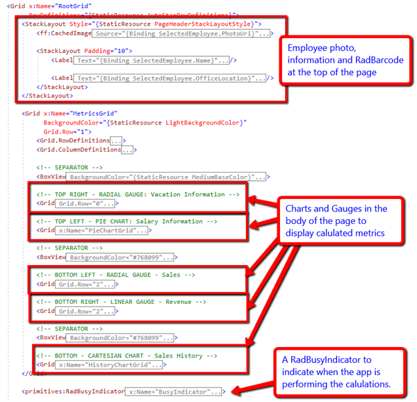
For the details page, I wanted a “hero” style header that has the employee’s photo and other details like name and office location, while in the body we can have the charts and gauges.
Here’s a high level look at this layout:
When the page’s OnAppearing method is called, the view model’s LoadDataAsync is called because we need to use asynchronous code. This makes the app much more responsive and snappy compared to if I did all the calculations from the page, the view model constructor, or use .Wait() on asynchronous methods. Note: You should avoid using Wait as much as possible!
Here’s the OnAppearing method:
protected override async void OnAppearing()
{
    base.OnAppearing();

    await vm.LoadDataAsync();

    SetupVacationGauge();
    SetupSalesGauge();
    SetupRevenueGauge();
    SetupChartLegend();
}
You’ll notice that I’m configuring some UI elements here as well. The chart series will automatically update when the bound ObservableCollections are populated, but for the gauges I want a little more fine-grained control.
Charts
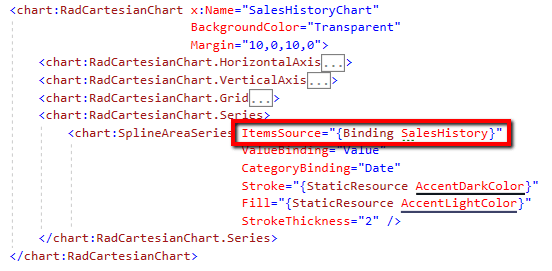
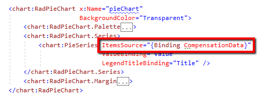
Let’s start with the SalesHistory and Compensation charts. These are straightforward. The series ItemsSources can be bound directly to the respective view model collections:
LineChart
Gauges
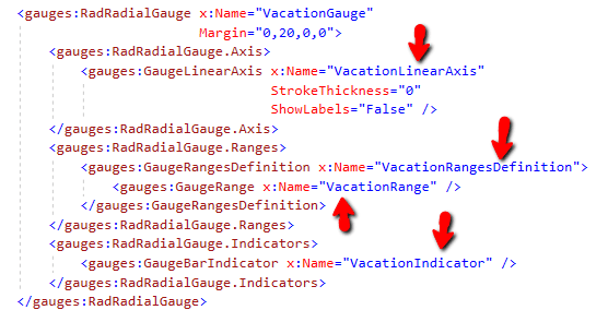
The Gauges are defined in the XAML, but are configured in the clearly named methods you seen in OnAppearing. Let’s look at the Vacation RadialGauge closer as an example of one of these setups.
Here’s the XAML, take note of the x:Names of the gauge components:
Here’s the configuration method:
private void SetupVacationGauge()
{
    // Vacation Radial Gauge
    VacationGauge.StartAngle = 90;
    VacationGauge.SweepAngle = 360;
    VacationGauge.AxisRadiusFactor = 1;

    VacationLinearAxis.Maximum = vm.SelectedEmployee.VacationBalance;
    VacationLinearAxis.StrokeThickness = 0;
    VacationLinearAxis.ShowLabels = false;

    VacationRangesDefinition.StartThickness = 10;
    VacationRangesDefinition.EndThickness = 10;

    VacationRange.To = vm.SelectedEmployee.VacationBalance;
    VacationRange.Color = (Color)Application.Current.Resources["GrayBackgroundColor"];

    VacationIndicator.Value = vm.SelectedEmployee.VacationUsed;
    VacationIndicator.Fill = (Color)Application.Current.Resources["AccentColor"];
    VacationIndicator.StartThickness = 10;
    VacationIndicator.EndThickness = 10;
    VacationIndicator.StartCap = GaugeBarIndicatorCap.ConcaveOval;
    VacationIndicator.EndCap = GaugeBarIndicatorCap.Oval;
}
The same pattern is used for the other gauges as well.
Deleting an Employee
Also on the details page, we provide a way for the user to delete the item. This is done using a Delete toolbar button Command event.
However, there are implications to deleting an employee because records in the Orders table may contain orders with this employee’s ID. I need to first check if they are associated with any open orders and warn the user that deleting the employee will also delete the orders.
Here is the command’s Action in the EmployeeDetailViewModel:
private async Task DeleteEmployeeAsync()

{

    if (this.SelectedEmployee == null)

    {

        return;

    }


    var result = await App.Current.MainPage.DisplayAlert("Delete?", "Do you really want to delete this item?", "Yes", "No");


    if (!result)

    {

        return;

    }


    try

    {

        this.IsBusy = true;


        // Do Referential Integrity Check

        var orders = await DependencyService.Get<IDataStore<Order>>().GetItemsAsync();

        var matchingOrders = orders.Where(o => o.EmployeeId == this.SelectedEmployee.Id).ToList();


        if (matchingOrders.Count > 0)

        {

            var deleteAll = await App.Current.MainPage.DisplayAlert("!!! WARNING !!!", $"There are orders in the database for {_vm?.SelectedEmployee.Name}. If you delete this employee, you'll also delete all of the associated orders.\r\n\nDo you wish to delete everything?", "Delete All", "Cancel");


            // Back out if user declines to delete associated orders

            if (!deleteAll)

                return;


            // Delete each associated Order

            foreach (var order in matchingOrders)

            {

                await DependencyService.Get<IDataStore<Order>>().DeleteItemAsync(order);

            }

        }


        // Lastly, delete the employee

        await DependencyService.Get<IDataStore<Employee>>().DeleteItemAsync(this.SelectedEmployee);

    }

    catch (Exception ex)

    {

        // display error to user

    }

    finally

    {

        this.IsBusy = false;

    }


    await this.NavigateBackAsync();

}
Note: There are other ways to handle this scenario. Deleting the related orders is a rather drastic measure. In a real-world app, you’re more likely to re-set the ID or use a nullable field for EmployeeID.
Editing an Employee
Now we’re ready for some editing! I could have built this so that the edit form is built into the details page. This is a common approach, however I wanted to also provide a way to add an employee with the same edit form.
I decided that a separate EmployeeEditPage would be better so I can keep the page code more readable and keep responsibilities separated.
The same EmployeeDetailsPage toolbar that has the delete button also has buttons for Edit and New Order. They can all share the same view model Command, but invoke different operations depending on a predefined command parameter.
<ContentPage.ToolbarItems>

    <ToolbarItem Text="order"

                 IconImageSource="add_order.png"

                 Command="{Binding ToolbarCommand}"

                 CommandParameter="order" />

    <ToolbarItem Text="edit"

                 IconImageSource="edit.png"

                 Command="{Binding ToolbarCommand}"

                 CommandParameter="edit" />

    <<ToolbarItem Text="delete"

                 Icon="delete.png"

                 Command="{Binding ToolbarCommand}"

                 CommandParameter="delete" />

</ContentPage.ToolbarItems>
Here's the view model command ToolbarItemTapped Action that will navigate to the EmployeeEditPage, the OrderEditPage or delete. We pass the SelectedEmployee to the constructor of both options.
private async void ToolbarItemTapped(object obj)

{

    if (this.SelectedEmployee == null)

    {

        return;

    }


    switch (obj.ToString())

    {

        case "order":

            await this.NavigateForwardAsync(new OrderEditPage(this.SelectedEmployee));

            break;

        case "edit":

            await this.NavigateForwardAsync(new EmployeeEditPage(this.SelectedEmployee));

            break;

        case "delete":

            await this.DeleteEmployeeAsync();

            break;

    }

}
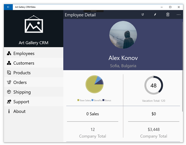
Here’s the EmployeeDetailPage at runtime on Windows 10:
EmployeeEditViewModel
This view model’s responsibility is simple:
- Determine if this is an existing employee or editing an existing employee
- Provide a mechanism to either insert a new or update an existing database record
To do this use, I the following items in the view model:
- SelectedEmployee property
- IsNewEmployee property
- UpdateDatabaseAsync method
Let’s look at a shortened version of the UpdateDatabaseAsync method, notice that depending on the value of IsNewEmployee, we choose to either update or insert SelectedEmployee:
public async Task UpdateDatabaseAsync()
{
    if (IsNewEmployee)
    {
        await DependencyService.Get<IDataStore<Employee>>().AddItemAsync(SelectedEmployee);
    }
    else
    {
        await DependencyService.Get<IDataStore<Employee>>().UpdateItemAsync(SelectedEmployee);
    }
}
Note: Some code omitted for clarity, see demo source for full method.
So, how do we make the determination as to whether this is a new or existing employee? This is done using the page’s constructor.
EmployeeEditPage
The Edit page’s XAML is very simple:
- An Image + Button to select a photo (instead of manually typing in a URL string into the DataForm).
- A RadDataForm to edit the fields
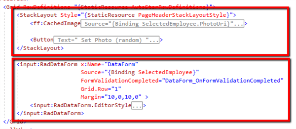
Here’s the high-level layout:
As you can see the DataForm’s Source is bound to the view model’s SelectedEmployee. The button’s click handler just assigns a random photo to the SelectedEmployee’s PhotoUri.
The extra interesting part of this page lies in the Employee model’s property attributes that tell the RadDataForm how to create its Editors and how the edit page determines if we’re editing or adding an employee.
Let’s start with the Employee model’s DataForm Annotations.
Data Annotations
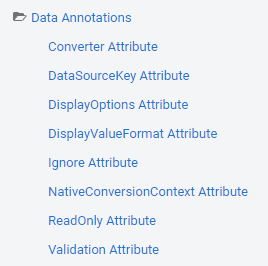
The RadDataForm Data Annotations are model property attributes, which are used to set a wide range of DataForm features. You can find a list of the attributes in the RadDataForm documentation under the “Data Annotations” sub folder.
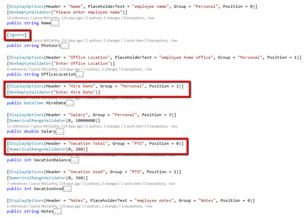
For the employee model, I need to exclude the PhotoUri property because I want the button to set that value instead of a user-entered string. To do this, I can leverage the Ignore attribute:
[Ignore]
public string PhotoUri
{
    get => photoUri;
    set => SetProperty(ref photoUri, value);
}
The Data Annotations let you set the editor display and validation options as well. On the Employee model, I also use the DisplayOptions, NonEmptyValidator and NumericalRangeValidator attributes on the Employee properties:
Page Constructor and Configuring Editors
As I mentioned at the beginning of this section, the page needs to decide if we’re editing an employee or creating a new one. This is simply achieved by using two constructors.
If the overloaded constructor is used, that means we passed an existing employee object to edit. If the normal constructor was used, then we’re creating a new employee:
// If we're adding a new employee
public EmployeeEditPage()
{
    InitializeComponent();
    ViewModel.IsNewEmployee = true;
    ViewModel.SelectedEmployee = new Employee();

    ConfigureEditors();
}

// If we're editing an existing employee
public EmployeeEditPage(Employee employee)
{
    InitializeComponent();
    ViewModel.SelectedEmployee = employee;

    ConfigureEditors();
}
In the ConfigureEditors method, we set the EditorType for each property. This tells the DataForm to use a specific Editor type, see the full list in the DataForm Editors documentation.
private void ConfigureEditors()
{
    DataForm.RegisterEditor(nameof(Employee.Name), EditorType.TextEditor);
    DataForm.RegisterEditor(nameof(Employee.OfficeLocation), EditorType.TextEditor);
    DataForm.RegisterEditor(nameof(Employee.HireDate), EditorType.DateEditor);
    DataForm.RegisterEditor(nameof(Employee.Salary), EditorType.DecimalEditor);
    DataForm.RegisterEditor(nameof(Employee.VacationBalance), EditorType.IntegerEditor);
    DataForm.RegisterEditor(nameof(Employee.VacationUsed), EditorType.IntegerEditor);
    DataForm.RegisterEditor(nameof(Employee.Notes), EditorType.TextEditor);
}
We're almost done, the last remaining thing to cover is how the DataForm saves the data in its editors.
Saving
The DataForm has validation considerations, so the values in the editors are not immediately committed to the bound Source. Instead, you call DataForm.CommitAll and validation is performed against the values, (according to the Data Annotations you've set).
The DataForm has a FormValidationCompleted event that will fire when values are committed to the form. This means we can use an EventToCommandBehvaior to hook up the event to a view model command.
<input:RadDataForm x:Name="DataForm"

                   Source="{Binding SelectedEmployee}"

                   Grid.Row="1"

                   Margin="10,0,10,0">

    <input:RadDataForm.Behaviors>

        <behaviors:EventToCommandBehavior EventName="FormValidationCompleted"

                                          Command="{Binding FormValidationCompleteCommand}" />

    </input:RadDataForm.Behaviors>

</input:RadDataForm>
In the command, we use the event args to hold a flag on whether or not the SelectedEmployee's changed can be saved.
private void FormValidationCompleted(object obj)

{

    if (obj is FormValidationCompletedEventArgs e)

    {

        this._isReadyToSave = e.IsValid;

    }

}
Just like the EmployeeDetailsPage, the EmployeeEditPage has a toolbar button that invokes a command. In the command's Action, we can save it and automatically navigate back to the details page when it is done.
private async void ToolbarItemTapped(object obj)

{

    switch (obj.ToString())

    {

        case "save":

            // Commit the Editor's values for validation

            this.DataFormView.CommitChanges();


            // If values pass validation

            if (this._isReadyToSave)

            {

                // Save the record

                if (await this.UpdateDatabaseAsync())

                {

                    await this.NavigateBackAsync();

                }

            }

            break;

    }

}
Wrapping Up
That concludes our deep dive in to the ListPage -> DetailsPage ->EditPage approach! The Art Gallery CRM app uses this pattern for all four of the entity models.
Now that you’ve got a handle on the pattern, take a look at the following special scenarios for some other ideas of what you could do:
- RadDataGrid to easily group, sort and filter open Orders on the OrdersPage
- RadSlideView for a great “out of the box experience” on the WelcomePage
- RadListView with GridLayout to show beautiful product images on the ProductsPage
- RadCalendar to show collated shipping dates on the CalendarPage
- RadNumericInput and RadMaskedInput on the advanced OrderEditPage
In part three of this series, I’ll show how to create and hook up an Azure Bot Service leveraging a custom trained Natural Language Understanding (LUIS) with the RadConversationalUI control to create an in-app Support Bot experience.
Read Next
⬅ Part One of the series where we built the backend
➡ Part Three of the series where we train a LUIS AI model using Telerik UI for Xamarin's Conversational UI

Lance McCarthy
Lance McCarthy is a Senior Manager Technical Support for DevTools & Sitefinity, responsible for the Americas with additional responsibilities in product security and AI tooling. He's also a multiple-awarded Microsoft MVP (.NET & Windows Dev) who enjoys working with the developer community, sharing knowledge, presenting at events, and loves hackathons.
Lance still provides technical support for DevTools customers, answering cases focusing on security, .NET (desktop, mobile, web components), and CI/CD. Say hi the next time he answers one of your support tickets!

