Build a Cross-Platform Crypto App With Telerik UI for .NET MAUI—Part 2

Summarize with AI:
We’ll get into the page navigation of our real use-case sample crypto application that tracks the cryptocurrency market build with Telerik .NET MAUI controls like DataGrid, Chart, ListView and more.
Hello everyone. 🙋♂️ I hope you liked the first part of the Crypto Tracker blog post where we created three pages—CoinSelection, CoinInfo and Desktop page—that contain one or two views—CoinSelectionView and/or CoinInfoView. Furthermore, we added preprocessor directives to our app so that it can have two separate pages on mobile and a single page on desktop. And finally, we added a ListView that contains different cryptocurrencies to our CoinSelectionView.
And as I promised, in the second part we will review the Navigation between the pages. ✔ Let’s get into it!
When tapping on a certain coin, we want a navigation from CoinSelectionPage to the CoinInfoPage. To achieve this, we’ll use the convenience of the ListView ItemTapped event handler:
<telerikDataControls:RadListView ItemTapped="OnListViewItemTapped"SelectionMode="None"
x:Name="listView"
ItemsSource="{Binding Source}">
<telerikDataControls:RadListView.BindingContext>
<local:CoinsViewModel/>
</telerikDataControls:RadListView.BindingContext>
</telerikDataControls:RadListView>We want the ListView ItemTapped to invoke a new event handler that can be set from the XAML of the entire CoinSelection ContentView. Why do we do this? Because we want our mobile pages to navigate from one to another, and on desktop, we want our data to update dynamically—therefore, we require different event handlers. Take a look at the code behind file CoinSelectionView.xaml.cs:
public partial class CoinSelectionView : ContentView{public CoinSelectionView()
{
this.InitializeComponent();
}
public event EventHandler<CoinSelectionEventArgs> CoinSelected;
private void OnListViewItemTapped(object sender, ItemTapEventArgs e)
{
this.CoinSelected?.Invoke(this, new CoinSelectionEventArgs((CoinData)e.Item));
}
}Every time we tap on an item, it will invoke the CoinSelected event handler which will contain the custom CoinSelectedEventArgs we defined in Part 1. Now we make the initial page CoinSelectionPage the Navigation page and set the CoinSelected event handler to a function that switches from the first page to the second one.
This is the new CoinSelectionPage.xaml:
<ContentPage xmlns="http://schemas.microsoft.com/dotnet/2021/maui"xmlns:view="clr-namespace:CryptoTracker.Views"
x:Class="CryptoTracker.Pages.CoinSelectionPage"
Title="Crypto Tracker"
x:Name="mainPage">
<view:CoinSelectionView CoinSelected="OnCoinSelected"/>
</ContentPage>And this is the CoinSelectionPage.xaml.cs:
public partial class CoinSelectionPage : ContentPage{public CoinSelectionPage()
{
this.InitializeComponent();
}
private void OnCoinSelected(object sender, CoinSelectionEventArgs e)
{
var coinInfo = e.SelectedCoin;
var destination = new CoinInfoPage()
{
Title = $"{coinInfo.Name} {coinInfo.Symbol}",
};
destination.InitializeCoinData(coinInfo);
this.Navigation.PushAsync(destination, true);
}
}Now let’s fill up the list with CoinData items to test out our navigation. We used the data files provided by kaggle.com. They are comma separated values, thus they are easy to work with and they have data from at least a year.
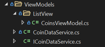
First off, add a folder Coins containing the files from the Kaggle link. The files’ build action property must be set to Embedded Resource:
.png?sfvrsn=d7905506_0)
We use StreamReaders to read the data from csv files. We have implemented a CoinDataService class that inherits an ICoinDataService interface:

The interface contains three methods:
CoinData GetCurrentCoin(string coinPath);The GetCurrentCoin returns the last known price, date, etc. of a specific coin by reading the last line of a specific file.
IEnumerable<CoinData> GetAllCurrentCoins();The GetAllCurrentCoins method is for the data fill up in our ListView. It will read only the last line of each csv file to fill our ListView source.
IEnumerable<CoinData> GetCoinDataFromDateToDate(string coinName, DateTime fromDate, DateTime toDate);The GetCoinDataFromDateToDate method should read a single csv file containing the data of our selected coin. This is a method we will use after we have tapped on a ListView item.
In the CoinDataService.cs, we use reflection to get the files on any device by any user:
public class CoinDataService : ICoinDataService{
private readonly string[] coinFilePaths;
public CoinDataService()
{
var assembly = typeof(CoinDataService).Assembly;
this.coinFilePaths = assembly
.GetManifestResourceNames()
.Where(x => x.StartsWith("CryptoTracker.Data.Coins"))
.ToArray();
}
public IList<CoinData> GetAllCurrentCoins() { }
public IList<CoinData> GetCoinDataFromDateToDate(string coinName, DateTime start, DateTime end) { }
public CoinData GetCurrentCoin(string coinPath) { }
}
Now off to the CoinInfoView. We’ll be using three controls:
- A segmented control, which will be used to select a time period (1 day, 1 week, etc.)
- A chart that will visualize the data
- A data grid to give us per day coin data with closing and opening price
These three controls will be put in a Grid layout:
<GridLayout RowDefinitions="50, *, Auto" >.............................
</GridLayout>The Segmented control:
<telerikInput:RadSegmentedControl x:Name="timePeriodsSegmentedControl"ItemsSource="{Binding TimePeriods}"
SelectedIndex="{Binding SelectedTimePeriod, Mode=TwoWay}"
SelectionChanged="ChangedTimePeriod"
Style="{StaticResource SegmentedControlStyle}" />
The Chart:
<telerikChart:RadCartesianChart GridLayout.Row="1"HandlerChanged="RadCartesianChart_HandlerChanged">
<telerikChart:RadCartesianChart.HorizontalAxis>
<telerikChart:DateTimeContinuousAxis
LabelTextColor="Black"
LabelFitMode="Rotate"
LabelFormat="{Binding ChartLabelFormat}"
MajorStep="{Binding ChartMajorStep}"
MajorStepUnit="{Binding ChartMajorStepUnit}">
</telerikChart:DateTimeContinuousAxis>
</telerikChart:RadCartesianChart.HorizontalAxis>
<telerikChart:RadCartesianChart.VerticalAxis>
<telerikChart:NumericalAxis LabelTextColor="Black">
<telerikChart:NumericalAxis.LabelFormatter>
<formatters:ShortPriceFormatter/>
</telerikChart:NumericalAxis.LabelFormatter>
</telerikChart:NumericalAxis>
</telerikChart:RadCartesianChart.VerticalAxis>
<telerikChart:RadCartesianChart.Series>
<telerikChart:LineSeries
StrokeThickness="2.5"
CategoryBinding="Date"
ValueBinding="ClosingPrice"
ItemsSource="{Binding DataForChart}">
</telerikChart:LineSeries>
</telerikChart:RadCartesianChart.Series>
<telerikChart:RadCartesianChart.ChartBehaviors>
<telerikChart:ChartTrackBallBehavior
ShowIntersectionPoints="True"
ShowTrackInfo="True" />
</telerikChart:RadCartesianChart.ChartBehaviors>
</telerikChart:RadCartesianChart>The DataGrid:
<telerikDataGrid:RadDataGrid GridLayout.Row="2"AutoGenerateColumns="False"
IsVisible="{Binding IsDataGridVisible, Mode=OneWay}"
ItemsSource="{Binding DataForDataGrid}"
GridLinesThickness="1"
GridLinesVisibility="Horizontal"
GridLinesColor="{StaticResource DataGridLineColor}"
HeightRequest="150">
<telerikDataGrid:RadDataGrid.Columns>
<telerikDataGrid:DataGridDateColumn HeaderStyle="{StaticResource dataGridHeaderStyle}" CellContentStyle="{StaticResource dataGridColumnStyle}" CellContentFormat="{}{0:MMM d, yyyy}" PropertyName="Date" HeaderText="Date"/>
<telerikDataGrid:DataGridNumericalColumn HeaderStyle="{StaticResource dataGridHeaderStyle}" CellContentStyle="{StaticResource dataGridColumnStyle}" CellContentFormat="{}${0:N2}" PropertyName="OpeningPrice" HeaderText="Open"/>
<telerikDataGrid:DataGridNumericalColumn HeaderStyle="{StaticResource dataGridHeaderStyle}" CellContentStyle="{StaticResource dataGridColumnStyle}" CellContentFormat="{}${0:N2}" PropertyName="Price24High" HeaderText="High"/>
<telerikDataGrid:DataGridNumericalColumn HeaderStyle="{StaticResource dataGridHeaderStyle}" CellContentStyle="{StaticResource dataGridColumnStyle}" CellContentFormat="{}${0:N2}" PropertyName="Price24Low" HeaderText="Low"/>
</telerikDataGrid:RadDataGrid.Columns>
</telerikDataGrid:RadDataGrid>All three of these controls require a bunch of bindings which we’ll define in a CoinInfoViewModel.cs file. Instead of using the INotifyPropertyChanged Interface, we’ll be using our own interface—NotifyPropertyChangedBase. It inherits from INotifyPropertyChanged interface, and we use UpdateValue() to update the property and call the NotifyPropertyChanged() at the same time. So basically, after we have created the ViewModel, we’ll inherit the NotifyPropertyChangedBase class and define three ObservableCollections like so:
public class CoinInfoViewModel : NotifyPropertyChangedBase {private ObservableCollection<CoinData> dataForChart;
private ObservableCollection<CoinData> dataForDataGrid;
private ObservableCollection<string> timePeriods;
public CoinInfoViewModel()
{
this.DataForChart = new ObservableCollection<CoinData>();
this.DataForDataGrid = new ObservableCollection<CoinData>();
this.TimePeriods = new ObservableCollection<string>() { "1D", "1W", "1M", "6M", "1Y"};
}
public ObservableCollection<CoinData> DataForChart
{
get => this.dataForChart;
set => UpdateValue(ref this.dataForChart, value);
}
public ObservableCollection<CoinData> DataForDataGrid
{
get => this.dataForDataGrid;
set => UpdateValue(ref this.dataForDataGrid, value);
}
}Okay, we’ve defined our data sources. Now we need to fill them up. We’ll do that with LoadCoinData(). We’ll use the DependencyService we defined earlier. In it, we defined a GetCoinDataFromDateToDate():
private void LoadCoinData(){
var coinService = DependencyService.Get<ICoinDataService>(); var coinData = coinService.GetCoinDataFromDateToDate(this.CoinName, this.FromDate, this.EndDate);
this.DataForChart = new ObservableCollection<CoinData>(coinData);
this.DataForDataGrid = new ObservableCollection<CoinData>(coinData);
}
As you can see, we’ll be needing three additional properties:
public string CoinName {
get => this.coinName;
set => this.UpdateValue(ref this.coinName, value);
}
public DateTime FromDate{
get => this.fromDate;
set => this.UpdateValue(ref this.fromDate, value);
}
public DateTime ToDate {
get => this.toDate;
set => this.UpdateValue(ref this.toDate, value);
}
You’re probably asking yourself how we will use those properties if we don’t know their values. Well, we do know them. At the beginning we defined a CoinSelectionEventArgs, which contains our SelectedCoin. On mobile, if we’re on the CoinInfoPage, then we’ve tapped on a coin, thus selecting it. What we can do is define a function InitializeCoinData(CoinData coinInfo) both in the CoinInfoView.xaml.cs and in the CoinInfoViewModel.cs like so:
CoinInfoPage.xaml.cs:
public CoinInfoPage() {
InitializeComponent();
}
public void InitializeCoinData(CoinData coinInfo)
{
var viewModel = (CoinInfoViewModel)this.coinInfoView.BindingContext;
viewModel.InitializeCoinData(coinInfo);
}
CoinInfoView.xaml.cs:
public CoinInfoView() {
InitializeComponent();
}
public void InitializeCoinData(CoinData coinInfo)
{
var viewModel = (CoinInfoViewModel)this.BindingContext;
viewModel.InitializeCoinData(coinInfo);
}
Now we can call the function in our previously defined OnCoinSelected function in our CoinSelectionPage.xaml.cs:
public CoinSelectionPage(){
this.InitializeComponent();
}
private void OnCoinSelected(object sender, CoinSelectionEventArgs e)
{
var coinInfo = e.SelectedCoin;
var destination = new CoinInfoPage()
{
Title = $"{coinInfo.Name} {coinInfo.Symbol}",
};
destination.InitializeCoinData(coinInfo);
this.Navigation.PushAsync(destination, true);
}
At the moment, we’re just redirecting to the ViewModel, therefore we need to define it in our CoinInfoViewModel.cs but this time we’ll actually use the provided data.
CoinInfoViewModel.cs:
public void InitializeCoinData(CoinData currentCoinInfo){
this.CoinName = currentCoinInfo.Name;
this.CoinCurrentPrice = currentCoinInfo.ClosingPrice;
this.ToDate = currentCoinInfo.Date;
this.SelectedTimePeriod = 0; // so that UpdateValue gets called when we change from 2 to 2 (that happens when we select a new coin from the ListView)
this.SelectedTimePeriod = 2;
}
The only thing left to do in our ViewModel is to add logic for when we select a time period in our SegmentedControl. You’ll notice that we’ve added a SelectedTimePeriod property. This is the property that we’ll be binding to the SelectedIndex property of the RadSegmentedControl. Every time we select a different index in the RadSegmentedControl, we’ll be calling a OnDatePeriodSelection() function.
SelectedTimePeriod property:
public int SelectedTimePeriod{
get => this.selectedTimePeriod;
set
{
if (this.UpdateValue(ref this.selectedTimePeriod, value))
{
this.OnDatePeriodSelection();
}
}
}
OnDatePeriodSelection function:
private void OnDatePeriodSelection(){
var timePeriod = this.TimePeriods[this.SelectedTimePeriod];
if (this.ToDate.Year < 2000) return;
this.ChartMajorStep = 1;
switch (timePeriod)
{
case "1D":
this.FromDate = this.ToDate.AddDays(-1);
this.ChartMajorStepUnit = TimeInterval.Hour;
this.ChartLabelFormat = "h tt";
this.ChartMajorStep = 4;
break;
case "1W":
this.FromDate = this.ToDate.AddDays(-7);
this.ChartMajorStepUnit = TimeInterval.Day;
this.ChartLabelFormat = "ddd";
break;
case "1M":
this.FromDate = this.ToDate.AddMonths(-1);
this.ChartMajorStepUnit = TimeInterval.Week;
this.ChartLabelFormat = "MMM, dd";
break;
case "6M":
this.FromDate = this.ToDate.AddMonths(-6);
this.ChartMajorStepUnit = TimeInterval.Month;
this.ChartLabelFormat = "MMM";
break;
case "1Y":
this.FromDate = this.ToDate.AddYears(-1);
this.ChartMajorStepUnit = TimeInterval.Month;
break;
}
this.LoadCoinData();
}
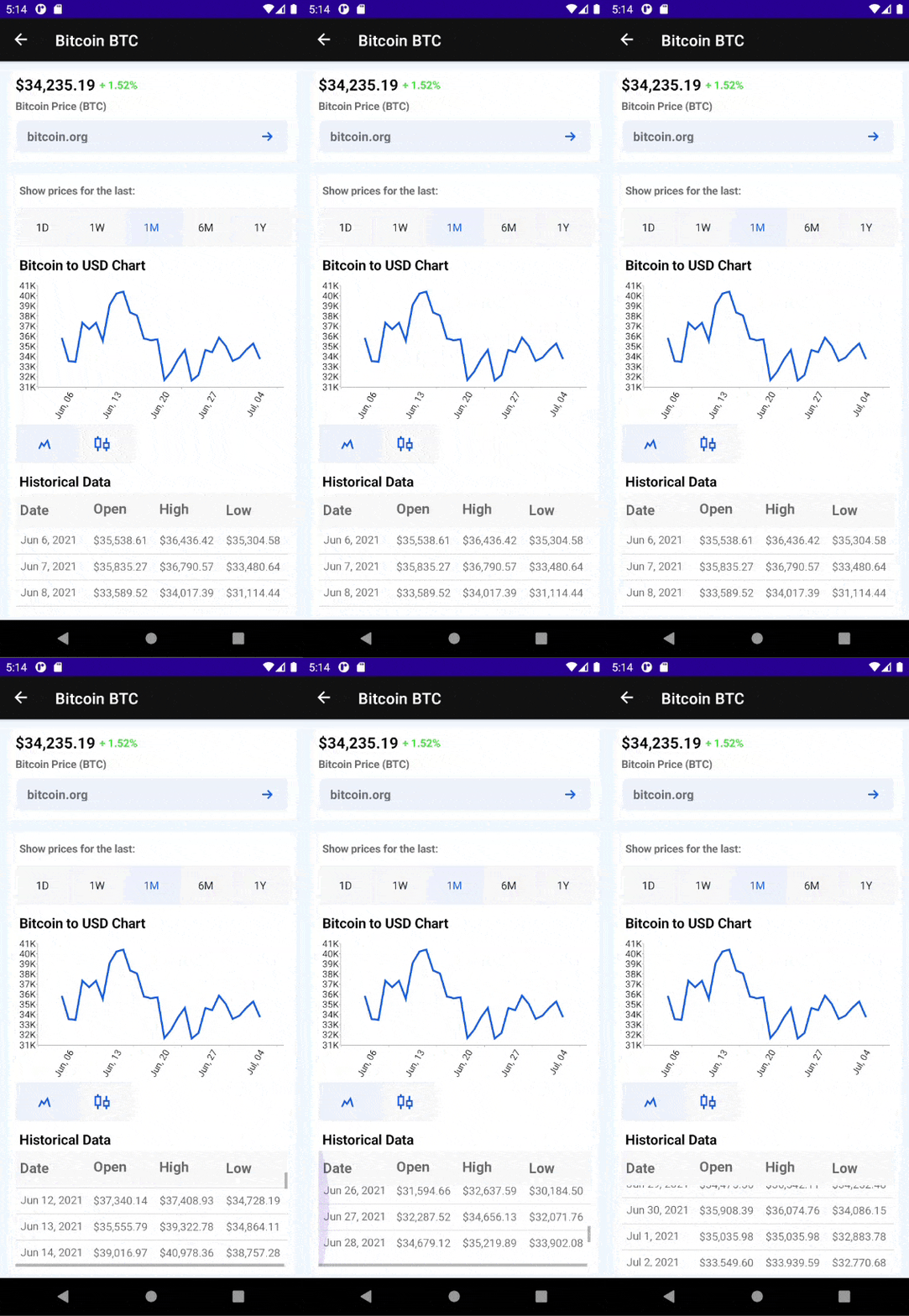
This is how the CoinInfoPage should look:

There are a few more Labels to display info, and I’ve used our RadBorder for a more appealing background. You can check out the styles used in the App.xaml file, in the Converters folder and in the Formatters folder.
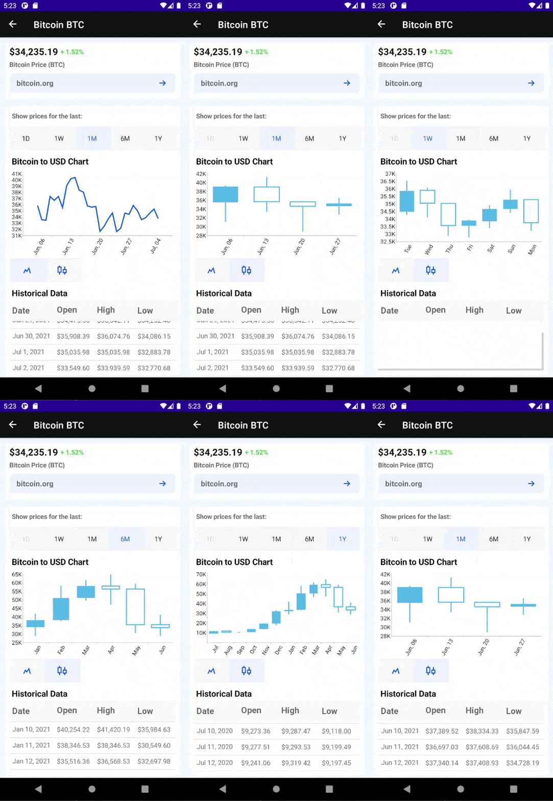
You can easily display the data in the chart using two types of chart series—LineSeries and Financial series (CandleStickSeries). What you need to do is just switch between the two segment buttons:

For a better visualization of the data in the chart, the method Get24HourCoinInfo separates the 1day information in 24h format.
❗ I couldn’t summarize all of the information I wanted to share with you in two blog posts, so I have great news—there will be a third part, which is coming shortly.
In the third part, I will show you the Crypto Tracker app in a different light—with a brand-new design and new controls included in the app. So stay tuned! 😎
Let Us Know What You Think
If you like the Crypto Tracker Demo app, I encourage you to share your feedback in the public GitHub repo or in the Telerik UI for .NET MAUI Forum.

Deyan Terziyski
Deyan Terziyski was an intern on the .NET MAUI team.

