Build an Animated Login Form in Angular Using Kendo UI

Summarize with AI:
In this post, we'll build an animated login page for an Angular application using Kendo UI components. We’ll learn how to use TextBox from the Input components, which provides a floating label, and also add a zoom effect from Kendo UI for jQuery.
Nowadays, creating an eye-catching product is one of the most common traits of web applications. This can either be geared toward creating better conversions or attracting users to buy, click and view things on a website. Animations help achieve all these goals and more.
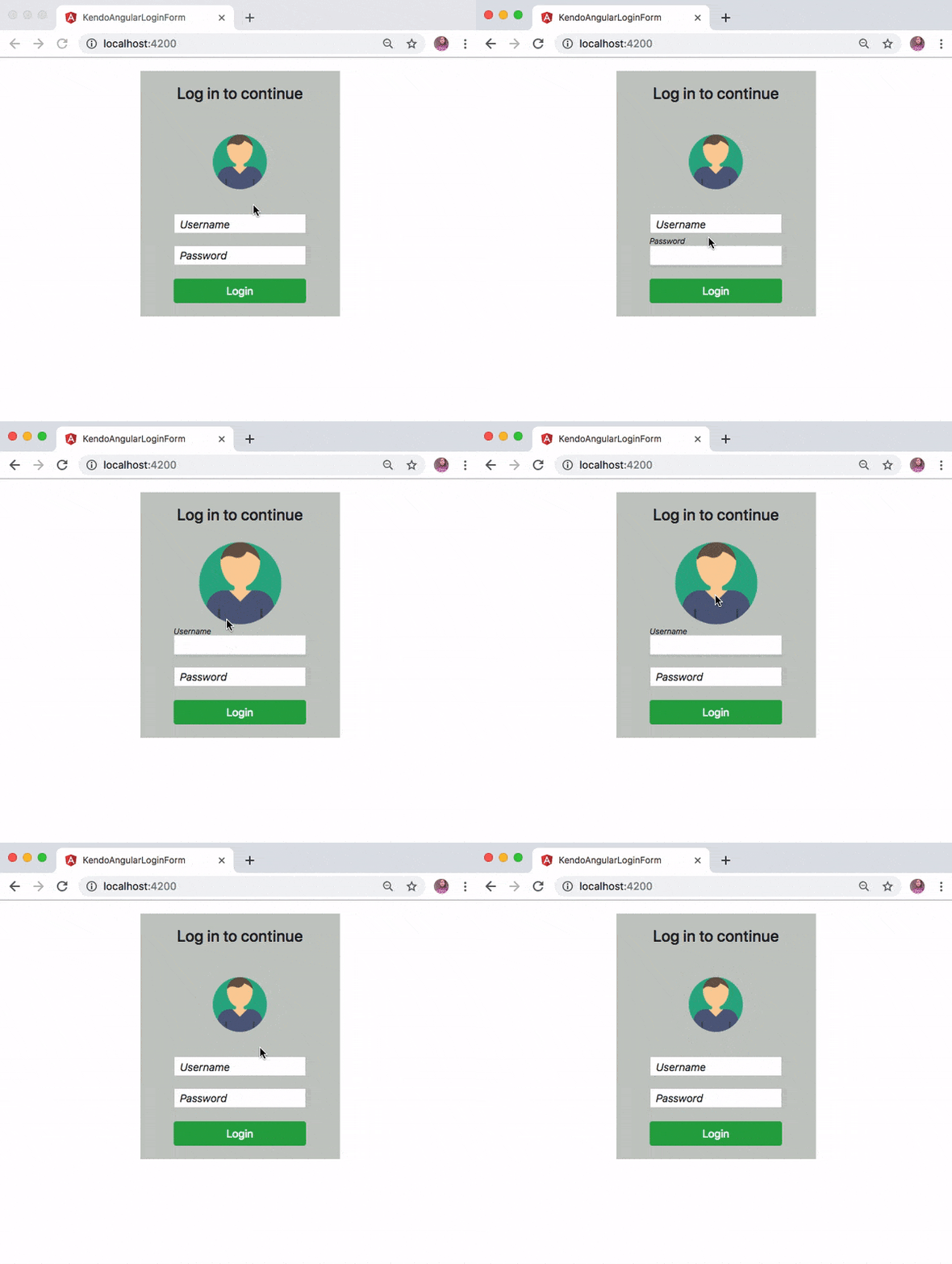
In this post we will further explore the Kendo UI components for Angular and build an animated login page. We’ll use the Input components from Kendo UI for Angular and combine them with a user interface interactivity component from Kendo UI for jQuery to achieve the page shown below:
Getting Started
Before we start building the login page, you first need to download and install Angular CLI globally on your machine. This will help you craft a new Angular application without much hassle. Run the command below for that purpose:
npm install -g @angular/cli
Create Angular Application
Now that you have Angular CLI installed, let’s proceed to create a new Angular application for this demo. Run the following command in the terminal from one of your projects folder:
ng new kendo-login-form
The preceding command will create a new Angular application in a folder named kendo-login-form. You can move into the newly created project with the command below and start the application:
// change directory
cd kendo-login-form

// Start the application
ng serve
You may experience an error with the message below in your console:
ERROR in node_modules/rxjs/internal/types.d.ts(81,44): error TS1005: ';' expected.
node_modules/rxjs/internal/types.d.ts(81,74): error TS1005: ';' expected.
node_modules/rxjs/internal/types.d.ts(81,77): error TS1109: Expression expected.
This is a known issue on GitHub and it’s due to lack of compatibility between the current version of TypeScript on your machine and rxjs. The quick way to fix this is to delete the node_modules folder. Now, open the package.json file and within the dependencies object, edit the rxjs by removing ^ :
  "dependencies": {
    ...
    "rxjs": "6.0.0", // remove the `^`
    "zone.js": "^0.8.26"
  },
Save the file and run npm install command again. Once the installation process is complete, you can proceed to start the application with ng serve.
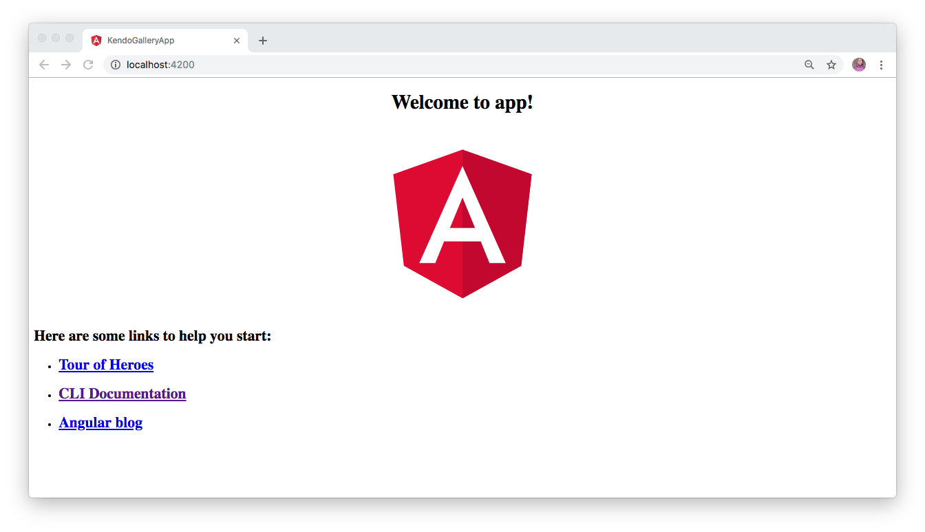
This will compile your application and start the development server. To view the default page of this Angular application, navigate to http://localhost:4200 from your favorite browser and you will see this:
Install Angular Input Component
Angular CLI supports the addition of packages through the ng add command. So we’ll use it to add Kendo UI Angular Input components. Use this command for that:
ng add @progress/kendo-angular-inputs
Kendo UI Input components can generally be used to render HTML input fields that allow users to input data easily for any Angular application. Some of these input fields include TextBox, TextArea, NumericTextBox, Slider and so on.
After installing the kendo-angular-inputs package, we can now make use of the InputsModule that has been automatically imported into our application as shown here in ./src/app.module.ts file:
// ./src/app/app.module.ts

...
import { InputsModule } from '@progress/kendo-angular-inputs';
import { BrowserAnimationsModule } from '@angular/platform-browser/animations';


@NgModule({
..
  imports: [
    BrowserModule,
    InputsModule,
    BrowserAnimationsModule
  ],
 ...
})
export class AppModule { }
Kendo UI Angular Input Component in Action
To render the Input component within the view, all that is needed is to include the <input KendoTextBox /> on our page. Furthermore, we will wrap the <input /> elements with a TextBoxContainer component in order to give the input element a floating label. Replace the content of ./src/app/app.component.html file with the following:
// ./src/app/app.component.html

<div class="container-fluid" id="authentication-wrapper">
  <div id="welcome-message">
    <h4>Log in to continue </h4>
  </div>
  <div id="wrap">
    <img src="https://bit.ly/2udBml1" alt="profile picture">
  </div>
  <div class="row">
    <div class="col-xs-12 col-sm-12 col-md-12">
      <kendo-textbox-container floatingLabel="Username">
        <input kendoTextBox type="email" />
      </kendo-textbox-container>
    </div>
    <div class="col-xs-12 col-sm-12 col-md-12">
      <kendo-textbox-container floatingLabel="Password">
        <input kendoTextBox type="password" />
      </kendo-textbox-container>
    </div>
    <div class="col-xs-12 col-sm-12 col-md-12">
      <button class="submit-btn btn btn-success"> Login </button>
    </div>
  </div>
</div>
Here, we have added the Input components and wrapped them with a textbox component and also defined a floatingLabel for each.
Add the Zoom Effect
In order to complete the animated login page here, we’ll also include a zoom effect by adding the following CDN files for jQuery and Kendo UI within the ./src/index.html file. Replace the content of the index.html file with this:
<!-- ./src/index.html -->

<!doctype html>
<html lang="en">
<head>
  <meta charset="utf-8">
  <title>KendoAngularLoginForm</title>
  <base href="/">
  <meta name="viewport" content="width=device-width, initial-scale=1">
  <link rel="icon" type="image/x-icon" href="favicon.ico">
  <link rel="stylesheet" href="https://kendo.cdn.telerik.com/2019.1.220/styles/kendo.common.min.css" />
  <link rel="stylesheet" href="https://kendo.cdn.telerik.com/2019.1.220/styles/kendo.default.min.css">
  <link rel="stylesheet" href="https://kendo.cdn.telerik.com/2019.1.220/styles/kendo.default.mobile.min.css">
  <link rel="stylesheet" href="https://stackpath.bootstrapcdn.com/bootstrap/4.3.1/css/bootstrap.min.css">
</head>
<body>
  <app-root></app-root>

  <script src="https://kendo.cdn.telerik.com/2019.1.220/js/jquery.min.js"></script>
  <script src="https://kendo.cdn.telerik.com/2019.1.220/js/kendo.all.min.js"></script>
</body>
</html>
Update the App Component
Replace the content of the app component by adding the following code:
// ./src/app/app.component.ts

import { Component, OnInit } from '@angular/core';
declare var $: any;
declare var kendo: any;
@Component({
  selector: 'app-root',
  templateUrl: './app.component.html',
  styleUrls: ['./app.component.css']
})
export class AppComponent implements OnInit {
  constructor() { }
  ngOnInit() {
    $(document).ready(function () {
      $("#wrap img").hover(function () {
        kendo.fx(this).zoom("in").startValue(1).endValue(1.5).play();
      }, function () {
        kendo.fx(this).zoom("out").endValue(1).startValue(1.5).play();
      });
    })
  }
}
Once the application loads, we added a zoom effect to the user image on the login form on hover.
Lastly add the following styles to the application’s stylesheet as shown here:
// ./src/app/app.component.css

#authentication-wrapper {
  width: 300px;
  text-align: center;
  background: #c6cac6;
}
#wrap {
  margin-bottom: 20px;
}
#wrap img {
  width: 82px;
  bottom: 65px;
}
#welcome-message {
  margin: 20px;
  padding: 20px;
}
.submit-btn {
  width: 74%;
  margin: 20px 0;
}
Test the Application
Now proceed to start the application again by running ng serve from the terminal within the application’s directory. Once the application is built and served on http://localhost:4200 you will see this:
Conclusion
In this post, we used Kendo UI components to include input fields for our Angular application. We also learned how to leverage Kendo UI to add some sort of animations to a login form.
Hopefully you have learned from this post and will give Kendo UI components a try for your Angular web applications. Don’t hesitate to read the official documentation to get a feel of other awesome features offered by Kendo UI.

Christian Nwamba
Chris Nwamba is a Senior Developer Advocate at AWS focusing on AWS Amplify. He is also a teacher with years of experience building products and communities.
