5 Mobile App Design Trends You Should Know for 2020

Summarize with AI:
You’re here because you want to know what’s going to be new in mobile app design in 2020. The fact of the matter is, most of what we do is going to be the same from years past. Rather than discuss the trends you already know, we’re going to look at the ones that will help your mobile app effectively compete with the rise of PWAs. And if you can’t compete or beat PWAs, these trends will help you join them.
I’m not sure where 2019 went, but here we are, talking about mobile app design trends for another year. Here’s the thing though:
I usually don’t like reading design trend predictions or recaps.
It’s because they tend to say the same things from year to year.
- “AR and VR will be everywhere!”
- “Bold colors and gradients are a must!”
- “Use animations to boost conversion rates!”
To me, it’s not really helpful rehashing the same things over and over again about color palettes, typography and tech. You’re reading these roundups so you can get some insight about what’s going to change in the coming year. So, today, here’s what I want to focus on:
Progressive web apps have been making huge waves on mobile for the last couple of years. As such, we need to think about what this is going to do to the state of native apps because, in all honesty, I think PWAs are going to force app developers to step up their game.
We’re going to look at two kinds of design trends:
- Ones that help you create a superior experience to PWAs.
- Ones that help you create a more comparable experience to PWAs (think about it like, “If you can’t beat ‘em, join ‘em”).
Let’s get started:
Trend 1: Voice-enabled Search
I recognize that conversational interfaces have been a hot trend for a few years, but I don’t know how viable of an option they are for mobile apps.
Your users want you to build your apps with technology that’s going to expedite and enhance their experience. That’s why I see developers focusing their efforts on conversational technologies that more substantially improve the interactions users have with apps. Namely, I think we’re going to see a lot more voice-enabled search in 2020.
eCommerce apps, in particular, would really benefit from this feature as this example from Chewy demonstrates:
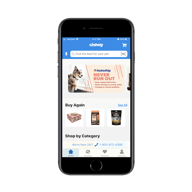
The microphone that sits to the left of the search bar allows users to enable voice search. All they need to do is click the microphone once and this encouraging screen helps them get the feature activated:
.png?sfvrsn=d999e124_0)
This is a smart choice by Chewy. Rather than display one of those ugly pop-ups that says “Chewy wants access to your microphone”, Chewy quickly explains what the microphone icon does with a custom splash screen.
.png?sfvrsn=c171e907_0)
Once access to the microphone is enabled, users need only click the microphone icon and speak a short search query like “martingale collar” to quickly narrow down their search results. This is going to be a big deal for mobile app users who might not have the convenience of a mega menu or deep categories to shop from the way they would on a website or PWA.
Another mobile app that utilizes voice search today is Google Maps.
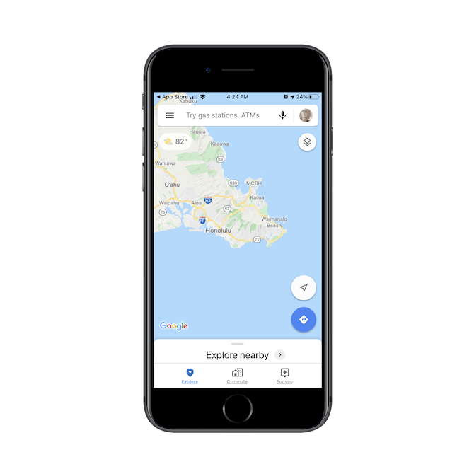
Think about the stories you hear about people getting into accidents because they were typing something into their phones instead of looking at the road. Or about how many people you’ve nearly bumped into while walking around town, the mall, or some other crowded space because they couldn’t be bothered to look away from their screens.
As consumers spend more time glued to their mobile devices and apps, you have to consider how the design choices you make affect real world scenarios like these. And by adding voice search to any search component on an app, you could help your users keep their eyes off of their devices when they need to.
Maps is just one example of this. Consider doing this on productivity apps for the professional on the go or on social media apps for the influencer who needs to respond to their messages in real time.
Trend 2: Dark Mode
Whenever a popular device or app moves to the dark side (i.e. Dark Mode), it’s always big news. Apple just recently enabled the feature on its iPhones in October of 2019. Instagram added it around the same time, too. People went nuts for it.
Apple is now even calling attention to apps that are compatible with or have a Dark Mode feature already enabled:
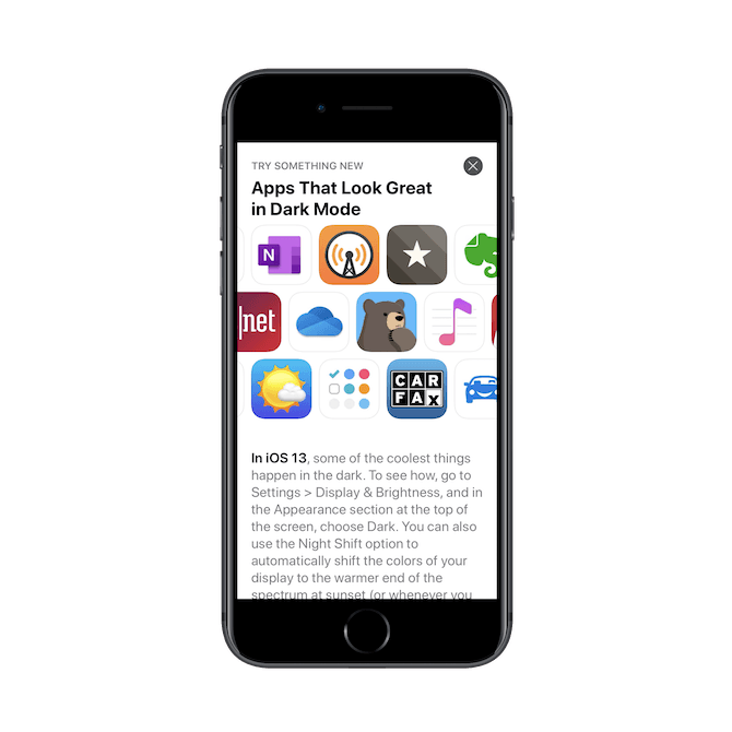
Whether you like or dislike dark mode or dark color schemes yourself, there’s no denying how excited it gets app users. That’s why I think more developers are going to have to add a Dark Mode feature to many of their apps in 2020 and beyond.
Breaker, a social podcast app, has made the leap already. Here’s how it looks when a user first enters the app:
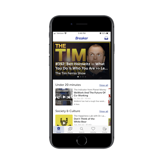
It looks like many apps, with its black-on-white color scheme. The only time we see a reverse color contrast is when white text sits atop a dark featured image.
When Dark Mode is enabled, however, all colors are reversed:
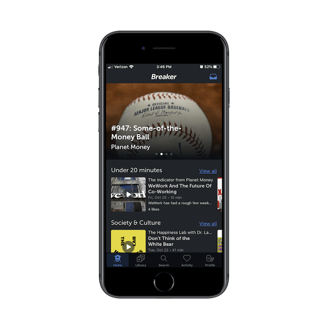
That said, I want to point out that Dark Mode is not all it’s cracked up to be. Yes, it can help reduce the blue light from phones users are exposed to late at night. However…
There were three studies done on the subject in the mid-2010s that found that white text on a dark background is the most difficult type of contrast polarity to read.
So, while it’s fine to give your users the option to enable Dark Mode, I wouldn’t go encouraging users to do so if your app requires a lot of reading. You should make the same kind of consideration when designing apps with dark themes.
For instance, the Insomniac Events app is designed with a dark theme:
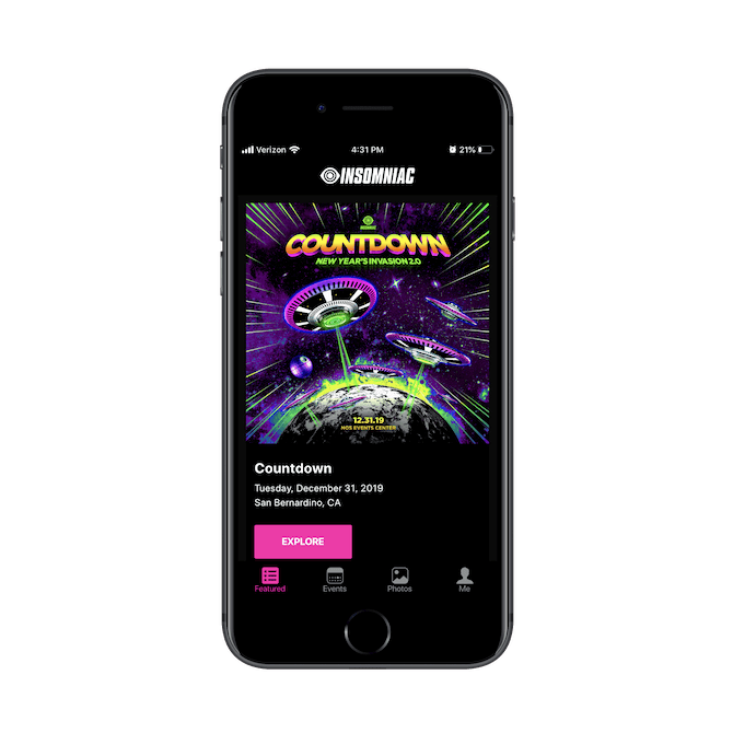
An app like this would be fine to design with a dark theme. Users aren’t likely to spend long periods of time looking up events, so the reverse color theme shouldn’t cause any eye strain. But for a social media, entertainment, or news app where users are glued to their screens for extended periods, you’ll want to steer clear.
Trend 3: Better Onboarding
One could argue that mobile apps are much easier to use than websites that are overloaded with content. However, the assumption that mobile users know what to do when they first enter an app or even that they understand the real value of it can be problematic. Because if you feel like the app is a no-brainer, then you’re going to design it that way, which may prevent some users from ever really knowing how much they can do with it.
Since you don’t have the luxury of sharing as much information with users as your PWA counterparts do, I think swipeable intros are the solution. We’re starting to see a number of apps utilize these before ever inviting users to sign up or log in and I think more apps will adopt this friendlier approach to onboarding users in the years to come.
Here’s one example from MealPrepPro:
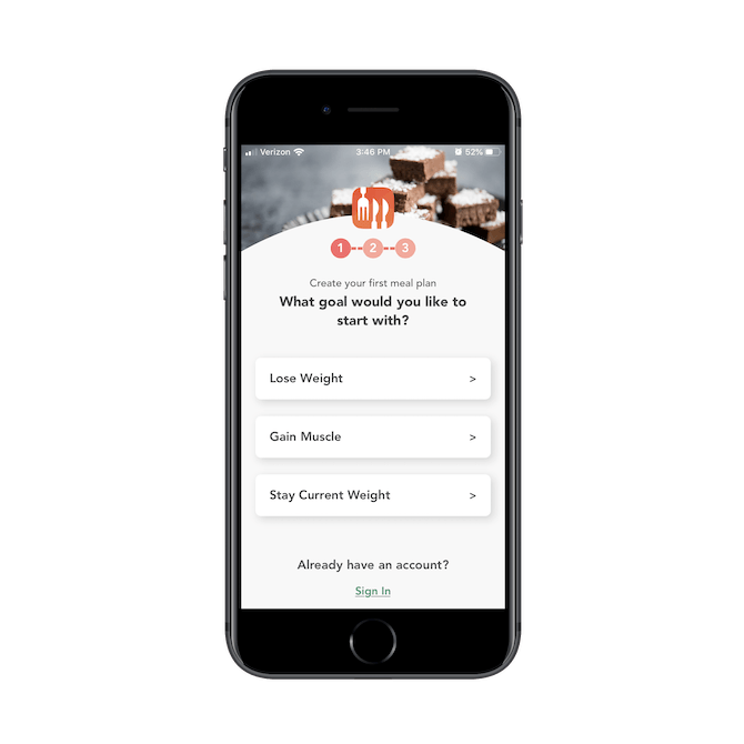
MealPrepPro doesn’t ask users to create an account right off the bat. Instead, it gently invites them into the experience with three simple steps.
This gives users a chance to see how well-developed the app is and how easy the experience of meal planning is going to be once they get inside. It’s a good way to make a positive first impression with users who might be apprehensive about an app like this (i.e. health and wellness).
Another app that uses a pre-signup onboarding process is Trello:
.png?sfvrsn=6fa924d_0)
This is the first card users see when they install the Trello app. It’s a warm and quirky greeting that sets the tone for the app they’re about to use.
The next few cards highlight the features of the app, like this one that shows them how to organize their tasks within Trello boards:
.png?sfvrsn=404ec11a_0)
The other two cards users see when they swipe through explain how they can add notes, upload files, create checklists and collaborate with others — all for free.
For SaaS apps, in particular, this intro onboarding process is essential. While you could assume that the app is intuitive enough for users to get moving right away, you know first-hand how much people’s tech-savviness can differ. I’ve had some clients who take to Asana and Trello right away whereas there are others who really struggle to get the hang of it, for instance.
If you want to make your mobile app something that all users feel confident engaging with — which ultimately helps with user retention rates — start adding onboarding processes before you ask them to sign up.
Trend 4: Push Notification Requests with Personality
This is another way that I see mobile apps “warming up” in 2020.
It’s not like a mobile app is devoid of life. It’s just that, well, you don’t have a lot of room to mess around with, so brevity is key.
It’s like going to a party that you can only stay at for 20 minutes because you have a work commitment you can’t get out of. So, your friend hurriedly introduces you to their other friends. But how much can you really convey about yourself as you’re bounced around the room from person to person? That’s kind of like what a mobile app is trying to do.
Something I’ve started to see this year and I think we’re definitely going to see more of is a move away from cold push notification messages like this one on the FOX Sports app:
.png?sfvrsn=64860565_0)
There’s nothing wrong with this push notification request, per se. Users have become accustomed to seeing these kinds of pop-ups asking them if it’s okay to send push notifications or give them access to their camera or microphone. But that’s just it: your users have seen these pop-ups a million times before.
What if they’re tired of being asked, “Hey, can I get access to your personal photos?” or “Can I send you notifications you might not want to read?” Instead, banner blindess (and frustration) washes over them and they automatically click “Don’t Allow”.
If you want your app to be able to compete with progressive web apps and websites that can take more time and space to woo their users, think about giving your push notification requests a friendlier touch. Duolingo has a nice example of this:
.png?sfvrsn=a2b05c59_0)
This is sure to catch Duolingo’s users’ attention. With a large graphic of the app’s mascot along with a customized message that explains the value in enabling push notifications, it’s kind of hard to say no to this.
The Leo AR Magic Camera app is another one that uses a custom push notification pop-up:
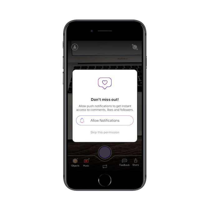
Although minimally designed, it definitely stands out more than traditional push notification requests — especially with the social media “like” graphic at the top of it. Also, rather than just post a vague message about how push notifications might be used, Leo AR explains what users get when they allow notifications.
You already know how useful push notifications are for keeping users engaged. By fusing some of the warmer parts of a PWA (the ability to be more personable, in this instance) with your mobile app, you might be able to capture more of those “Allow notifications” than you would before.
Trend 5: PWA and Native App Companions
The last trend I think we’re going to see more of is the creation of both a PWA and native app for companies. I know it might seem crazy to go to all of that trouble to create both, but think about the benefits.
For starters, you’ll improve discoverability as your app will be placed in both search engines and app stores. Also, this is a great opportunity to capture more revenue as you have a broader pool of users and because you’re not always having to give up 30% of your earnings to the app stores.
We’re operating in a mobile-first world and, when it makes sense and you have the means to do so, I think developers and companies should take the chance to dominate it with a PWA and native app.
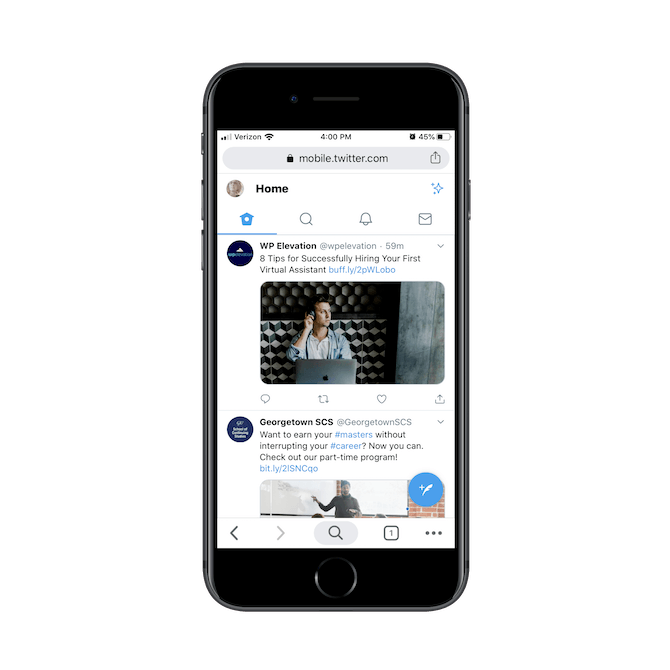
Twitter is a good example. Whether users go searching for it on the web and encounter its Twitter Lite PWA:
Or they find it in one of the app stores:
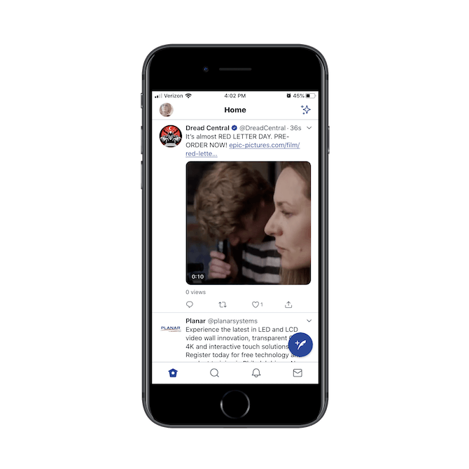
The app experience is nearly the same across the board. The feed comprises the whole of the screen, the menu is simplified and consistently presented across both, and it’s always easy and fast to create a new tweet.
Another company that’s maximizing its mobile reach is Target:
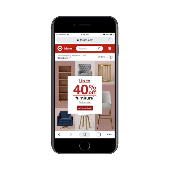
Target takes a slightly different approach with its PWA and mobile app companions though. While they both give users full access to the store, they do it in different ways.
The PWA, for instance, tucks its categories under the Menu.
.png?sfvrsn=fdfd677b_0)
The mobile app, on the other hand, decides what’s most important for users to see. The home page of the app provides them with three options to explore upfront:
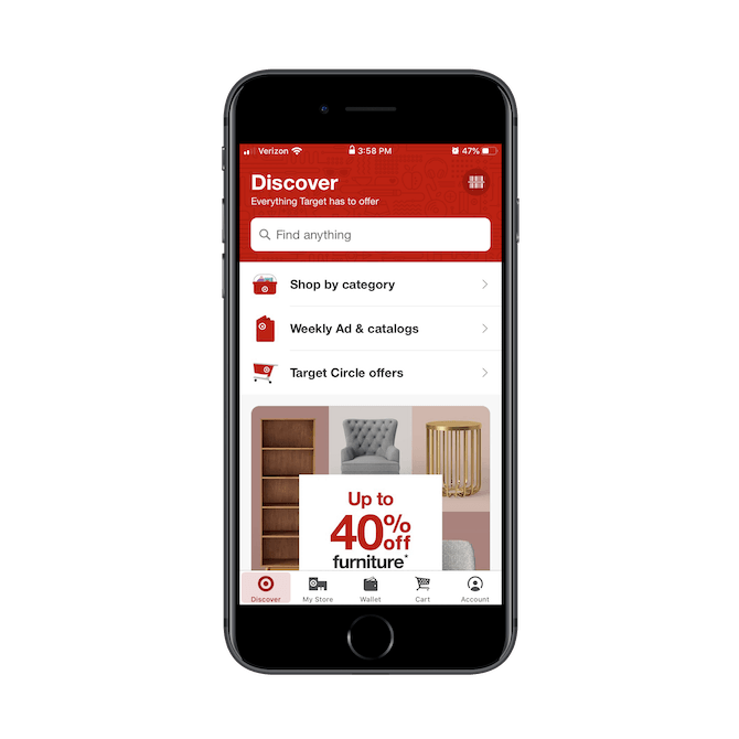
While users will eventually be able to look at the same home page they’d see on the PWA, the mobile app tries not to waste any time here.
This design decision likely came about after looking at how PWA visitors and mobile app users were interacting with each app. When designing your companion apps, you should do the same.
Wrap-Up
Like I said, there’s not much use rehashing what we already know about good and modern mobile app design. If you want to stay on the cutting edge and make sure you’re delivering an experience your users will reap a lot of benefits from, it’s time to think outside the box when looking at future trends. And if the PWA is making waves (and potentially stealing business from your apps), it’s time to design something that can effectively compete with or complement it!

Suzanne Scacca
A former project manager and web design agency manager, Suzanne Scacca now writes about the changing landscape of design, development and software.
