What Is Banner Blindness and What Should You Do About It?

Summarize with AI:
There was a time when the web was overrun with ads that opened in new windows — some of which weren’t discovered until you closed your browser for the day and discovered a barrage of them hiding beneath it. It was frustrating, to say the least.
While we’ve moved past the days of pop-out ad windows, are the ad and ad-like interruptions we put on websites nowadays really any better?
Considering the proliferation of banner blindness (and even more overt ad-blocking tactics), I think it’s safe to say that we’re continuing to annoy the heck out of our visitors.
Rather than continue to include these annoyances on our sites, let’s take a look at what the underlying issue is and how to design a better experience that doesn’t compromise your client’s ability to generate leads and revenue from their website.
The Problem with Ads, Pop-ups, and Other Small Interruptions
Think about the last time you were chugging along at work when your manager or an employee knocks on the door or pings you over Slack:
“Hey, can you look at this thing real quick?”
Even if you don’t have time to look at that small “thing,” the disruption alone costs you.
There’s an often-cited study from the University of California, Irvine on the cost of interruptions. The findings of this study found the following:
“When people are constantly interrupted, they develop a mode of working faster (and writing less) to compensate for the time they know they will lose by being interrupted. Yet working faster with interruptions has its cost: people in the interrupted conditions experienced a higher workload, more stress, higher frustration, more time pressure, and effort. So interrupted work may be done faster, but at a price.”
We’ve all experienced that pain as professionals. But what about as consumers?
Consider this from the perspective of a website visitor:
They go to your website with a specific goal in mind. Read an article. Buy a product. Subscribe to a service. Along the path to that objective, however, is a seemingly slight interruption in the form of an ad or pop-up.
Whether they decide to take action or disregard it, it’s disrupted their flow. This, in turn, increases the likelihood that, when they return their attention to what they came to do, they feel annoyed and pressured to just get it over with.
What Is Banner Blindness?
“Banner blindness” describes a sort of tunnel vision people get on websites. Rather than take time to soak in every detail and acknowledge every pop-up and alert and ad in front of them, they focus on one clear and narrow path.
Some users have even gone so far as literally blind themselves against ads with ad-blocking tools. According to Statista, this is the number of internet users in the U.S. who use or are expected to use ad-blocking tools:
.png?sfvrsn=85cd6b25_0)
Statista data on the number of Internet users who have ad blocking technology on their computers. The data shows upward growth from 15.7% in 2014 to a projected 27% in 2021.
Even without the use of ad blockers, internet users have had enough. As the Nielsen Norman Group explains in its findings:
“On the web, UI elements and different pieces of content all fight for users’ attention. To complete their tasks efficiently, people have learned to pay attention to elements that typically are helpful (e.g., navigation bars, search boxes, headlines) and ignore those which are usually void of information.”
Really, any sort of advertorial or promotional element used on a website may be excluded by your visitors’ banner blindness. For example:
- Pop-ups promoting lead magnets
- Browser push notification requests
- Inline and sidebar ads on blogs
- Video ads
- Unrelated callout boxes
- Cookie consent notices
Because design trends spread like wildfire once prolific marketers or digital influencers start touting them as the next “hot” thing, we’re only making it worse for our consumers.
For instance, the track your location message like this one used by Social Media Today:
.png?sfvrsn=f219e9dd_0)
Social Media Today displays a small pop-up on top of browser, asking visitors if they will share their location with the website.
Or the cookie consent notice that seems to be on every website since the implementation of GDPR last year, like this one on the Le Monde website:
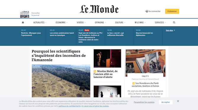
Le Monde displays a cookie notice at the bottom of its website that must be dismissed or accepted.
Vitaly Friedman of Smashing Magazine says:
“In our research, the vast majority of users willingly provide consent without reading the cookie notice at all.”
A cookie consent notice is essential, especially in light of the major privacy violations that have taken place on the web in recent years. However, because it’s become such a predictable interruption, users don’t even bother to read the content or explore the options within the banner. They simply “Accept” so they can move on.
How to Design for Banner Blindness
Banner blindness is a problem. If your visitors are unable to see the pop-ups and ads you’ve carefully placed on the website, or willingly pass them by, how is your client going to maximize their lead generation efforts and conversions?
It gets even worse.
NNG’s research found that it’s not just ad-like elements that go ignored. The following are also affected by banner blindness:
- Elements placed in locations where ads are usually found (like a sidebar)
- Elements placed near an actual ad
- Elements designed to resemble an ad
Even if your website isn’t populated by a bunch of intrusive ad-like elements, any resemblance or relation to them is enough for some visitors to skip over them.
As you go about building websites for your clients, consider the following tips for introducing ads, pop-ups, and other interruptions in a way that won’t harm the experience:
1. Prioritize the Content.
The Content Marketing Institute has a number of disruptions on this page:
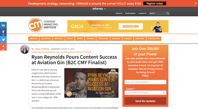
Content Marketing Institute has an ad for ON24 in the header, a newsletter subscription form on the sidebar, and $100 savings banner in a top sticky bar.
Overall, there are too many promotional elements on the page. There’s the newsletter signup on the sidebar, which might’ve been okay if it was the only promotional element on the page. Even then, the sidebar is a risky place to put it if users are wary about ads being there.
There’s also an ad to the right of the logo. This isn’t a very smart choice, as it distracts from the website’s branding and also pushes the navigation down another layer.
Finally, there’s a promotional offer to save $100 on the conference in the sticky bar up top. While it’s nice that visitors are spared an intrusive pop-up that has to be dismissed to see the content, it’s still one too many calls-to-action and not enough content.
If you want to prevent your visitors from getting banner blindness, don’t overload their visual field with ads and promotions. It’s no different than how you design a call-to-action for a page. The more choices you give them, the harder it’s going to be to persuade them to take action. So, keep it simple.
2. Put Some Thought into Designing Your Ads.
BuzzFeed is another one of those websites that’s guilty of going overboard with ad monetization.
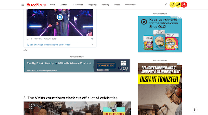
BuzzFeed has ads for Hyatt Place hotels, OLLY snacks, and something for an “instant transfer” but whose advertiser you can’t see.
Compare this page to the one on the CMI website though. Notice anything different?
No matter how overboard it’s gone with placing promotional elements on the page, CMI has done a beautiful job of designing them to blend with the website. BuzzFeed, on the other hand, has put any old ad on the page so long as it fits into the space. Even worse, the sidebar ads change as the user scrolls, creating an even greater distraction for them as they try to focus on the content.
If you’re going to use numerous ads or promotions on a page, don’t make it so glaringly obvious. By blending them with the site, you can make it feel more like your visitors have the option to engage with the interruptions if they want to.
3. Limit How Many Ads You Bring in from External Networks.
There’s something even more troubling happening with websites that import banner ads from third-party ad networks.
This is the website for 22 Words, a competitor of BuzzFeed:
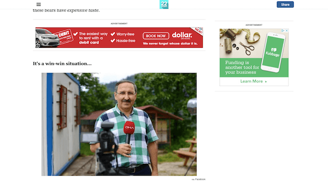
This page on the 22 Words website includes an ad for Dollar And Kabbage.
Again, ads are imported from an external network, so there’s no control over the design.
What’s more, ads continue to intrude on the experience all the way down the page, which takes a very long time to get to, too. Part of this may be due to how many images are on the page, though with a good caching system, that shouldn’t be a problem. The overuse of ads is more likely to blame for the length of the page and the long loading times.
This is the pagespeed score Google gives this page on desktop:
.png?sfvrsn=366badea_0)
The 22 Words web page gets a score of 42 out of 100 on desktop.
And this is its mobile pagespeed score:
.png?sfvrsn=e82379ff_0)
The 22 Words web page gets a score of 25 out of 100 on mobile.
Neither of these scores is good, but the mobile score is especially troubling.
If you need a reason to stop using so many ads on your website, let this be it.
Your users visit your website to get some value out of it. If you bog it down with annoying ads at every scroll and, worse, slow down their reading experience in the process, don’t expect them to stick around long enough to see if there’s anything of value there.
4. Create More Passive Interruptions.
That might seem like an oxymoron — a “passive interruption” — but I assure you it’s not.
For example, remember the CMI newsletter signup form on the sidebar? According to NNG’s research, there’s a chance that signup form will be ignored by visitors because they expect ads and other promotional elements to reside there.
Here’s the thing though: you’re going to want people to subscribe to its newsletter. It’s the only way to ensure they know when new content or products hit the site. It’s also the best way to start growing your email list. So, what do you do?
Well, you can put it somewhere that’s out of the way, but still sure to get noticed. Like Uncommon Goods does with its footer form:
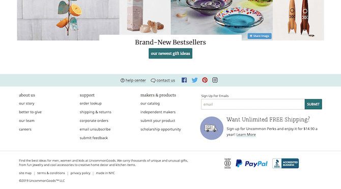
Uncommon Goods moves its newsletter form to the footer of its website.
Another way to avoid placing unnecessary pop-ups on the site is by designing the element directly into the page.
This is the first thing visitors see when they enter the Debenhams website:
.png?sfvrsn=f31e7239_0)
The Debenhams website greets visitors with a pop-up asking for their location and currency.
There’s no reason to introduce an interruption so early in the visit. There’s also no reason to put this information in a pop-up when visitors know they can find this kind of location switcher widget at the top or bottom of many websites. Like Nike does in the top-right corner of its header:
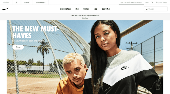
Nike places a location switching widget in top-right corner of its website.
This is a much better and non-intrusive way to share this information with visitors.
Then, there’s the matter of banner ads.
Your visitors might have ad blockers installed that keep them from seeing your ads. For the rest, though, do you really want your banner ads to interrupt what they’re doing?
Your client might put up a fight when it comes to this. After all, how will they make money if the content is free and they don’t want to force memberships on visitors?
Fast Company has found a good middle ground:
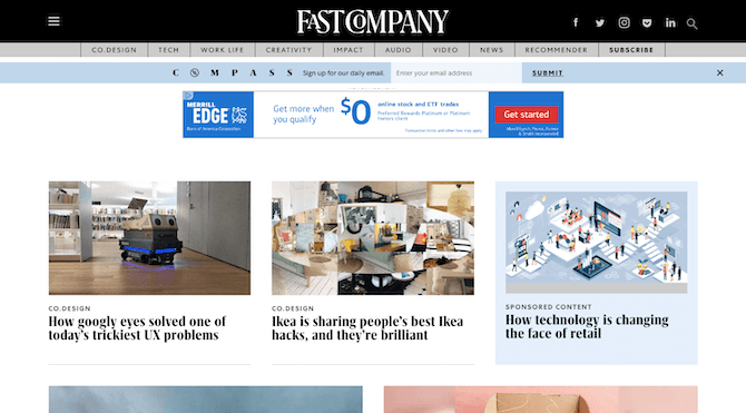
Fast Company has a banner ad for Merrill Edge and a highlighted block for a sponsored post mixed in with the rest of its content.
Fast Company uses a mix of banners ads and sponsored content to monetize its website.
This way, even if users miss out on the banner ads due to ad blockers or banner blindness, there’s still a chance to make money from them with sponsored posts.
Wrap-Up
One thing is for certain: Internet users are becoming more savvy to what websites are capable of. So, when choices are made to present interruptions into their reading, browsing, or shopping experiences, it can be understandably frustrating for them. Not only are you asking them to stop to look at an ad or pop-up they may not have any use for, but you’re unwittingly forcing them into a different mindset when they re-engage with the website.
To keep visitors happy and focused on what they came to your website to do, design these distractions so that they don’t get in the way. You still need them for the purposes of lead and sales generation, among other things, but you can give visitors more control over when and how they engage with them.

Suzanne Scacca
A former project manager and web design agency manager, Suzanne Scacca now writes about the changing landscape of design, development and software.
