New to Telerik UI for Blazor? Start a free 30-day trial
Tooltip Position
Updated on Jun 24, 2026
The Tooltip component lets you define the location of its popup according to its target element.
You can control it through the Position parameter, which takes a member of the Telerik.Blazor.TooltipPosition enum:
Top- the default valueBottomRightLeft
The possible positions of the tooltip relative to its target
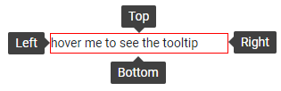
Explore the possible tooltip positions
@* Setting a position is not mandatory, it defaults to Top *@

<select @bind=@position>
    @foreach (var item in Enum.GetValues(typeof(TooltipPosition)))
    {
        <option value=@item>@item</option>
    }
</select>

<TelerikTooltip TargetSelector="#target" Position="@position">
</TelerikTooltip>

<div id="target" title="@position">hover me to see the tooltip</div>

@code {
    TooltipPosition position { get; set; } = TooltipPosition.Top;
}

<style>
    #target {
        margin: 200px;
        width: 200px;
        border: 1px solid red;
    }
</style>