Blazor FlatColorPicker Overview
The FlatColorPicker for Blazor is an interactive component that allows color selection from a color palette or a HSV canvas. Users can also type a specific RGB/HEX color value manually. The FlatColorPicker is practically identical to the ColorPicker component with the only difference that the ColorPicker takes up less space and displays the color selection UI in a popup.
 Start Free Trial
In this article:
Basics
To use a Telerik FlatColorPicker for Blazor:
- Add the
TelerikFlatColorPickertag. - Set its
Valueattribute to any of the supported HEX/RGB formats. Use astringproperty with one-way or two-way binding. - (optional) Set the
ValueFormattoColorFormat.HexorColorFormat.Rgbif the app expects a specific color format.
Example
Here is a simple FlatColorPicker declaration and the resulting UI.
@* Blazor FlatColorPicker *@

<TelerikFlatColorPicker @bind-Value="@Color" />

@code {
    string Color { get; set; } = "rgb(40, 47, 137)";
}
Interface
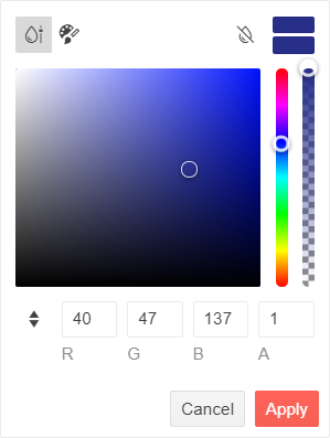
The image below reveals all FlatColorPicker interface elements:
-
View selectors (top left)
-
Color preview box (top right)
-
Current color box (below the color preview)
-
Clear button (top)
-
Palette tiles or HSV canvas with hue and opacity sliders (middle)
-
RGBA or HEX value textboxes with a toggle button (bottom)
-
Apply and Cancel buttons (bottom)
FlatColorPicker Parameters
The FlatColorPicker tag exposes the following features via its attributes:
-
Value-string- sets the FlatColorPicker value in a few different color formats. Supports two-way binding. -
ValueFormat-ColorFormat- sets the color format, which the component will return in the application code. By default, the property is not set and the value format will change depending on the used view:Rgbwhen selecting a color from the GradientView, andHexwhen selecting a color from the PaletteView. -
FlatColorPickerViews-RenderFragment- a nested container to list the FlatColorPicker views. All views are enabled by default and the user can switch between them with buttons. Each view tag has its own configuration attributes. -
View-ColorPickerView- sets the default selected view (ColorPickerView.Gradientby default). Supports two-way binding. -
ShowPreview-bool- toggles the current color box and the color preview box in the popup (trueby default). -
Class-string- renders a custom CSS class to thediv.k-flatcolorpickerelement. -
Enabled-bool- determines if the user can open the popup and change the value (trueby default).
Buttons
ShowButtons-bool- sets the visibility of the Apply and Cancel buttons (trueby default).ShowClearButton-bool- sets the visibility of the Clear button.
Supported Value Formats
The FlatColorPicker accepts values by the application code in the following formats:
- Hexadecimal
- 3 digits -
#f00 - 6 digits -
#ff0000 - 8 digits, including alpha opacity -
#ff000080
- 3 digits -
- RGB or RGBA
- integer color values -
rgb(255, 0, 0) - percentage color values -
rgb(100%, 0%, 0%) - the alpha opacity must always be a decimal number between 0 and 1 -
rgba(100%, 0%, 0%, 0.5). Note thergba()notation, compared torgb()above.
- integer color values -
Users can type values in the following formats:
- All hexadecimal
- RGB and RGBA with integer color values
Color keywords are not supported.