Drawer Modes
The expanded Drawer component can Push the content (decrease its width) or Overlay it (be on top of it and show a modal background).
You can choose which mode you want to use though the Mode parameter which takes a member of the DrawerMode enum:
If the Mode is not set, by default the Drawer will be in Overlay mode.
You can control how large the drawer is by setting its Width parameter to a CSS value. We recommend using pixel values for better control over its size - there are many ways a drawer can be placed in the layout and percentage values depend highly on the DOM hierarchy and CSS rules applied to the elements.
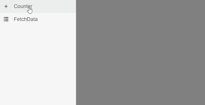
Push Mode
When Mode is set to Push, the Drawer's default width is 240px when expanded, and 50px when collapsed in MiniMode. When it's state is changed (expanded/collapsed) the content is resized - the width is increased or decreased based on the state.
The drawer's height is dynamic based on the height of the content (you can change it with CSS).
The Drawer in Push mode.
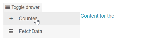
Overlay Mode
When Mode is set to Overlay, the Drawer's navigation is on top of the content and its height takes all available vertical space (100%). The drawer also adds blurred background on top of the content until the user clicks on an item of the Drawer or outside.
ComboBoxes, DropDownLists, DateTimePickers and similar popup-based components are not supported inside the Template or ItemTemplate of a Drawer in Overlay mode. This is because the popup is rendered outside the Drawer and clicking on the popup will close the Drawer.
Drawer in Overlay mode