Bubble Chart
The Blazor Bubble chart shows the data as points with coordinates and size defined by their items' values. You might think of a Bubble chart as a variation of the Scatter chart, in which the data points are replaced with bubbles. This allows a Bubble chart to display three dimensional data — two values for the items' coordinates and one for their size.
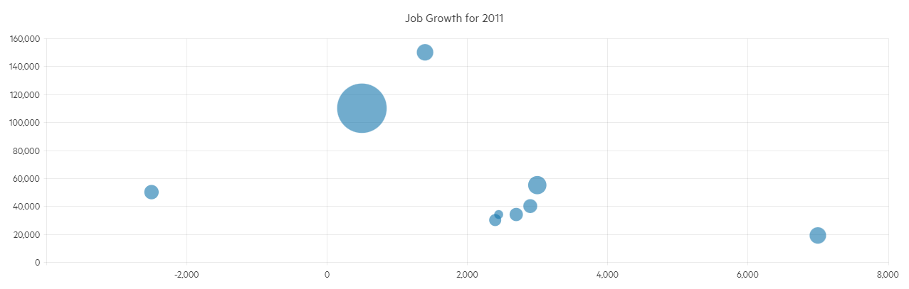
A Bubble chart is useful for visualizing different scientific relationships (e.g, economical, social, etc.). This chart type's x-axis is also numerical and does not require items.
This article assumes you are familiar with the chart basics and data binding.
Creating a Blazor Bubble Chart
To use a Chart component with Bubble series:
- Add a
ChartSeriesto theChartSeriesItemscollection. - Set its
Typeproperty toChartSeriesType.Bubble. - Provide a data collection to its
Dataproperty, which contains numerical data for the X and Y axes, and for the bubble size.
A bubble chart that shows projected population change on a plot of life expectancy versus fertility rate
<TelerikChart>

    <ChartSeriesItems>
        <ChartSeries Type="ChartSeriesType.Bubble"
                     Data="@Series1Data"
                     Name="North America"
                     XField="@nameof(ModelData.LifeExpectancy)"
                     YField="@nameof(ModelData.FertilityRate)"
                     SizeField="@nameof(ModelData.PopulationChange)">
            <ChartSeriesLabels Visible="true" Template="@labelTemplate"></ChartSeriesLabels>
        </ChartSeries>
        <ChartSeries Type="ChartSeriesType.Bubble"
                     Data="@Series2Data"
                     Name="Europe"
                     XField="@nameof(ModelData.LifeExpectancy)"
                     YField="@nameof(ModelData.FertilityRate)"
                     SizeField="@nameof(ModelData.PopulationChange)">
            <ChartSeriesLabels Visible="true" Template="@labelTemplate"></ChartSeriesLabels>
        </ChartSeries>
    </ChartSeriesItems>

    <ChartXAxes>
        <ChartXAxis>
            <ChartXAxisTitle Text="Life Expectancy (years)"></ChartXAxisTitle>
        </ChartXAxis>
    </ChartXAxes>

    <ChartYAxes>
        <ChartYAxis>
            <ChartYAxisTitle Text="Fertility Rate (children per family)"></ChartYAxisTitle>
        </ChartYAxis>
    </ChartYAxes>

    <ChartTitle Text="Life expectancy, fertility rate and projected population change" />

</TelerikChart>

@code {
    string labelTemplate = "#=dataItem.Country#";

    public class ModelData
    {
        public double LifeExpectancy { get; set; }
        public double FertilityRate { get; set; }
        public int PopulationChange { get; set; }
        public string Country { get; set; }
    }

    public List<ModelData> Series1Data = new List<ModelData>()
    {
        new ModelData() { LifeExpectancy = 80.66, FertilityRate = 1.27, PopulationChange = 500000, Country = "Canada" },
        new ModelData() { LifeExpectancy = 78.09, FertilityRate = 2.3, PopulationChange = 7600000, Country = "USA" }
    };

    public List<ModelData> Series2Data = new List<ModelData>()
    {
        new ModelData() { LifeExpectancy = 67.3, FertilityRate = 1.54, PopulationChange = 25000, Country = "Denmark" },
        new ModelData() { LifeExpectancy = 74.3, FertilityRate = 1.85, PopulationChange = 3000000, Country = "Great Britain" }
    };
}
Bubble Sizing
By default, the Chart determines the physical size of each bubble automatically:
- The maximum bubble diameter is 20% of the smaller Chart dimension (width or height). This ensures that the largest bubbles do not occupy too much space.
- The minimum bubble diameter is 2% of the smaller Chart dimension, but not less than
10px. This ensures that even the smallest bubbles are perceivable and accessible. The smallest bubble size also depends on the largestSizevalue in the Chart series. - All bubble sizes are set proportionately, as long as they comply with the preceding rules.
To change the minimum and maximum bubble diameter, use the MinSize and MinSize parameters of <ChartSeries>. In this case, the Chart component sets the diameter of the rendered bubbles based on:
- The absolute values of
MinSizeandMaxSize, which represent pixels. - The ratio between
MinSizeandMaxSize. - The ratio between the smallest and largest
Sizevalues in the series.
As a result of the above algorithms:
- Bubble sizing may not look proportionate if the ratio between the smallest and largest
Sizevalue in the series is not consistent with the ratio between the current minimum and maximum allowed bubble size. - The Bubble Chart helps users compare bubble sizes in the same Chart instance, rather than between different instances. To compare bubbles from multiple series, define these series in the same Chart instance.
If you need to improve the bubble size comparability across several Charts, then use a dummy data item with a Size value that matches the maximum Size value in all Chart instances.
Using default and custom Chart bubble sizes
<TelerikChart Width="1000px" Height="420px">

    <ChartSeriesItems>
        <ChartSeries Type="ChartSeriesType.Bubble"
                     Data="@BubbleData"
                     Name="Custom Sizes"
                     XField="@nameof(BubbleModel.XValue)"
                     YField="@nameof(BubbleModel.YValue1)"
                     SizeField="@nameof(BubbleModel.SizeValue)"
                     CategoryField="@nameof(BubbleModel.SizeValue)"
                     MinSize="1"
                     MaxSize="200">
            <ChartSeriesLabels Visible="true">
                <ChartSeriesLabelsMargin Top="24" />
            </ChartSeriesLabels>
        </ChartSeries>
        <ChartSeries Type="ChartSeriesType.Bubble"
                     Data="@BubbleData"
                     Name="Default Sizes"
                     XField="@nameof(BubbleModel.XValue)"
                     YField="@nameof(BubbleModel.YValue2)"
                     SizeField="@nameof(BubbleModel.SizeValue)"
                     CategoryField="@nameof(BubbleModel.SizeValue)">
            <ChartSeriesLabels Visible="true">
                <ChartSeriesLabelsMargin Bottom="30" />
            </ChartSeriesLabels>
        </ChartSeries>
    </ChartSeriesItems>

    <ChartLegend Position="@ChartLegendPosition.Top" />

</TelerikChart>

@code {
    private List<BubbleModel> BubbleData { get; set; } = new();

    protected override void OnInitialized()
    {
        for (int i = 0; i <= 12; i++)
        {
            BubbleData.Add(new()
            {
                XValue = 3 + (int)Math.Pow(i, 2),
                YValue1 = i + 2,
                YValue2 = (i + 3) * 2,
                SizeValue = (int)Math.Pow(2, i)
            });
        }
    }

    public class BubbleModel
    {
        public double XValue { get; set; }
        public double YValue1 { get; set; }
        public double YValue2 { get; set; }
        public int SizeValue { get; set; }
    }
}
Bubble Chart Specific Appearance Settings
Color
The color of a series is controlled through the Color property that can take any valid CSS color (for example, #abcdef, #f00, or blue). The color control the fill color of the bubble.
The ColorField can change the color of individual items. To use it, pass a valid CSS color to the corresponding field in the model and the chart will use its values instead of the Color parameter.
Opacity
You can control how transparent the series fill is through the Opacity property. 0 means a completely transparent series, and 1 means a completely opaque (non-transparent) fill. You can use decimal values to set the desired transparency (for example, Opacity="0.3").
Negative Values
Negative values are allowed for the X and Y fields, because they are plotted on standard numerical axes.
The size field should, generally, have positive values as it correlates to the physical size of the bubble. To render negative values, set the Visible parameter of the ChartSeriesNegativeValues tag of the series to true. Bubbles with negative size values will be calculated as if their sizes are positive. To distinguish one from the other, you can have negative items show up in a different color through the Color parameter of the ChartSeriesNegativeValues tag.
Negative bubble size
@* Negative bubble sizes can showcase decreases in values and can render in different color than the rest of the series *@

<TelerikChart>

    <ChartSeriesItems>
        <ChartSeries Type="ChartSeriesType.Bubble"
                     Data="@SeriesData"
                     XField="@nameof(ModelData.X)"
                     YField="@nameof(ModelData.Y)"
                     SizeField="@nameof(ModelData.Size)">
            <ChartSeriesNegativeValues Visible="true" Color="cyan"></ChartSeriesNegativeValues>
            <ChartSeriesLabels Visible="true" Template="#=dataItem.MetaData#"></ChartSeriesLabels>
        </ChartSeries>
    </ChartSeriesItems>

</TelerikChart>

@code {
    public class ModelData
    {
        public int X { get; set; }
        public int Y { get; set; }
        public int Size { get; set; }
        public string MetaData { get; set; }
    }

    public List<ModelData> SeriesData = new List<ModelData>()
    {
        new ModelData() { X = 250, Y = 5000, Size = 50000 , MetaData = "positive size"},
        new ModelData() { X = 500, Y = 1100, Size = -760000, MetaData = "negative size" }
    };
}
Customize Chart Elements - Nested Tags Settings
When configuring nested properties and child elements in your chart, the inner tags will contain their parent tag name and add specifics to its end. In general the structure of such nested tags will be <Chart*Category**Specifics*> where the Category can be one of the following:
- CategoryAxis
- ChartArea
- Legend
- PlotArea
- SeriesItems
- Title
- Tooltip
- ValueAxis
- XAxes
- YAxes
- and others
To customize the chart, look for nested tags and their properties - the inner tags will contain their parent tag name and add specifics to its end. For example, the
ChartSeriestag has aChartSeriesLabelstag that exposes configuration options and more child tags.
For example, for numerical charts you can rotate the Labels for ChartXAxes or ChartYAxes depending on your application design needs and layout. This can be done through the
ChartXAxes > ChartXAxis > ChartXAxisLabelsRotation tag
where you can set the Angle property to the desired value in degrees (they might be negative or positive numbers). By using similar approach you can take control over ChartXAxisLabelsBorder (add borders), ChartXAxisLabelsMargin (add margin for top, bottom, left and right) and others.
This approach is not limited only to the Labels - it can be used with to all tags that are applicable for the chart type, for example the Chart Title ChartTitle > ChartTitleMargin.