New to Telerik UI for Blazor? Start a free 30-day trial
Breadcrumb Collapse Modes
Updated on Jun 24, 2026
You can specify how the Breadcrumb items are visualized when their total width exceeds the width of the component through the CollapseMode attribute of the Breadcrumb. It takes a member of the BreadcrumbCollapseMode enum and provides the following options:
-
Auto(default) - Items are automatically collapsed based on the width of the Breadcrumb. The first and last item always remain visible. -
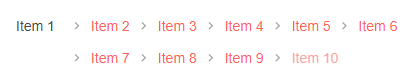
Wrap— Items are wrapped on multiple rows. -
None— All items are expanded on a single row and a horizontal scrollbar will appear if needed.
Set the Breadcrumb CollapseMode to
Wrap. The result from the snippet below.
@* This example demonstrates how to change the default Breadcrumb CollapseMode to Wrap *@

<div style="width:400px">
    <TelerikBreadcrumb CollapseMode="@BreadcrumbCollapseMode.Wrap"
                       Data="@Items">
    </TelerikBreadcrumb>
</div>

@code {

    public IEnumerable<BreadcrumbItem> Items { get; set; }

    protected override void OnInitialized()
    {
        Items = Enumerable.Range(1, 10).Select(x => new BreadcrumbItem { Text = $"Item {x}" }).ToList();
    }

    public class BreadcrumbItem
    {
        public string Text { get; set; }
    }
}