
Telerik UI for .NET MAUI
What's New R2 2022
What's New HistoryNew Component: .NET MAUI DateTimePicker
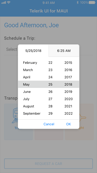
The new .NET MAUI DateTimePicker offers an easy and intuitive interface for the user to pick a date, time or—depending on the used format—string. This customizable control supports different date and time formats, two picker modes (popup or dropdown), predefined date ranges and more. Its flexible styling API makes this component easy to adapt to your app’s existing look-and-feel. You can customize every aspect, from the spinners and popups to the text that gets displayed when a date is selected.
See the .NET MAUI DateTimePicker docs
New Component: .NET MAUI BadgeView
The small but attention-grabbing BadgeView is a handy component widely used to display notifications or short messages in mobile and desktop applications alike. With the new Telerik UI for .NET MAUI BadgeView control, you can easily add a BadgeView to your cross-platform apps and customize it to your liking. This customizable control enables you to set its position and alignment based on its content, to animate it and to choose to go with predefined or customized badge types. The flexible styling API allows you to control every aspect of the BadgeView appearance.
See the .NET MAUI BadgeView docs

All Picker Components: Desktop Support Added
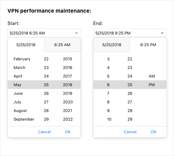
With added desktop support of our powerful picker components, you can now use them to develop apps for Windows and macOS. The full list of updated controls includes our .NET MAUI DatePicker, TimePicker, TimeSpanPicker, ListPicker and TemplatedPicker. With this release, all listed components (plus the DateTimePicker) now have a picker mode property that lets you choose what interface to use for picking a value. The default picker mode for mobile is Popup and for desktop—DropDown.
See the .NET MAUI DatePicker docs
Updated NumericInput Component
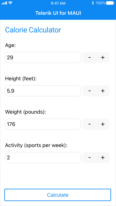
In line with our commitment to provide the best, most comprehensive .NET MAUI UI library, we work hard to ensure developers can build native applications for Windows, macOS, Android and iOS, taking advantage of the technology’s full power. That’s why one of the main goals of this complete redesign of the NumericInput component was to migrate it from a Xamarin.Forms Renderer to a native .NET MAUI Handler. Beyond that, you can expect mobile-first views on iOS/Android and a desktop-friendly look when running on Windows/MacOS.
See the .NET MAUI NumericInput docs
Updated Entry Component
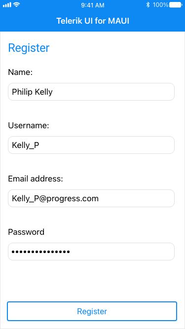
The evolved .NET MAUI Entry component is now built against the latest UI guidelines and ships many API enhancements. You can count on the Entry control whenever you want to enable the user to enter a string input. It comes with a whole range of handy features to support the variety of scenarios in which an Entry can be used: from password masking (hiding the characters typed by the user) and setting a character limit to text prediction and validation with error messages. As any .NET MAUI control, the Entry is also easy to style to your liking.
New Data Grid Feature: Added RowHeight Property
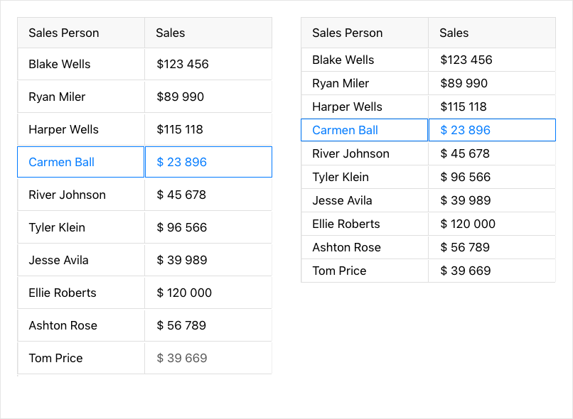
The newly added option for manually setting row height gives developers full control over the way content is accommodated inside grid cells. By default, row height is calculated according to the cells’ content. But with the new RowHeight property, you can easily set a custom height for your Data Grid’s rows.
See the .NET MAUI DataGrid row height docs
New features & Roadmap
Have a feature request?
Post your feedback via the Feedback Portal or the Public forums
What's new across all Telerik products?

Get the Bits
Download Free TrialSee Telerik UI for .NET MAUI in action and check out how much it can do out-of-the-box.


