
Telerik UI for .NET MAUI
What's New R1 2022
What's New HistoryNew Component: ListView
The ListView control for .NET MAUI is a virtualized list component that presents lists of data. This data control is indispensable for scenarios that require scrolling and manipulation of a large number of items. The control is easy to use and packed with every feature you would need from a ListView component: data binding, load on demand, filtering, grouping, sorting, item swipe and reordering, various selection options, header and footer support and much more.
For more information, check out our product documentation.

New Component: MaskedEntry
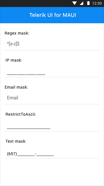
The Telerik UI for .NET MAUI MaskedEntry control enables you to format and restrict text inputs to predefined or defined patterns, and provides input validation and masks, such as text, Regex, IP, email and numeric.
The control covers multiple Mask types for any validation scenario, provides built-in globalization and localization as well as an exhaustive number of events to execute various operations within the user interface, such as value changing.
For more information, check out our product documentation.
New Component: TabView
The Telerik TabView for .NET MAUI is a flexible navigation control that allows you to build tabbed interfaces. Each TabView item has an associated content displayed on selection. The control is fully customizable—using the API, you can easily customize the TabView header area that contains the tabs and the TabView content.
For more information, check out our product documentation.
New Component: TimePicker
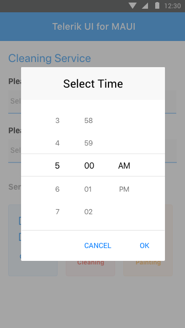
The TimePicker control for .NET MAUI enables you to implement a stylish and user-friendly way for users to select a time. The time values are visualized inside a dialog that is open to various tweaks and customizations designed to ensure consistency across the user experience of the .NET MAUI application.
For more information, check out our product documentation.
New Component: TimeSpanPicker
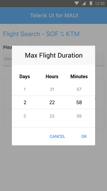
The Telerik TimeSpanPicker for .NET MAUI provides users with an easy way to select time duration. The TimeSpanPicker presents the user with a time interval, allowing them to set a range measured in days, hours, minutes and all the way down to seconds.
The TimeSpanPicker covers multiple possible application development scenarios: for example, defining maximum flight duration in a .NET MAUI travel booking app. Just like all other picker controls from the Telerik UI for .NET MAUI suite, the TimeSpanPicker is open to multiple customizations to give you ultimate flexibility when creating your next .NET MAUI application.
For more information, check out our product documentation.
New Component: ListPicker
The ListPicker for Telerik’s UI for .NET MAUI is a fully customizable picker component, providing a simple and elegant UI experience that covers a wide range of use cases where you need the user to select a value from multiple options.
The .NET MAUI ListPicker displays a list of items and enables the user to select from that list. The customizable dialog appearance enables developers to ensure that the ListPicker is consistent with the overall user experience of their application.
For more information, check out our product documentation.
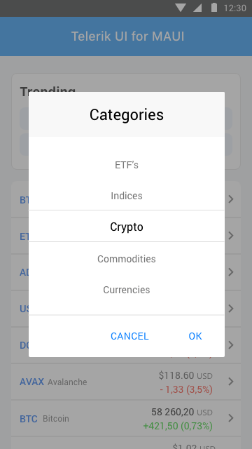
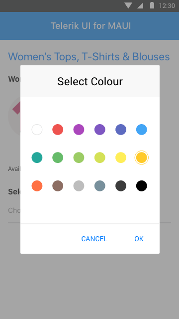
New Component: TemplatedPicker
The Telerik TemplatedPicker for .NET MAUI is a control that enables you to tailor an item selection with a custom template, covering any potential scenario you might need for your .NET MAUI development initiative.
New Component: NumericInput
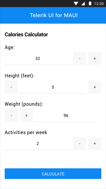
The NumericInput is a highly customizable input control for numeric data. It allows users to set or edit a number in the numeric field using the up and down buttons or to enter it directly via the keyboard. The control supports defining custom steps for an increment/decrement value, minimum/maximum values, as well as value changing/value changed events.
New Component: BusyIndicator
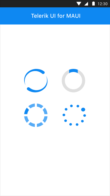
Busy indicators enable you to provide immediate feedback to the app user while the background process is running, a common trick by app developers and widely recommended UX best practice. The Telerik UI for .NET MAUI BusyIndicator enables you to add a notification to your app with minimal coding, making the UI more informative and the user experience smoother.
New Component: DockLayout
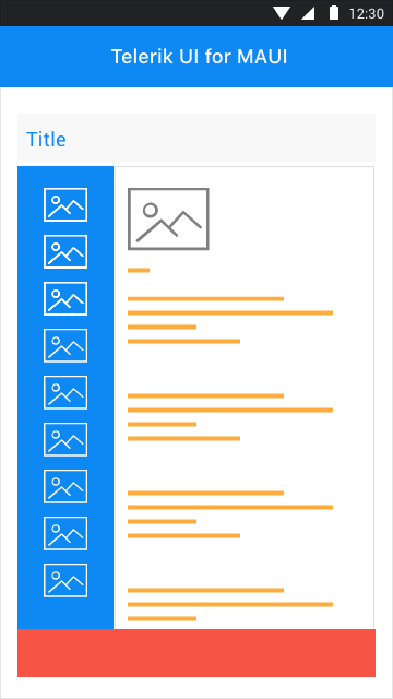
The Telerik UI for .NET MAUI DockLayout is a layout control that provides a mechanism for child elements to be docked to the left, right, top or bottom edge, or to occupy the central area of the layout.
New Component: WrapLayout
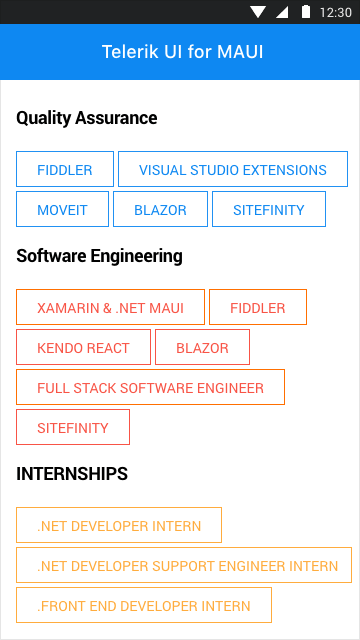
The Telerik UI for .NET MAUI WrapLayout provides a mechanism for arranging child elements in rows or columns, depending on the Orientation property. When the available space is filled, the control wraps these elements on а new row or column.
New Component: Map control
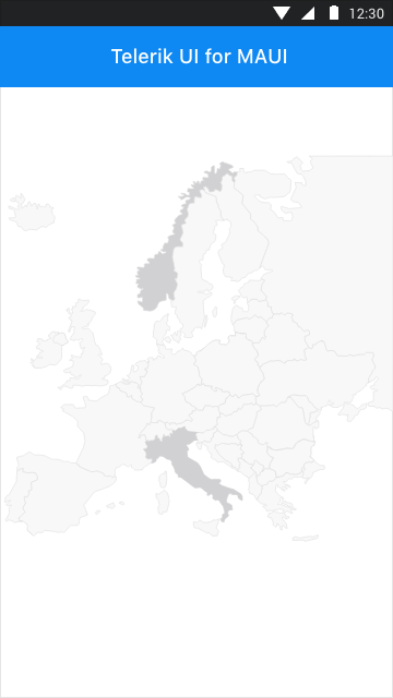
The Telerik Map for .NET MAUI is a data visualization control whose primary purpose is to visualize rich spatial data. The control provides visualization of ESRI shapefiles that consist of geometric objects, such as lines, polylines and polygons. Such objects are commonly used to display various schemes, for example floor plans and seats distribution, all the way to parts of maps for countries, roads, rivers, etc.
New Component: Rating
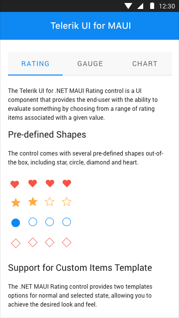
The Telerik UI for .NET MAUI Rating control is a UI component that provides the end-user with the ability to evaluate something by choosing from a range of rating items associated with a given value. The control supports multiple predefined shapes, custom items templates and other flexible customizations to meet your application design requirements.

Support for .NET MAUI Preview 11
As always, we make sure that all our existing controls are compatible with the latest Preview from Microsoft. Despite the jolly holiday spirit, we made sure that the Telerik UI for the .NET MAUI controls suite is up to date with the .NET MAUI Preview 11.
Telerik UI for .NET MAUI - R1 2022
- New Component: ListView
- New Component: MaskedEntry
- New Component: TabView
- New Component: TimePicker
- New Component: TimeSpanPicker
- New Component: ListPicker
- New Component: TemplatedPicker
- New Component: NumericInput
- New Component: BusyIndicator
- New Component: DockLayout
- New Component: WrapLayout
- New Component: Map control
- New Component: Rating
- Support for .NET MAUI Preview 11
New features & Roadmap
Have a feature request?
Post your feedback via the Feedback Portal or the Public forums
What's new across all Telerik products?

Get the Bits
Download Free TrialSee Telerik UI for .NET MAUI in action and check out how much it can do out-of-the-box.

