
Telerik UI for .NET MAUI
What's New R3 2021
What's New HistoryNew Component: DataGrid
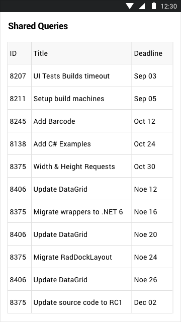
The Telerik UI DataGrid for .NET MAUI , one of the most sought-after controls for developers, is now available in Preview! This feature-rich control can be populated from various data sources and comes with out-of-the-box support for operations like editing and sorting. Enjoy fast performance, UI virtualization and easily customizable API.
The DataGrid control for .NET MAUI includes the following features:
- Multiple built-in column types: Text, Boolean, Numeric, ComboBox, DateTime and Template.
- Load on demand: automatic data loading when the user scrolls past the last available record.
- UI virtualization: creates visual elements only when needed and only for the currently visible cells.
- Sorting, grouping and editing: quickly and easily sort and programmatically group your DataGrid items, as well as edit the presented data.
- Selection modes: allow for a single or multiple item selection and choice of selection unit (Cell or Row).
- Rows alternation: alternate row colors so your end-users can easily distinguish between different rows.
- Styling API: customize the Telerik UI for .NET MAUI DataGrid based on your application requirements and/or preferences.
For more information on the Telerik UI for .NET MAUI DataGrid control, visit the product documentation.
New Component: Gauge
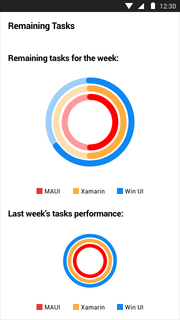
The Telerik Gauge control for .NET MAUI is a powerful data visualization control that offers you a wide range of highly customizable, animated and UX-refined gauges, all configurable to display your data in the predefined layout.
The Gauge control for .NET MAUI comes with the following key features:
- Multiple display layouts: the MAUI Gauge control includes radial, horizontal and vertical gauges for visualizing your data.
- Indicators: the MAUI Gauge control comes with fully customizable built-in indicators.
- Ranges: the control comes with a collection of ranges that allow you to easily mark the various parts of your gauge.
- Animations: ready-to-use animations enable you to achieve transition effects that will feel native on each platform.
Visit our documentation for more information on the Telerik UI for .NET MAUI Gauge Control.
New Component: Barcode
The Telerik Barcode for .NET MAUI is a lightweight control designed to generate and display data in a machine-readable format. The generated barcodes are optimized for both printing and on-screen scanning. The Telerik UI for .NET MAUI Barcode comes with the following features:
- Support for one and two-dimensional barcodes: the MAUI Barcode supports 1D and 2D barcodes, including the widely used QR code and the recently introduced SwissQR.
- Multiple sizing modes: the MAUI Barcode comes in three sizing modes—manual, snap and stretch.
- Flexible styling capabilities: easily customize the MAUI Barcode visual appearance with the control’s various styling capabilities.
New Component: Entry
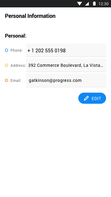
Entry is a text input control that accepts input from end-users and ensures a consistent look and feel across your .NET MAUI application thanks to an innovative theming mechanism. The control comes with the following key features:
- Watermark support: acts as a placeholder to hint at the type of input required by end-users (e.g., username, password, etc.)
- Keyboard support: easily define the keyboard that will be visualized by the device.
- Non-editable state: specify whether the Entry control can be edited or not.
- Max length: define the maximum number of symbols allowed in the Entry control.
- Border styles: customize the look of the border around the input by configuring the BorderStyle property.
New Component: CheckBox
The CheckBox for .NET MAUI control will enable your end-users to select one or more options from a list of predefined choices. The preview version of the Telerik UI for .NET MAUI CheckBox control includes the following features:
- Classic and Nested states: support for the classic checked and unchecked states, as well as for an intermediate state often used when you want to add nested checkboxes in your application.
- Flexible customizations: easily customize the stroke, width, color and size of your checkboxes.
- Theming support: the MAUI CheckBox comes with built-in theming support that allows you to easily create a sleek and consistent look and feel of your multi-platform app.
New Component: SegmentedControl
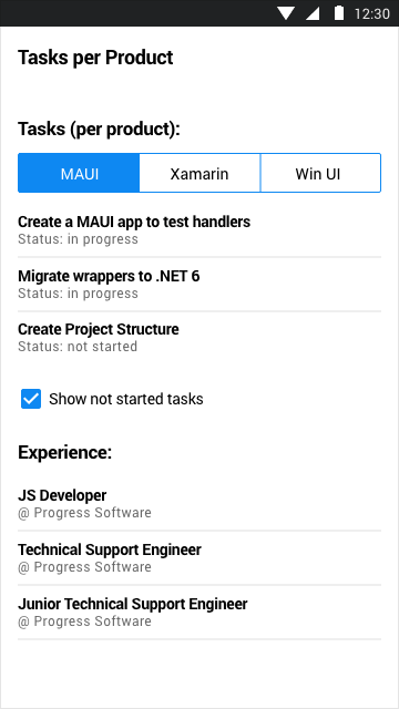
The Telerik Segmented control for .NET MAUI shares a somewhat similar UX as the Button control, but is targeted at enabling users to select from multiple different contexts where each linear segment can contain either text or images.
The SegmentedControl will provide you with the following capabilities for your .NET MAUI application development:
- Single selection flexibility: easily introduce custom code or logic for a selected item.
- Support for images and text: each segment can be displayed with either image or text, giving you an ultimate UX flexibility.
- Customizations: the flexible API allows you to fully customize the background and text of the segment items in both the normal and selected states.
New Component: Popup
Popup is a widely used controls designed to draw the attention of your users towards an important information. The Telerik UI for .NET MAUI Popup control provides you with a flexible API that enables you to implement complex logic for a wide range of application scenarios. The MAUI Popup control comes with various built-in features, including:
- Modal popups: modal popups are incredibly user-friendly since they close automatically when the user clicks outside the UI element.
- Placement configuration: the flexible placement configuration of the MAUI Popup control allows you to place the UI element anywhere within your MAUI app interface.
- Animation support: the MAUI Popup control comes with customizable animation support that is played when the control appears or disappears from the screen.

New Component: Path
The Path control for .NET MAUI allows you to draw complex shapes that are composed of different geometrics like arcs, ellipses, lines and rectangles rendered with the help of SkiaSharp graphics library. The MAUI Path control styling capabilities allow for flexible customization of its properties, such as the stroke thickness or the background color. In addition to the built-in geometrics, the multipath object feature allows you to draw more complex shapes by grouping multiple geometrics into a single element.
New features & Roadmap
Have a feature request?
Post your feedback via the Feedback Portal or the Public forums
What's new across all Telerik products?

Get the Bits
Download Free TrialSee Telerik UI for .NET MAUI in action and check out how much it can do out-of-the-box.
