
Telerik UI for ASP.NET MVC
What's New R1 2021
What's New HistoryNew ASP.NET MVC FloatingActionButton Component
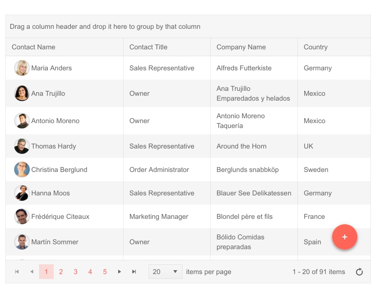
You can now position the most common action of your app right at the users’ fingertips thanks to the new Floating Action Button control. What’s a chat app without a “New message” or an email app without a “Compose” button?
New ASP.NET MVC Bottom Navigation Component
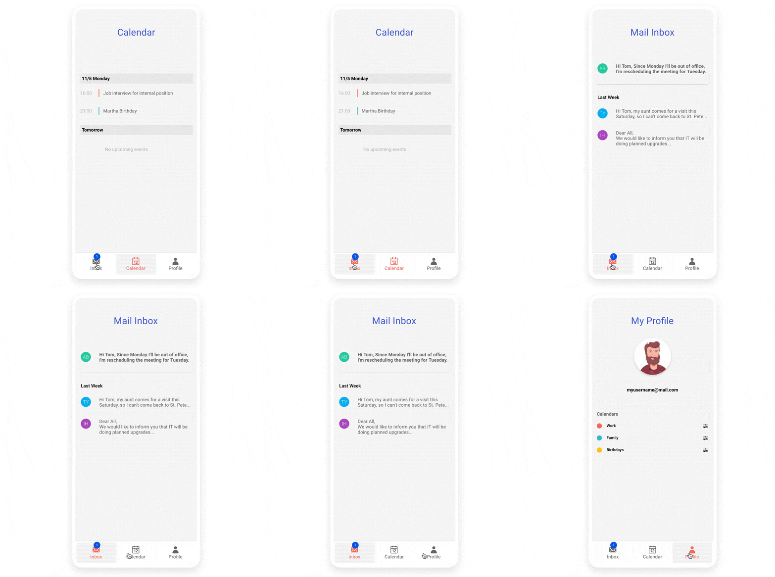
The Telerik UI for ASP.NET MVC Bottom Navigation component allows your users to quickly access the most used destinations within your application.
New ASP.NET MVC Expansion Panel Component
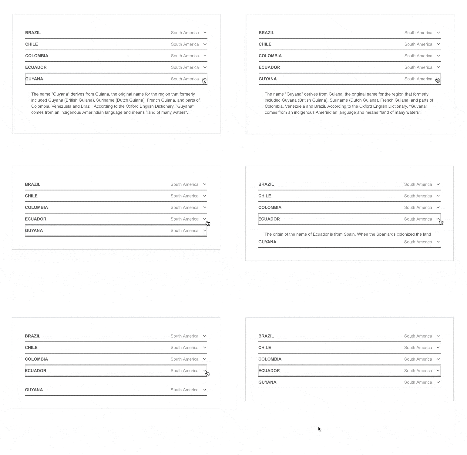
Let your users control the amount of information displayed on a screen within your app through the Telerik UI for ASP.NET MVC ExpansionPanel component. It is designed to organize content in sections that expand and collapse with the press of a button, making it easier for users to focus on what’s most important to them at a given moment.
New ASP.NET MVC CheckBoxGroup Component
The CheckBoxGroup control groups together a set of checkbox controls, enabling easy layout configurations of the list elements.

New ASP.NET MVC RadioGroup Component
The RadiоGroup component brings capabilities similar to the CheckBoxGroup component. It groups a set of radio buttons instead, enabling users to select only one radio button at a time.

New ASP.NET MVC Grid Component Feature: Exportable Property for Columns
You now have the ability to mark specific Grid columns as non-exportable, allowing you to hide their contents when exporting the Grid to either PDF, Excel or CSV.
New ASP.NET MVC Editor Feature: Roman Numerals
The Editor control can now create upper and lower numbered lists supporting Roman numerals.

New ASP.NET MVC Editor Feature: Table Aligning Tool
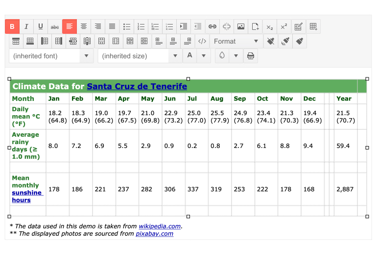
The Editor component now allows you to further customize your tables with a left, right or center alignment.
New ASP.NET MVC TileLayout Feature: Add/Remove Items
Your users can benefit from the updated version of the TileLayout component, which now supports dynamically adding or removing tiles with a simple drag-and-drop operation.

New Telerik UI for ASP.NET MVC ListView Feature: Grouping
The Telerik UI for ASP.NET MVC ListView component can now group its items based on your specifications, enabling your users to easily access the information they’re most interested in.

New ASP.NET MVC Area Charts Feature: Improved Highlight of Area Series
Area charts can now show a visual indication when you hover over the various series. With the new feature, the area charts will enable you to make the active series a user is interacting with stand out, while turning the non-hovered series transparent.
New ASP.NET MVC Multi-Component Feature: Keyboard Navigation
We have added keyboard support to the Drawer, ScrollView, TileLayout and Timeline components to bring them up to date with the rest of the suite.

New Telerik Document WordsProcessing Feature: Support for Content Controls
Structured Document Tags (also called Content Controls) allow users to add specific semantics to the document, such as restricting input, modifying editing behavior and more. Normally, the content controls are used to create a template, allowing you to fill specific data by interaction with the document (using checkboxes, predefined options, calendars).
Telerik UI for ASP.NET MVC - R1 2021
- New ASP.NET MVC FloatingActionButton Component
- New ASP.NET MVC Bottom Navigation Component
- New ASP.NET MVC Expansion Panel Component
- New ASP.NET MVC CheckBoxGroup Component
- New ASP.NET MVC RadioGroup Component
- New ASP.NET MVC Grid Component Feature: Exportable Property for Columns
- New ASP.NET MVC Editor Feature: Roman Numerals
- New ASP.NET MVC Editor Feature: Table Aligning Tool
- New ASP.NET MVC TileLayout Feature: Add/Remove Items
- New Telerik UI for ASP.NET MVC ListView Feature: Grouping
- New ASP.NET MVC Area Charts Feature: Improved Highlight of Area Series
- New ASP.NET MVC Multi-Component Feature: Keyboard Navigation
- New Telerik Document WordsProcessing Feature: Support for Content Controls
New features & Roadmap
Have a feature request?
Post your feedback via the ASP.NET MVC UserVoice portal or the Public forums
What's new across all Telerik products?

Next Steps
See UI for ASP.NET MVC in action and check out how much it can do out-of-the-box.
Check out the offers. Purchase an individual suite, or treat yourself to one of our bundles.
Try UI for ASP.NET MVC with dedicated technical support.


