WPF TreeListView Overview
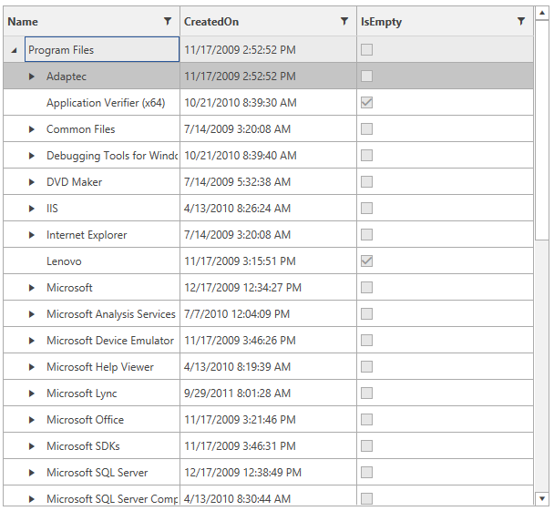
Use RadTreeListView to display hierarchical data in a tabular layout. The control combines the data operations and column model of RadGridView with tree-style expand and collapse behavior, which makes it suitable for scenarios such as file explorers, organizational structures, category trees, and nested business records.
This overview highlights the main capability areas of RadTreeListView and points you to the most relevant next article for setup, performance, and advanced data scenarios.
 Start Free Trial
When to Use RadTreeListView
Use RadTreeListView when you need to:
- Show homogeneous hierarchical data in a single table.
- Combine expand and collapse behavior with sortable and filterable columns.
- Work with large hierarchical data sets while keeping the UI responsive.
- Let users edit, validate, select, and inspect nested records without switching controls.
If your scenario requires heterogeneous child structures, evaluate a hierarchical RadGridView instead of RadTreeListView.
Key Features
Performance for Large Data Sets
RadTreeListView combines native UI virtualization, container recycling, and a LINQ-based data engine to keep scrolling and interaction responsive even with large data sets. To learn how to tune performance-sensitive scenarios, see Performance and UI Virtualization.
Hierarchical Data Binding
Define parent-child relationships through the data binding system and choose where the hierarchy column appears in the grid. This allows layouts similar to file explorers and other tree-based business views. See Data Binding and Hierarchy Column.
Built-In Data Operations
Apply sorting and filtering directly to your bound data while preserving the hierarchy structure. Parent nodes remain visible when matching child nodes need their context.
Columns, Details, and Aggregates
Choose from multiple built-in column types, keep important values visible with frozen columns, show extra content through row details, and calculate summary values through aggregates.
Editing, Validation, and Selection
Use the built-in selection model for single or multiple records, and combine editing with metadata-driven validation and custom validation logic. For more detail, see Selection and Managing Data.
Appearance and Customization
Adapt RadTreeListView to your application theme and editing workflow through styling, templating, and custom editors. The control supports a flexible appearance model and integrates with the theming system used across Telerik UI for WPF.
Common Next Steps
Start with the article that matches your immediate goal:
- To create your first tree grid and bind sample data, open Getting Started.
- To understand how the control behaves with larger data sets, open Performance.
- To configure hierarchy relationships and columns, open Data Binding and Columns.
- To inspect events and extensibility points, open Events.
- To see runnable examples, open Developer Focused Examples.
Explore the control demos at demos.telerik.com to review RadTreeListView behavior before integrating it into your application.
You can find additional implementation examples in the Telerik XAML SDK repository under
TreeListView.
Telerik UI for WPF Support and Learning Resources
- Telerik UI for WPF TreeListView Homepage
- Get Started with the Telerik UI for WPF TreeListView
- Telerik UI for WPF API Reference
- Getting Started with Telerik UI for WPF Components
- Telerik UI for WPF Virtual Classroom (Training Courses for Registered Users)
- Telerik UI for WPF TreeListView Forums
- Telerik UI for WPF Knowledge Base