Getting Started with WPF GridView
This tutorial will walk you through the creation of a sample application that contains RadGridView.
- Adding Telerik Assemblies Using NuGet
- Adding Assembly References Manually
- Adding RadGridView to the Project
- Populating with Data
- Columns
- Sorting, Grouping and Filtering
- Setting a Theme
Adding Telerik Assemblies Using NuGet
To use RadGridView when working with NuGet packages, install the Telerik.Windows.Controls.GridView.for.Wpf.Xaml package. The package name may vary slightly based on the Telerik dlls set - Xaml or NoXaml
Read more about NuGet installation in the Installing UI for WPF from NuGet Package article.
With the 2025 Q1 release, the Telerik UI for WPF has a new licensing mechanism. You can learn more about it here.
Adding Assembly References Manually
If you are not using NuGet packages, you can add a reference to the following assemblies:
- Telerik.Licensing.Runtime
- Telerik.Windows.Controls
- Telerik.Windows.Controls.GridView
- Telerik.Windows.Controls.Input
- Telerik.Windows.Data
Adding RadGridView to the Project
Before proceeding with adding RadGridView to your project, make sure the required assembly references are added to the project.
You can add RadGridView manually by writing the XAML code in Example 1. You can also add the control by dragging it from the Visual Studio Toolbox and dropping it over the XAML view.
Example 1: Adding RadGridView in XAML
xmlns:telerik="http://schemas.telerik.com/2008/xaml/presentation"In order to use RadGridView in XAML, you have to add the following namespace declaration: Example 2: Declaring Telerik Namespace
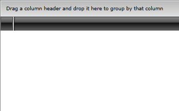
xmlns:telerik="http://schemas.telerik.com/2008/xaml/presentation"If you run the application, you will see an empty grid with no columns and rows as demonstrated in Figure 1.
Figure 1: The empty grid generated by the code in Example 1
Populating with Data
In order to populate the RadGridView control with data, you should create a collection of business objects. For the purposes of this example, create a new class named Club and add several properties to it, as shown in Example 3.
Example 3: Simple business class
public class Club : INotifyPropertyChanged
{
    public event PropertyChangedEventHandler PropertyChanged;

    private string name;
    private DateTime established;
    private int stadiumCapacity;

    public string Name
    {
        get { return this.name; }
        set
        {
            if (value != this.name)
            {
                this.name = value;
                this.OnPropertyChanged("Name");
            }
        }
    }

    public DateTime Established
    {
        get { return this.established; }
        set
        {
            if (value != this.established)
            {
                this.established = value;
                this.OnPropertyChanged("Established");
            }
        }
    }

    public int StadiumCapacity
    {
        get { return this.stadiumCapacity; }
        set
        {
            if (value != this.stadiumCapacity)
            {
                this.stadiumCapacity = value;
                this.OnPropertyChanged("StadiumCapacity");
            }
        }
    }

    public Club(string name, DateTime established, int stadiumCapacity)
    {
        this.name = name;
        this.established = established;
        this.stadiumCapacity = stadiumCapacity;
    }

    protected virtual void OnPropertyChanged(PropertyChangedEventArgs args)
    {
        PropertyChangedEventHandler handler = this.PropertyChanged;
        if (handler != null)
        {
            handler(this, args);
        }
    }

    private void OnPropertyChanged(string propertyName)
    {
        this.OnPropertyChanged(new PropertyChangedEventArgs(propertyName));
    }
}Public Class Club
Implements INotifyPropertyChanged
Public Event PropertyChanged As PropertyChangedEventHandler Implements INotifyPropertyChanged.PropertyChanged
Private m_name As String
Private m_established As DateTime
Private m_stadiumCapacity As Integer
Public Property Name() As String
Get
Return Me.m_name
End Get
Set(value As String)
If value <> Me.m_name Then
Me.m_name = value
Me.OnPropertyChanged("Name")
End If
End Set
End Property
Public Property Established() As DateTime
Get
Return Me.m_established
End Get
Set(value As DateTime)
If value <> Me.m_established Then
Me.m_established = value
Me.OnPropertyChanged("Established")
End If
End Set
End Property
Public Property StadiumCapacity() As Integer
Get
Return Me.m_stadiumCapacity
End Get
Set(value As Integer)
If value <> Me.m_stadiumCapacity Then
Me.m_stadiumCapacity = value
Me.OnPropertyChanged("StadiumCapacity")
End If
End Set
End Property
Public Sub New()
End Sub
Public Sub New(name As String, established As DateTime, stadiumCapacity As Integer)
Me.m_name = name
Me.m_established = established
Me.m_stadiumCapacity = stadiumCapacity
End Sub
Protected Overridable Sub OnPropertyChanged(ByVal args As PropertyChangedEventArgs)
Dim handler As PropertyChangedEventHandler = Me.PropertyChangedEvent
If handler IsNot Nothing Then
handler(Me, args)
End If
End Sub
Private Sub OnPropertyChanged(ByVal propertyName As String)
Me.OnPropertyChanged(New PropertyChangedEventArgs(propertyName))
End Sub
End ClassIf you want to support two-way binding, your Club class should implement the INotifyPropertyChanged interface and raise the PropertyChanged event every time a property value changes.
Next, you should create the view model containing a collection of Club objects.
Example 4: View model containing ObservableCollection of sample data
public class MyViewModel : ViewModelBase
{
    private ObservableCollection<Club> clubs;

    public ObservableCollection<Club> Clubs
    {
        get
        {
            if (this.clubs == null)
            {
                this.clubs = this.CreateClubs();
            }

            return this.clubs;
        }
    }

    private ObservableCollection<Club> CreateClubs()
    {
        ObservableCollection<Club> clubs = new ObservableCollection<Club>();
        Club club;

        club = new Club("Liverpool", new DateTime(1892, 1, 1), 45362);
        clubs.Add(club);

        club = new Club("Manchester Utd.", new DateTime(1878, 1, 1), 76212);
        clubs.Add(club);

        club = new Club("Chelsea", new DateTime(1905, 1, 1), 42055);
        clubs.Add(club);

        return clubs;
    }
}Public Class MyViewModel
Inherits ViewModelBase
Private m_clubs As ObservableCollection(Of Club)
Public ReadOnly Property Clubs() As ObservableCollection(Of Club)
Get
If Me.m_clubs Is Nothing Then
Me.m_clubs = Me.CreateClubs()
End If
Return Me.m_clubs
End Get
End Property
Private Function CreateClubs() As ObservableCollection(Of Club)
Dim clubs As New ObservableCollection(Of Club)()
Dim club As Club
club = New Club("Liverpool", New DateTime(1892, 1, 1), 45362)
clubs.Add(club)
club = New Club("Manchester Utd.", New DateTime(1878, 1, 1), 76212)
clubs.Add(club)
club = New Club("Chelsea", New DateTime(1905, 1, 1), 42055)
clubs.Add(club)
Return clubs
End Function
End ClassViewModelBase is an abstract class implementing INotifyPropertyChanged. It resides in the Telerik.Windows.Controls namespace.
Now that you have prepared the needed sample data, it is time to bind RadGridView to it. For that purpose, you should set the RadGridView's ItemsSource property to the collection of clubs.
Example 5 demonstrates how you can bind the ItemsSource collection in XAML. The local namespace in the example corresponds to the namespace where MyViewModel resides.
Example 5: Bind RadGridView
<Window x:Class="WpfApp1.Window1"
		xmlns="http://schemas.microsoft.com/winfx/2006/xaml/presentation"
		xmlns:x="http://schemas.microsoft.com/winfx/2006/xaml"
		xmlns:d="http://schemas.microsoft.com/expression/blend/2008"
		xmlns:mc="http://schemas.openxmlformats.org/markup-compatibility/2006"
		xmlns:telerik="http://schemas.telerik.com/2008/xaml/presentation"
		mc:Ignorable="d"
		xmlns:local="clr-namespace:WpfApp1"
		Title="Window1" Height="450" Width="800">
	<Grid>
		<Grid.Resources>
			<local:MyViewModel x:Key="MyViewModel" />
		</Grid.Resources>
		<telerik:RadGridView x:Name="gridView" DataContext="{StaticResource MyViewModel}" ItemsSource="{Binding Clubs}"/>
	</Grid>
</Window>
Alternatively, you can set the ItemsSource property in code-behind, as demonstrated in Example 6.
Example 6: Set ItemsSource in code
public partial class Window1 : Window
{
    public Window1()
    {
        InitializeComponent();
        this.gridView.ItemsSource = new MyViewModel().Clubs;
    }
}Public Partial Class Window1
Inherits Window
Public Sub New()
InitializeComponent()
Me.gridView.ItemsSource = New MyViewModel().Clubs
End Sub
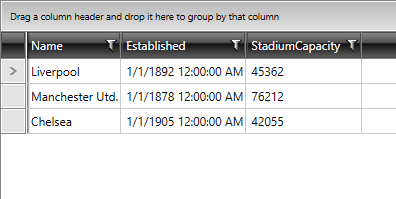
End ClassRunning the application containing the code from Examples 1 - 6 will result in a populated RadGridView, like in Figure 2.
Figure 2: RadGridView bound to collection of clubs
You can read more about configuring the data bindings here.
Columns
The RadGridView from the examples above contains three columns, one for each of the properties of the Club class. RadGridView automatically generates these columns. If you want to stop the columns auto generation and define the columns that you want to be visible manually, set the property AutoGenerateColumns to False.
Example 7 demonstrates how you can manually prevent the automatic generation and define columns.
Example 7: Manually defined columns
<telerik:RadGridView x:Name="manualGridView" DataContext="{StaticResource MyViewModel}"
                     ItemsSource="{Binding Clubs}"
                     AutoGenerateColumns="False" >
    <telerik:RadGridView.Columns>
        <telerik:GridViewDataColumn DataMemberBinding="{Binding Name}" Header="Club Name"/>
        <telerik:GridViewDataColumn DataMemberBinding="{Binding Established}" Header="Established"/>
    </telerik:RadGridView.Columns>
</telerik:RadGridView>
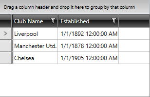
The code in Example 7 is shown in Figure 3. The XAML declaration of the RadGridView contains two columns: the first one named "Club Name" is bound to the Name property. The second named "Established" is bound, respectively, to Established. As a result, your grid control will have only two columns and no other column will be added because the AutoGenerateColumns property is set to False.
Figure 3: RadGridView with manually defined columns
You can read more about RadGridView columns here.
Sorting, Grouping and Filtering
Sorting, Grouping and Filtering of RadGridView are enabled by default.
-
You can disable sorting for a specific column by setting its IsSortable property to False.
-
You can disable filtering for a specific column by setting its IsFilterable property to False or by setting the IsFilteringAllowed property of RadGridView to False.
-
You can disable grouping for a specific column by setting its IsGroupable property to False.
Setting a Theme
The controls from our suite support different themes. You can see how to apply a theme different than the default one in the Setting a Theme help article.
Changing the theme using implicit styles will affect all controls that have styles defined in the merged resource dictionaries. This is applicable only for the controls in the scope in which the resources are merged.
To change the theme, you can follow the steps below:
-
Choose between the themes and add reference to the corresponding theme assembly (ex: Telerik.Windows.Themes.Windows8.dll). You can see the different themes applied in the Theming examples from our WPF Controls Examples application.
-
Merge the ResourceDictionaries with the namespace required for the controls that you are using from the theme assembly. For RadGridView, you will need to merge the following resources:
- Telerik.Windows.Controls
- Telerik.Windows.Controls.Input
- Telerik.Windows.Controls.GridView
Example 8 demonstrates how to merge the ResourceDictionaries so that they are applied globally for the entire application.
Example 8: Merge the ResourceDictionaries
<Application.Resources>
	<ResourceDictionary>
		<ResourceDictionary.MergedDictionaries>
               <ResourceDictionary Source="/Telerik.Windows.Themes.Windows8;component/Themes/System.Windows.xaml"/>
               <ResourceDictionary Source="/Telerik.Windows.Themes.Windows8;component/Themes/Telerik.Windows.Controls.xaml"/>
               <ResourceDictionary Source="/Telerik.Windows.Themes.Windows8;component/Themes/Telerik.Windows.Controls.Input.xaml"/>
               <ResourceDictionary Source="/Telerik.Windows.Themes.Windows8;component/Themes/Telerik.Windows.Controls.GridView.xaml"/>
		</ResourceDictionary.MergedDictionaries>
	</ResourceDictionary>
</Application.Resources>
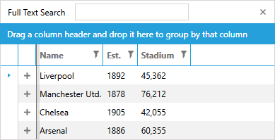
Figure 4 shows RadGridView with the Windows8 theme applied.
Figure 4: RadGridView with the Windows8 theme
Telerik UI for WPF Learning Resources
- Telerik UI for WPF DataGrid Component
- Getting Started with Telerik UI for WPF Components
- Telerik UI for WPF Installation
- Telerik UI for WPF and WinForms Integration
- Telerik UI for WPF Visual Studio Templates
- Setting a Theme with Telerik UI for WPF
- Telerik UI for WPF Virtual Classroom (Training Courses for Registered Users)
- Telerik UI for WPF License Agreement