DateRangePicker Overview
The DateRangePicker component allows you to easily enrich your UI with a tool for selecting range of dates. This is helpful for scenarios where you need to extract a specific set of data related to a time range. For example, applications for booking hotels, showing graphs with sales data in specific ranges and more.
 Start Free Trial
Key Features
-
Culture settings—RadDateRangePicker provides settings to adjust the current culture and few corresponding options, like the first day of the week.
-
Read-only support—The component can be displayed in a read-only state that disables the user selection of dates.
-
Allowed selection range—You can define an allowed selection range which restricts the user selection.
-
Blackout dates—This features can be used to disable a set of dates which cannot be selected.
-
Customizable input element—The DateRangePicker control allows you to customize the formatting, the empty content and the placeholders of the input area.
-
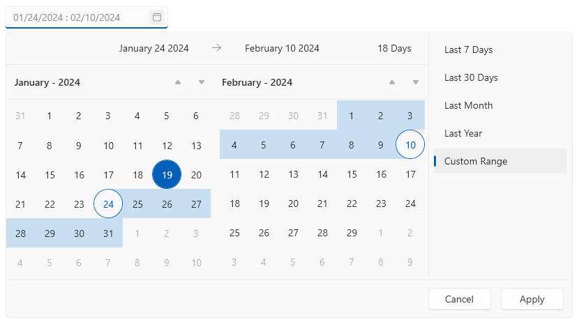
Customizable calendars—The control has a set of two calendars that show the current and next month or year, which can be customized via number of properties of the control.
-
Customizable list of predefined date ranges—The list with the predefined date ranges allows the end user to easily select a range.
Get started with the control with its Getting Started help article that shows how to use it in a basic scenario.
Check out the DateRangePicker demos at: https://demos.telerik.com/wpf/
Telerik UI for WPF Support and Learning Resources
- Telerik UI for WPF DateRangePicker Homepage
- Get Started with the Telerik UI for WPF DateRangePicker
- Telerik UI for WPF API Reference
- Getting Started with Telerik UI for WPF Components
- Telerik UI for WPF Virtual Classroom (Training Courses for Registered Users)
- Telerik UI for WPF DateRangePicker Forums
- Telerik UI for WPF Knowledge Base