Customizing MenuItem Appearance
The RadContextMenu and the RadMenuItem controls come with a set of selector properties. Typically, you use a template or style selector when you have more than one data template or style defined for the same type of objects.
The following example is based on the Data Binding article.
Here is a list of the selectors provided by the RadContextMenu control:
ItemContainerTemplateSelector—Used to select a DataTemplate, which needs to contain an element of the type of RadMenuItem that will be displayed in the RadContextMenu control.ItemTemplateSelector—Used to select theDataTemplatethat is set as theHeaderTemplateproperty of the child RadMenuItem instances.
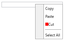
Define the ItemTemplateSelector
public class MyTemplateSelector : DataTemplateSelector
{
    public DataTemplate CutTemplate { get; set; }
    public DataTemplate DefaultTemplate { get; set; }

    public override DataTemplate SelectTemplate(object item, DependencyObject container)
    {
        var menuItem = item as MenuItem;
        if (menuItem != null && menuItem.Text == "Cut")
        {
            return this.CutTemplate;
        }
        return this.DefaultTemplate;
    }
}
Using the ItemTemplateSelector in XAML
<Grid xmlns="http://schemas.microsoft.com/winfx/2006/xaml/presentation"
            xmlns:x="http://schemas.microsoft.com/winfx/2006/xaml"
            xmlns:telerik="http://schemas.telerik.com/2008/xaml/presentation"
      xmlns:local="clr-namespace:MyProject">
    <Grid.Resources>
                <x:Array x:Key="MenuItems" Type="{x:Type local:MenuItem}">
                        <local:MenuItem Text="Cut" />
                        <local:MenuItem Text="Copy" />
                </x:Array>
        <Style x:Key="MenuItemStyle" TargetType="telerik:RadMenuItem">
            <Setter Property="Header" Value="{Binding Text}" />
        </Style>
        <local:MyTemplateSelector x:Key="MyTemplateSelector">
            <local:MyTemplateSelector.CutTemplate>
                <DataTemplate>
                    <StackPanel Orientation="Horizontal">
                        <Rectangle Width="10" Height="10" Fill="Red" />
                        <TextBlock Text="{Binding Text}" />
                    </StackPanel>
                </DataTemplate>
            </local:MyTemplateSelector.CutTemplate>
            <local:MyTemplateSelector.DefaultTemplate>
                <DataTemplate>
                    <TextBlock Text="{Binding Text}" />
                </DataTemplate>
            </local:MyTemplateSelector.DefaultTemplate>
        </local:MyTemplateSelector>
    </Grid.Resources>
    <TextBox Width="200" VerticalAlignment="Top" ContextMenu="{x:Null}">
        <telerik:RadContextMenu.ContextMenu>
            <telerik:RadContextMenu x:Name="radContextMenu"
                                    ItemContainerStyle="{StaticResource MenuItemStyle}"
                                    ItemsSource="{StaticResource MenuItems}"
                                    ItemTemplateSelector="{StaticResource MyTemplateSelector}" />
        </telerik:RadContextMenu.ContextMenu>
    </TextBox>
</Grid>
RadContextMenu with ItemTemplateSelector
ItemContainerStyleSelector—Used to select the Style that is applied to the child RadMenuItems.
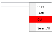
Define the ItemContainerStyleSelector
public class MyStyleSelector : StyleSelector
{
    public Style CutStyle { get; set; }
    public Style DefaultStyle { get; set; }

    public override Style SelectStyle(object item, DependencyObject container)
    {
        var menuItem = item as MenuItem;
        if (menuItem.Text == "Cut")
        {
            return this.CutStyle;
        }
        return this.DefaultStyle;
    }
}
Use the ItemContainerStyleSelector in XAML
<Grid xmlns="http://schemas.microsoft.com/winfx/2006/xaml/presentation"
            xmlns:x="http://schemas.microsoft.com/winfx/2006/xaml"
            xmlns:telerik="http://schemas.telerik.com/2008/xaml/presentation"
      xmlns:local="clr-namespace:MyProject">
    <Grid.Resources>
                <x:Array x:Key="MenuItems" Type="{x:Type local:MenuItem}">
                        <local:MenuItem Text="Cut" />
                        <local:MenuItem Text="Copy" />
                </x:Array>
        <Style x:Key="MenuItemStyle" TargetType="telerik:RadMenuItem">
            <Setter Property="Header" Value="{Binding Text}" />
        </Style>
        <local:MyStyleSelector x:Key="MyStyleSelector" DefaultStyle="{StaticResource MenuItemStyle}">
            <local:MyStyleSelector.CutStyle>
                <Style TargetType="telerik:RadMenuItem" BasedOn="{StaticResource MenuItemStyle}">
                    <Setter Property="Background" Value="Red" />
                </Style>
            </local:MyStyleSelector.CutStyle>
        </local:MyStyleSelector>
    </Grid.Resources>
    <TextBox Width="200" VerticalAlignment="Top" ContextMenu="{x:Null}">
        <telerik:RadContextMenu.ContextMenu>
            <telerik:RadContextMenu x:Name="radContextMenu"
                                    ItemsSource="{StaticResource MenuItems}"
                                    ItemContainerStyleSelector="{StaticResource MyStyleSelector}" />
        </telerik:RadContextMenu.ContextMenu>
    </TextBox>
</Grid>
RadContextMenu with ItemContainerStyleSelector
And a list of the selectors provided by the RadMenuItem control:
HeaderTemplateSelector—Used to select the DataTemplate that is set to its HeaderTemplate property.ItemContainerStyleSelector—Used to select theStylethat is applied to the child RadMenuItem elements.ItemContainerTemplateSelector—Used to select a DataTemplate, which needs to contain an element of the type of RadMenuItem that will be displayed in the RadContextMenu control.ItemTemplateSelector—Used to select the DataTemplate that is set as the HeaderTemplate property of the child RadMenuItem instances.
These properties of the RadMenuItem should be set through the
ItemContainerStyleof the parent item. If you set the ItemContainerStyle property of theRadContextMenuonly (valid for dynamic data scenarios), it will get inherited in the hierarchy, unless it is not explicitly set somewhere.
The HierarchicalDataTemplate used with the RadContextMenu also exposes ItemContainerStyleSelector and ItemTemplateSelector properties.