LightVisualElement
LightVisualElement is a lightweight element which is capable of displaying Text, Border and Image and can be easily customized. Here is a list of its properties allowing for fine tuning the element:
-
ShouldPaint: Indicates whether the element should be painted. Children visibility would not be affected.
-
CanFocus: Gets or sets value indicating whether an element can receive input focus.
-
DrawText, DrawFill, DrawBorder Gets or sets value indicating whether an element can receive input focus.
-
BorderBoxStyle: Defines the border rendering style – SingleBorder, FourBorders, OuterInnerBorders
-
BorderDrawMode: Defines drawing border corners – HorizontalOverVertical, LeftOverTop, RightOverTop, RightOverBotton, LeftOverBottom etc.
-
BorderWidth: Defines the width the border on each side
-
BorderLeftWidth, BorderLeftWidth, BorderRightWidth, BorderBottomWidth Defines the width of the border on each side independently
-
BorderGradientAngle: Defines the angle of the gradient the border uses as background.
-
BorderGradientStyle: Defines the gradient effects: Solid, Linear, Radial, Glass, OfficeGlass, Gel, and Vista.
-
BorderColor, BorderColor2, BorderColor3, BorderColor4 Defines the four colors used for making gradient border background
-
BorderInnerColor, BorderInnerColor2, BorderInnerColor3, BorderInnerColor4 Defines the four colors used for making the inner gradient border background
-
BackColor, BackColor2, BackColor3, BackColor4 Defines the four colors used the element’s gradient background
-
NumberOfColors: Defines how many colors will be used to make the background color. If the value is ‘1’ the other three colors are ignored
-
GradientStyle: Defines the gradient effects: Solid, Linear, Radial, Glass, OfficeGlass, Gel, and Vista.
-
GradientAngle: Gets or sets the angle of the background gradient
-
GradientPercentage: Defines how much of the available space the first gradient color will take
-
GradientPercentage2: Defines the space available for the the second gradient color
-
BackgroundImage: Gets or sets the BackgroundImage. This image fills up the entire element’s background
-
Image: Gets or sets the element’s image, the image can be resized inside the element.
-
SvgImage: Gets or sets the SVG image.
-
ImageLayout: Specifies the position of the image on the control. None, Tile, Center, Stretch, Zoom
-
BackgroundImageLayout: Specifies the position of the BackgroundImage on the control. None, Tile, Center, Stretch, Zoom
-
ImageOpacity: Specifies the opacity of the set image
-
ImageAlignment, TextAlignment Specifies alignment of content on the drawing surface. TopLeft, TopCenter, TopRight, MiddleLeft, MiddleCenter, MiddleRight, BottomLeft, BottomCenter, BottomRight
-
TextImageRelation: Specifies the position of the text and image relative to each other on a control. Overlay, ImageBeforeText, TextBeforeImage, ImageAboveText, TextAboveImage
-
ShowHorizontalLine, ShowHorizontalLineColor, ShowHorizontalLineWidth These properties allow you to modify a horizontal line over the element
-
PaintTextFormat: An object which Encapsulates text layout information (such as alignment, orientation and tab stops) display manipulations (such as ellipsis insertion and national digit substitution) and OpenType features
-
DisableHTMLRendering: Gets or sets the value indicating whether html tags will be rendered.
-
TextBlock: An object which contains the text and its styling.
-
BorderLeftColor, BorderTopColor, BorderRightColor, BorderBottomColor, BorderLeftShadowColor, BorderTopShadowColor, BorderRightShadowColor, BorderBottomShadowColor Defines border colors and shadows
-
ClipText: Determines whether text will be clipped within the calculated text paint rectangle.
-
Layout: Gets the LayoutManagerPart which is responsible for the layout. Use this property to set the margins of left, right parts separately.
-
ImageTransparentColor: Transparent color to be used for the image.
-
BorderDashStyle: Specifies the style of dashed lines drawn with a border
-
EnableImageTransparency: Gets or sets a value indicating whether image transparency is supported.
-
Shadow: Gets or Sets the ShadowSettings
-
AutoEllipsis: Determines whether character trimming will be automatically applied to the element if text cannot be fitted within the available space.
-
UseMnemonic: Determines whether ampersand character will be treated as mnemonic or not.
-
TextWrap: Determines whether text wrap is enabled.
-
MeasureTrailingSpaces: Indicates whether the trailing white spaces will be calculated by the layout logic
-
TextParams: Gets the TextParams object which defines some text settings
The following example will show you how to make a simple image gallery with three LightVisualElements inside a DockLayoutPanel.
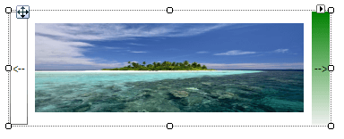
Creating a simple control with LightVisualElements
public class MyLightVisualElement : RadElement
{
    private DockLayoutPanel mainPanel;
    private LightVisualElement leftButtonElement;
    private LightVisualElement rightButtonElement;
    private LightVisualElement currentImageElement;
    private Image[] images;
    protected override void CreateChildElements()
    {
        this.mainPanel = new DockLayoutPanel();
        this.mainPanel.LastChildFill = true;
        this.Children.Add(this.mainPanel);
        this.leftButtonElement = new LightVisualElement();
        this.leftButtonElement.Text = "<--";
        this.leftButtonElement.DrawBorder = true;
        this.mainPanel.Children.Add(this.leftButtonElement);
        DockLayoutPanel.SetDock(this.leftButtonElement, Telerik.WinControls.Layouts.Dock.Left);
        this.leftButtonElement.Click += leftButtonElement_Click;
        this.rightButtonElement = new LightVisualElement();
        this.rightButtonElement.Text = "-->";
        this.rightButtonElement.DrawFill = true;
        this.rightButtonElement.BackColor = Color.Green;
        this.mainPanel.Children.Add(this.rightButtonElement);
        DockLayoutPanel.SetDock(this.rightButtonElement, Telerik.WinControls.Layouts.Dock.Right);
        this.rightButtonElement.Click += rightButtonElement_Click;
        this.currentImageElement = new LightVisualElement();
        this.mainPanel.Children.Add(this.currentImageElement);
        string imageFilesDirectory = Environment.GetFolderPath(Environment.SpecialFolder.MyPictures);
        string[] imageFiles = Directory.GetFiles(imageFilesDirectory, "*.jpg");
        this.images = new Image[imageFiles.Length];
        for (int i = 0; i < imageFiles.Length; i++)
        {
            this.images[i] = new Bitmap(Image.FromFile(imageFiles[i]), new Size(300, 100));
        }
        if (this.images.Length >= 0)
        {
            this.currentImageElement.Image = this.images[0];
        }
        base.CreateChildElements();
    }
    private void rightButtonElement_Click(object sender, EventArgs e)
    {
        int currentImageIndex = Array.IndexOf(this.images, this.currentImageElement.Image);
        if (++currentImageIndex <= this.images.Length - 1)
        {
            this.currentImageElement.Image = this.images[currentImageIndex];
        }
    }
    private void leftButtonElement_Click(object sender, EventArgs e)
    {
        int currentImageIndex = Array.IndexOf(this.images, this.currentImageElement.Image);
        if (--currentImageIndex >= 0)
        {
            this.currentImageElement.Image = this.images[currentImageIndex];
        }
    }
}