Show Custom Checkbox Glyphs in RadMenuItem
Environment
| Version | Product | Author |
|---|---|---|
| 2026.3.1007 | RadMenu | Desislava Yordanova |
Description
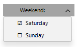
To keep a normal RadMenuItem's IsChecked, ToggleState, and CheckOnClick behavior while displaying your own checkbox glyphs, update the item's Text when its toggle state changes and collapse Layout.Checkmark after the state change. This preserves the standard menu item visual tree.
Solution
Call the following method after InitializeComponent() for each checkable item. The method sets the initial text and hides the built-in checkmark. It then updates the text and hides the checkmark again after each ToggleStateChanged event.
using System;
using Telerik.WinControls;
using Telerik.WinControls.UI;

private void ConfigureCheckableItem(RadMenuItem item, string label)
{
    item.CheckOnClick = true;

    Action updateVisual = () =>
    {
        item.Text = $"{(item.IsChecked ? "☑" : "☐")}  {label}";
        item.Layout.Checkmark.Visibility = ElementVisibility.Collapsed;
    };

    item.ToggleStateChanged += (sender, args) => updateVisual();
    updateVisual();
}

public Form1()
{
    InitializeComponent();

    RadMenuItem saturday = new RadMenuItem();
    this.radDropDownButton1.Items.Add(saturday);
    RadMenuItem sunday = new RadMenuItem();
    this.radDropDownButton1.Items.Add(sunday);

    ConfigureCheckableItem(saturday, "Saturday");
    ConfigureCheckableItem(sunday, "Sunday");

}
The menu items remain ordinary RadMenuItem instances. The method does not replace the built-in layout or change how the application reads IsChecked or ToggleState. CheckOnClick continues to toggle the item when it is selected from a drop-down menu.
Layout.Checkmark also contains the image element used in the item's left column. This technique is for menu items that do not need a separate item image in that column. The custom glyphs are Unicode text. Check that the font used by your application can display them.