Structure
This article describes the inner structure and organization of the elements which build RadTaskBoard.
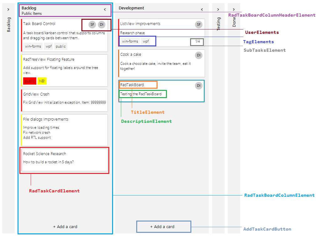
RadTaskBoard is composed of column elements. Each RadTaskBoardColumnElement contains a header, task card elements and a button at the bottom for adding more task cards. Every RadTaskCardElement contains 9 containers: 3 x 3. This allows adding different elements top-left, top-center, top-right, middle-left, middle-center, middle-right, bottom-left, bottom-center, bottom-right. The RadTaskCardElement.ElementsCollections offers a dictionary which Value is ContentAlignment allowing you easily to access the RadItemOwnerCollection for the respective container.
-
Column: Essential building block, represented by the base class RadTaskBoardColumnElement. The columns inside the control can be collapsed.
-
Column Header: Represents the header of the columns inside the RadTaskBoard control.
-
Task Title: Represents the title of the task item.
-
User: Represents the circle container which can display an icon image of the RadTaskBoard card.
-
Tags: Displays a collection of highlight objects applied to a given item.
-
Accent/Category Indicator: Represents the color container on the left side for a RadTaskBoard card.
-
Task Description: Represents the description of the item.
-
Expand/Collapse Column Button: Collapses and expands the column.
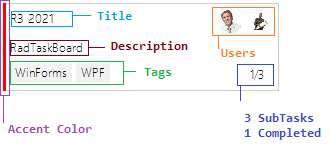
Each RadTaskCardElement offers accent color, title, description, user info, tags, sub tasks. The sub tasks are displayed in the following format: "Number of Completed Tasks/ Total number of tasks".
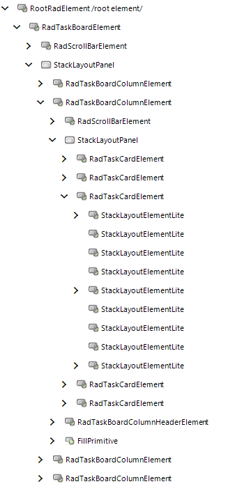
Elements Hierarchy