Inline AI Assistant Visual Structure
Telerik UI for WinForms RadInlineAIAssistant is a nonvisual component that owns a popup. The popup contains the prompt input and an optional response area built with Telerik Presentation Framework (TPF) elements.
Popup Layout
The response area appears above the prompt input when response text is supplied. The following diagram shows the main visual areas, not every internal layout element.
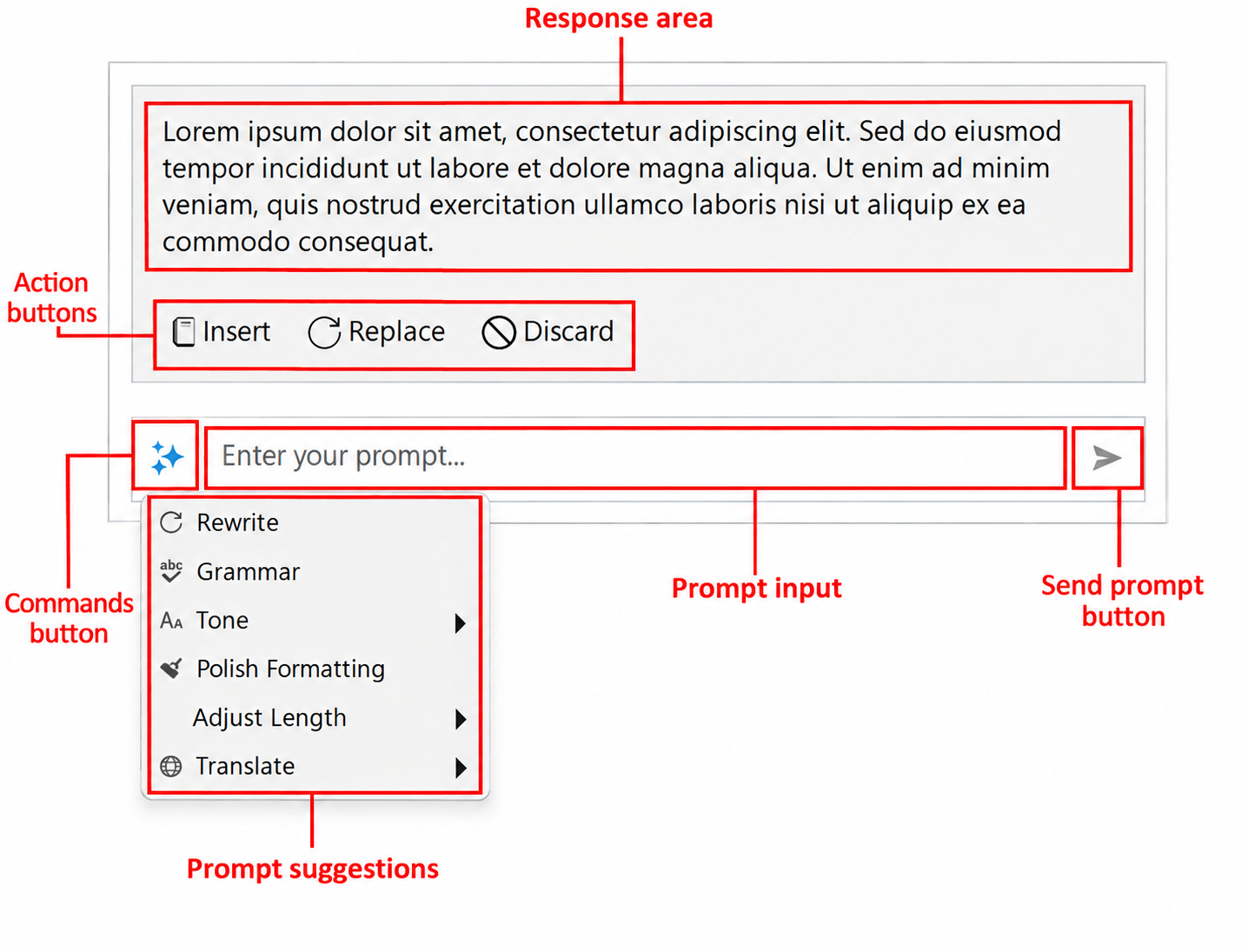
The component is not itself a text editor. Its interaction provider connects this popup to the host's text, selection, and caret position. See Configuring Interaction Providers.
Accessing the Elements
Use the following public properties to access the main elements. Paths are relative to the RadInlineAIAssistant instance.
| Visual area | Access path | Type |
|---|---|---|
| Popup window | Popup | InlineAIAssistantPopup |
| Prompt input | InlineAIAssistantElement.PromptInputElement | RadPromptInputElement |
| Commands button | InlineAIAssistantElement.CommandsButton | LightVisualButtonElement |
| Response area | InlineAIAssistantElement.ResponseElement | InlineAIAssistantResponseElement |
| Response text | InlineAIAssistantElement.ResponseElement.ResponseTextElement | LightVisualElement |
| Insert button | InlineAIAssistantElement.ResponseElement.InsertButton | AIPromptButtonElement |
| Replace button | InlineAIAssistantElement.ResponseElement.ReplaceButton | AIPromptButtonElement |
| Discard button | InlineAIAssistantElement.ResponseElement.DiscardButton | AIPromptButtonElement |
Use these properties instead of depending on child indexes. See Customizing Appearance for examples.
Prompt and Commands
NullText supplies the placeholder in the empty prompt. The command button opens a separate dropdown of InlineAIAssistantCommand and InlineAIAssistantCommandGroup entries. The prompt input's own suggestion lists are not used for this dropdown.
The component's Commands collection configures the dropdown. InlineAIAssistantElement.IsCommandsMenuOpen reports whether it is open, and ShowCommandsMenu() on that element opens it when commands are available. See Configuring Commands.
Response Area and Actions
The response is displayed as read-only text in a scroll viewer. ResponseMaxHeight limits its height, while the popup grows or shrinks as content changes. The response area is initially hidden.
During a request, the prompt shows its processing state. Streamed chunks can appear before generation finishes. The component enables Insert and Replace after completion according to the host provider's capabilities. An error response does not enable these editing actions.
Insert and Replace apply text to the host and request a close. Discard clears the response and returns focus to the prompt without closing the assistant. See Handling Responses.