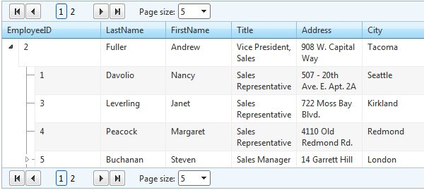
Paging
RadTreeList supports paging functionality which allows the users to view the data, separated in chunks. This is helpful in cases where the control is bound to a large collection of data which would be impractical or even impossible to display on a single page. Depending on the developers' preferences, the appearance of the pager may vary from a simple page-number buttons to a more sophisticated slider control.
To enable this functionality in RadTreeList, you should set the AllowPaging property to true.
<telerik:RadTreeList RenderMode="Lightweight" ID="RadTreeList1" runat="server" AllowPaging="true" />RadTreeList exposes the PageSizeControlType property in its PagerStyle property collection which is an enum of type PagerDropDownControlType.It has three values available with RadComboBox being the default one:
-
None
-
RadComboBox
-
RadDropDownList
As it name implies, the property specifies what type of page size drop down control will be rendered.The property provides an easy way to switch off the page size combo or replace it with its light weight counterpart RadDropDownList.
Pager API
The following methods and properties are exposed in the RadTreeList's server-side Pager API:
| Property | Description |
|---|---|
| PageSize | Determines the maximum items displayed on a single page. |
| PagerStyle-FirstPageToolTip | The text that is displayed when hovering the FirstPage button |
| PagerStyle-NextPageToolTip | The text that is displayed when hovering the NextPage button |
| PagerStyle-PrevPageToolTip | The text that is displayed when hovering the PrevPage button |
| PagerStyle-LastPageToolTip | The text that is displayed when hovering the LastPage button |
| PageButtonCount | The number of numeric buttons in the pager |
| Position | Determines the position of the Pager in RadTreeList: Top, Bottom, TopAndBottom |
| Mode | This property sets the appearance of the Pager. The available modes are: NextPrev, NumericPages, NextPrevAndNumeric, NextPrevNumericAndAdvanced, Advanced, Slider |