Tutorial Creating A Custom Skin
The following tutorial demonstrates creating a custom RadTabStrip skin, using the default skin as a base. This new skin will take the appearance of the tab strip from its default look:

to the following:

See Understanding the Skin CSS File for more information on specific CSS file properties.
Prepare the Project
-
Drag a RadTabStrip from the toolbox onto a new AJAX-enabled application Web form.
-
Use the RadTabStrip Item Builder to add tabs to the tab strip, or add them in the HTML markup. Include two levels of tabs, and include a disabled tab:
<telerik:RadTabStrip RenderMode="Lightweight" ID="RadTabStrip1" runat="server" SelectedIndex="0">
    <Tabs>
        <telerik:RadTab runat="server" Text="Root RadTab1" Selected="True">
            <Tabs>
                <telerik:RadTab runat="server" Text="Child RadTab 1">
                </telerik:RadTab>
                <telerik:RadTab runat="server" Text="Child RadTab 2">
                </telerik:RadTab>
            </Tabs>
        </telerik:RadTab>
        <telerik:RadTab runat="server" Text="Root RadTab2">
        </telerik:RadTab>
        <telerik:RadTab runat="server" Text="Root RadTab3">
        </telerik:RadTab>
        <telerik:RadTab runat="server" Text="Root RadTab4">
        </telerik:RadTab>
    </Tabs>
</telerik:RadTabStrip>-
In the Solution Explorer, create a new "Green" directory in your project.
-
Copy the default RadTabStrip skin files from the installation directory to the "Green" directory; copy both the \TabStrip directory that contains the images for this skin and the TabStrip.Default.css file that defines the skin styles.
The file path will typically be similar to this example: \Program Files\Progress\UI for ASP.NET AJAX RX YYYY\Skins\Default.
-
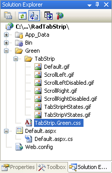
In the Solution Explorer, rename "TabStrip.Default.css" to "TabStrip.Green.css". The Solution Explorer should now look something like the following:

-
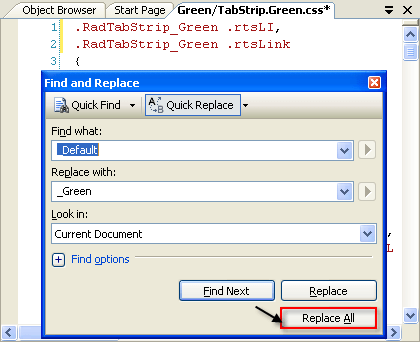
Open TabStrip.Green.css and replace all instances of _Default with _Green. Then save the file:

-
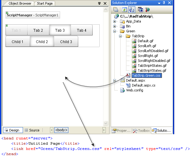
Drag the "TabStrip.Green.Css" file from the Solution Explorer onto your Web page. This automatically adds a reference to the page "" tag as a "" to the new stylesheet:

-
Set the EnableEmbeddedSkins property of the RadTabStrip control to False.
-
Change the Skin property of your RadTabStrip control to "Green".
-
Run the application. The new "Green" skin looks just like the Default skin:

Modifying the CSS file
- The first selector in the CSS file sets the "color" attribute for the .rtsLI and .rtsLink classes. These are the classes applied to the LI and A elements that represent a rendered tab. (Separator tabs get the .rtsLI class on an LI element, but have no A element with the .rtsLink class). Change the color to green, so that the text labels on tabs use a green font :
.RadTabStrip_Green .rtsLI,
.RadTabStrip_Green .rtsLink
{
  color: Green;
} - Locate the selector for the .rtsIn class. This class is applied to a SPAN that wraps the text and images that label the tabs. Change the padding attribute from "9px 20px 7px" to "0 5px 5px" to reduce the size of the tabs:
.RadTabStrip_Green .rtsIn
{
  font: 12px/20px arial,sans-serif;
  padding: 0 5px 5px;
} - Locate the selector for the .rtsDisabled class (it is qualified by the .RadTabStrip_Green, .RadTabStripLeft_Green, .RadTabStripRight_Green, .RadTabStripBottom_Green, and .RadTabStrip_Green_disabled classes for additional specificity). Change the color attribute from "#ccc" to "#bcb", to give the disabled text a greener font:
.RadTabStrip_Green .rtsDisabled,
.RadTabStripLeft_Green .rtsDisabled,
.RadTabStripRight_Green .rtsDisabled,
.RadTabStripBottom_Green .rtsDisabled,
.RadTabStrip_Green_disabled .rtsDisabled
{
color: #bcb;
cursor: default;
} - Locate the group of selectors that all begin with .RadTabStripTop. These are for tab strips with a "HorizontalTop" orientation. Within this group, locate the selector for .rtsLink and replace the background attribute (which loads an image) with "#aff1a1":
.RadTabStripTop_Green .rtsLink { background: #aff1a1; } -
In the same group, delete the selectors .rtsFirst .rtsLink, .rtsLast .rtsLink, and .rtsLast .rtsOut. These classes provide the shape of the first and last tabs in the tab strip (with the .rtsOut class to handle the interior portion of the tab).
-
Locate the remaining selectors that set a background image for the tabs. These are .rtsSelected, .rtsSelected .rtsOut, .rtsFirst .rtsSelected, .rtsLast .rtsSelected, and .rtsLast .rtsSelected .rtsOut. These apply to selected tabs, with qualifiers for the first and last tabs, and with the .rtsOut class added for the portion of the tab that contains images and text. Change the background attribute so that instead of a transparent color, it uses "#aff1a1":
.RadTabStripTop_Green .rtsSelected { background: #aff1a1 url('TabStrip/TabStripHStates.gif') no-repeat 0 -72px; }
.RadTabStripTop_Green .rtsSelected .rtsOut { background: #aff1a1 url('TabStrip/TabStripHStates.gif') no-repeat 100% -72px; }
.RadTabStripTop_Green .rtsFirst .rtsSelected { background: #aff1a1 url('TabStrip/TabStripHStates.gif') no-repeat 0 -180px; }
.RadTabStripTop_Green .rtsLast .rtsSelected { background: #aff1a1 url('TabStrip/TabStripHStates.gif') no-repeat 100% -180px; }
.RadTabStripTop_Green .rtsLast .rtsSelected .rtsOut { background: #aff1a1 url('TabStrip/TabStripHStates.gif') no-repeat 0 -72px; } - Locate the group of selectors that all begin with .RadTabStripTop. These are for tab strips with a "HorizontalTop" orientation. Within this group, locate the selector for .rtsLink and replace the background attribute (which loads an image) with "#aff1a1":
.RadTabStripTop_Green .rtsLink { background: #aff1a1; } -
The remaining selectors in the CSS file handle the appearance of the tabs for tab strips with other orientations. They work similarly to the group you just changed. If you were creating a real skin, you would want to make analagous changes to these rules as well, but for the purposes of this tutorial, we will skip them.
-
Run the application. The tab strip should now look as follows:

For more information about Cascading Style Sheets, see