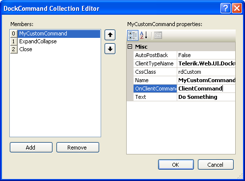
DockCommand Collection Editor
The DockCommand Collection Editor lets you add commands to a RadDock control. The commands you add here appear on the title bar of the control. To display the DockCommand Collection Editor, click on the ellipsis button for the Commands property of the RadDock control.
-
Click the Add button to append a new command to the collection.
-
Use the up and down arrow buttons to rearrange the commands in the collection. This order determines the order in which command icons appear in the title bar of the RadDock control.
-
Select a command and click the Remove button to delete it from the list.
-
Select individual commands to change properties for the specific command.

Each command in the Commands collection has the following properties
-
ClientTypeName: Use this to indicate the type of command you want to add. The following classes are built-in:
-
Telerik.Web.UI.DockPinUnpinCommand: the built-in pin/unpin command.
-
Telerik.Web.UI.DockExpandCollapseCommand: the built-in expand/collapse command.
-
Telerik.Web.UI.DockCloseCommand: the built-in close command.
-
Telerik.Web.UI.DockCommand: the default class for custom commands. You can use this class directly, implementing the command behavior in the client-side OnClientCommand or server-side Command event handler, or you can create your own class that inherits from DockCommand.
-
Telerik.Web.UI.DockToggleCommand: the default class for custom commands with two states (such as the expand and collapse states of the built-in expand/collapse command).
-
-
AutoPostBack: Set this to true if you want a postback where the server-side Command event fires when the user clicks on the command.
-
OnClientCommand: this is the name of a Javascript function that responds to the client-side event when the user clicks on the command. This function can implement the response to the command and/or cancel the default processing of the command.
In addition to the three properties listed above, with custom commands you can set six additional properties:
-
Name: This string is the name of the command. It is useful for identifying the command in an event handler.
-
CssClass: This is the name of a class that gives the command its appearance on the title bar. Use this to customize the look of the custom commands you add to the title bar.
-
Text: This string is the text that appears as a tool tip when the user hovers the mouse over the command icon.
-
AlternateCssClass: (toggle commands only) This is the name of a class that gives the alternate state of the command its appearance on the title bar. Use this like the CssClass.
-
AlternateText: (toggle commands only) This is the text that appears as a tool tip when the user hovers the mouse over the command icon when it is in the alternate state.
-
State: (toggle commands only) This indicates the state of the command. It can be "Primary" or "Alternate".