Shape
This article provides information about the shapes that you can use in the RadDiagram control and how to configure them. Below you can also find information on how to utilize the main DiagramShape class, as a sample configuration of the described properties can be seen in Example 1.
The DiagramShape object represents a visual node in the graph or diagram. The diagram object has a shapes collection, containing all configured shapes. RadDiagram provides rich API for customizing almost each part of the DiagramShape object – from standard properties like Width, Height, Background to specific ones like Type, Path, Visual, X and Y, and composite properties for configuring the ContentSettings, HoverSettings, RotationSettings and StrokeSettings.
Type
Specifies the type of the Shape using any of the built-in shape type. Currently three options are available:
-
"Rectangle"—this is the default option, representing an SVG rectangle shape.
-
"Circle"—represents an SVG circle/ellipse shape.
-
"Image"—creates a shape using the image located in the path passed to the Source property. The source is applicable only when the shape Type is set to "Image".
Figure 1: A diagram with Image shapes.

Example 1: How to use images to create shapes in RadDiagram:
<telerik:RadDiagram ID="RadDiagram2" runat="server">
	<ShapesCollection>
		<telerik:DiagramShape Id="cocktails" Type="Rectangle" X="50" Y="50" Width="310" Height="40">
			<ContentSettings Text="Cocktails" />
		</telerik:DiagramShape>
		<telerik:DiagramShape Id="cocktail1" Source="/Images/Mochito.jpg" Type="Image" X="50" Y="100" Width="150" Height="150" />
		<telerik:DiagramShape Id="cocktail2" Source="/Images/StrawberyMochito.jpg" Type="Image" X="210" Y="100" Width="150" Height="150" />
	</ShapesCollection>
</telerik:RadDiagram>
Path
The path option of a shape is a description of a custom geometrical figure. The format follows the standard SVG format. For more information, see the SVG Path data article and the Custom shapes and connectors article.
X and Y
Defines the x and y-coordinate of the shape when added to the diagram.
If any of the built-in layouts of RadDiagram is enabled, all explicitly configured X and Y coordinates will be ignored in the layout positioning algorithm favour.
Visual
A function returning a visual element to render for this shape. You can define a custom visualtemplate in the function given as a value to this property.
ContentSettings
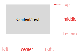
By configuring the ContentSettings composite property you can add and arrange the text content of a shape. The Text property defines the text displayed in the shape, the Align property—the alignment of this text (e.g., “middle center”) and the Color property—the color of the text.
Figure 2: Content Alignment.
EditableSettings
Specifies editable properties for shapes. For example, it contains a Connect property that defines whether the connectors of a shape appear when that shape is hovered.
FillSettings
Specifies the fill options for a shape, like the Color and Opacity if its background.
HoverSettings
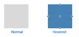
Defines the hover configuration of a shape, like background Color of the hovered shape.
Figure 3: Shape hovering
RotationSettings
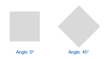
Here you can define the rotation Angle of a shape. For example:
Figure 4: Shape rotation
StrokeSettings
The Stroke represents the border around a shape. You can configure the following stroke-specific properties through the RadDiagram composite StrokeSettings property:
Color—defines the color of the shape's stroke.
Width—defines the thickness or width of the shape's stroke.
DashType—defines the dash type of the shape. The following dash types are supported:
-
"Dash"—a line consisting of dashes.
-
"DashDot"—a line consisting of a repeating pattern of dash-dot.
-
"Dot"—a line consisting of dots.
-
"LongDash"—a line consisting of a repeating pattern of long-dash.
-
"LongDashDot"—a line consisting of a repeating pattern of long-dash-dot.
-
"LongDashDotDot"—a line consisting of a repeating pattern of long-dash-dot-dot.
-
"Solid"—a solid line.
Figure 5: Stroke Dash Types

ShapeDefaultSettings
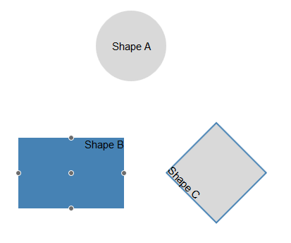
Configuring the default shape settings you can preset the initial values for the main properties like width, height, background color, position, etc., so you do not have to do this for every shape you add.
Shapes Configuration
Figure 6. A diagram with a few Shapes that utilize the properties described above.
Example 2: How to use the Shape properties to configure their appearance:
<telerik:RadDiagram ID="RadDiagram1" runat="server">
	<ShapesCollection>
		<telerik:DiagramShape Id="s1" Height="100" X="130" Y="20" Type="circle">
			<ContentSettings Text="Shape A" Align="middle center" />
		</telerik:DiagramShape>
		<telerik:DiagramShape Id="s2" Width="150" Height="100" X="20" Y="200">
			<ContentSettings Text="Shape B" Align="top right" />
			<HoverSettings>
				<FillSettings Color="4682B4" />
			</HoverSettings>
		</telerik:DiagramShape>
		<telerik:DiagramShape Id="s3" Width="100" Height="100" X="250" Y="200">
			<ContentSettings Text="Shape C" Align="bottom left" />
			<RotationSettings Angle="45" />
			<StrokeSettings Color="#4682B4" DashType="Solid" Width="2" />
		</telerik:DiagramShape>
	</ShapesCollection>
</telerik:RadDiagram>