New to Telerik UI for ASP.NET AJAX? Start a free 30-day trial
RadComboBox Structure
Updated over 1 year ago
The structure of the RadComboBox control is as follows:
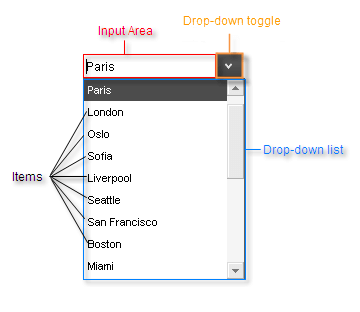
The top of the control has an Input Area, which displays the selected item. Depending on the RadComboBox properties, the user can use this area to type in a new value. Next to the input area is a drop-down toggle, which controls whether the Drop-down list is visible. The drop-down list contains a collection of items, from which the user can choose.