Image Button
RadButton provides an easy way to show a custom image on the control.The image can be used as a background, or can represent the button itself (Image Button).When using the RadButton control as an Image Button, the user must set Width and Height, because we don't use an actual <img/> tag, but the image is set as background to the Button's wrapper element (<span>). All the Image-related properties are controlled through the RadButton.Image property.
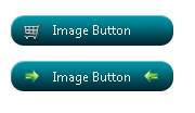
Figure 1: RadButton used as ImageButton (the image represents the button).

Figure 2: RadButton with background image, icons and text.

There are two ways to display an image on the control:
-
The first and the easiest way is to set the Image.ImageUrl property to the location of the image used. Setting the IsBackgroundImage to true enables the developer to use the image as background, and set text and icons to his/her button.
-
The second way to set the image using RadButton's CssClass property. Basically we set the background-image in the CssClass, and enable the image button functionality by setting Image.EnableImageButton=true (Example 1).
This approach is preferred when you want to use an image sprite for the button (see sample below). You set the background-image and background-position in the CssClass, and then in the HoveredCssClass and PressedCssClass, only the background-position of the hovered and pressed image. If the user wants she/he can display adifferent image when the mouse is hovering over the control, or the button is pressed using the HoveredImageUrl and PressedImageUrl properties respectively.
Example 1: Configure a RadButton as an Image Button through the CssClass and Image.EnableImageButton=true properties.
<style type="text/css">
	.classImage
	{
		background: url(img/categories.png);
		background-position: 0 0;
		width: 150px;
		height: 94px;
	}

	.classHoveredImage
	{
		background-position: 0 -100px;
	}

	.classPressedImage
	{
		background-position: 0 -200px;
	}
</style><telerik:RadButton RenderMode="Lightweight" ID="RadButton1" runat="server" Text="Image Button" CssClass="classImage"
HoveredCssClass="classHoveredImage" PressedCssClass="classPressedImage">
<Image EnableImageButton="true" />
</telerik:RadButton>It is always good to set the Text property, no matter if the control is used solely as image button (no text and icons shown), because this way the accessibility of the control is improved.