Items
RadBreadcrumb exposes two main item types - RootItem and default Item.
Each BreadcrumbItem can be customized by setting its various properties.
Figure 1:
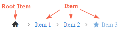
The RadBreadcrumb items can be defined declaratively in the markup in the <Items> tag:
<telerik:RadBreadcrumb ID="RadBreadcrumb1" runat="server">
    <Items>
        <telerik:BreadcrumbItem Type="RootItem" Text="Root item" />
        <telerik:BreadcrumbItem Text="Item 1" />
        <telerik:BreadcrumbItem Text="Item 2" />
    </Items>
</telerik:RadBreadcrumb>
They can also be added programmatically in the Items collection of the RadBreadcrumb control:
BreadcrumbItem item = new BreadcrumbItem();
item.Type = BreadcrumbItemType.Item;
item.Text = "Item 3";
RadBreadcrumb1.Items.Add(item);Main properties
-
Type- Specifies if the BreadcrumbItemType is Item(default) or RootItem.- RootItem - renders the item with an icon and no text.
- Item - renders the items with text and no icon.
-
Text- Defines the text of the item. If set, its value is also applied as a tooltip of the item. -
Icon- Defines the icon to be rendered. Gets a string value corresponding to a class from the Kendo UI Web Font Icons. Find more related information in the Icons section. -
Href- Defines the navigation link's URL of the item. The Href is applied only if the Navigational property of the RadBreadcrumb is set to 'true'. -
Disabled- Defines whether the item is disabled. -
ToolTip- Defines the title of the item that will be used as a tooltip.
Appearance properties
ShowText- Defines whether to show the text. The default value is 'false' for RootItem and 'true' for Item.ShowIcon- Defines whether to show the icon. The default value is 'true' for RootItem and 'false' for Item.ItemClass- Defines the item classes (applies to the rendered <li> element).LinkClass- Defines the link classes (applies to the <a> element).IconClass- Defines the icon classes (applies to the <span> element).
A sample with some of the Item's properties in use is shown in Figure 2 below:
Figure 2:

<telerik:RadBreadcrumb runat="server" ID="RadBreadcrumb1" Skin="Silk" Navigational="true">
    <Items>
        <telerik:BreadcrumbItem Type="RootItem" Text="Telerik UI" ShowText="true" Icon="pin" ItemClass="customRootItem" ToolTip="Home page" Href="https://docs.telerik.com/devtools/aspnet-ajax/" />
        <telerik:BreadcrumbItem Text="Controls" ShowIcon="true" Icon="folder-open" Disabled="true" IconClass="customIcon" Href="/controls" />
        <telerik:BreadcrumbItem Text="RadBreadcrumb" Href="https://docs.telerik.com/devtools/aspnet-ajax/controls/breadcrumb/overview" />
        <telerik:BreadcrumbItem Text="Functionality" ShowIcon="true" Icon="folder-open" Disabled="true"  Href="/functionality" />
        <telerik:BreadcrumbItem Text="Items" Icon="star" ShowIcon="true" Href="/items" />
    </Items>
</telerik:RadBreadcrumb>RootTilte
For RootItems, where no text is rendered by default, setting a title (ToolTip) can also be done by using the MessageSettings.RootTitle property of the RadBreadcrumb. The RootTitle can be declared in the markup inside the <MessageSettings> inner tag:
<telerik:RadBreadcrumb runat="server" ID="RadBreadcrumb1">
    <MessagesSettings RootTitle="Home page" />
The RootTitle set in the MessagesSettings takes efect only if RootItem has no values assigned to its Text and ToolTip properties.
ClientItemTemplate
RadBreadcrumb uses Kendo UI Templates to provide full control over the rendering of the items.
The default appearance of the Breadcrumb Control can be achieved with the template declaration shown below. It can serve as a convenient basis for further modifications:
<telerik:RadBreadcrumb runat="server" ID="RadBreadcrumb1" OnDataBinding="RadBreadcrumb1_DataBinding">
    <ClientItemTemplate>
        <li class="k-breadcrumb-item #:itemClass# #if(lastSegment){#k-breadcrumb-last-item#}#">
            <a href="#:href#"
            class="#:linkClass# #if(type !== "rootitem"){# k-breadcrumb-link#}#
            #if(showText && showIcon){# k-breadcrumb-icontext-link #}#
            #if(showIcon && !showText){# k-breadcrumb-icon-link #}#
            #if((lastSegment && type !== "rootitem")||disabled){# k-state-disabled#}#"
            #if(lastSegment){# aria-current="page"#}#
            title="#:text || title#">

                #if(showIcon) {#<span class="#if(icon){#k-icon k-i-#:icon##}# #:iconClass#"></span>#}#
                #if(showText) {##:text##}#
            </a>
            #if(renderDelimiter) {#<span class="k-breadcrumb-delimiter-icon k-icon k-i-#:delimiterIcon#" aria-hidden="true"></span>#}#
            #if(type === "rootitem" && renderDelimiter) {#<span class="k-breadcrumb-delimiter-icon k-hidden k-icon k-i-#:delimiterIcon#" aria-hidden="true"></span>#}#
        </li>
    </ClientItemTemplate>
</telerik:RadBreadcrumb>The result from the declaration above should be the same as if ClientItemTemplate is not in use, see Figure 3 below:
Figure 3:

We can modify the default template (the one above) and customize it to achieve the desired appearance.
In the sample below, a new custom attribute is added to each item and the same is included in the customized template structure:
Figure 4:

Here is the code leading to the appearance shown in Figure 4:
<telerik:RadBreadcrumb runat="server" ID="RadBreadcrumb1" OnDataBinding="RadBreadcrumb1_DataBinding">
    <ClientItemTemplate>
            <li class="k-breadcrumb-item #:itemClass# #if(lastSegment){#k-breadcrumb-last-item#}#">
                <a href="#:href#"
                class="#:linkClass# #if(type !== "rootitem"){# k-breadcrumb-link#}#
                #if(showText && showIcon){# k-breadcrumb-icontext-link #}#
                #if(showIcon && !showText){# k-breadcrumb-icon-link #}#
                #if((lastSegment && type !== "rootitem")||disabled){# k-state-disabled#}#"
                #if(lastSegment){# aria-current="page"#}#
                title="#:text || title#">

                <ul style="list-style-type:none;">
                    #if(showIcon) {#<li><span class="#if(icon){#k-icon k-i-#:icon##}# #:iconClass#"></span></li>#}#
                    #if(showText) {#<li>#:text#</li>#}#
                    #if(data.attributes){ #<li style="font-size:0.8em;">#: data.attributes['Description'] #</li># }#
                </ul>
                </a>
            #if(renderDelimiter) {#<span class="k-breadcrumb-delimiter-icon k-icon k-i-#:delimiterIcon#" aria-hidden="true"></span>#}#
            #if(type === "rootitem" && renderDelimiter) {#<span class="k-breadcrumb-delimiter-icon k-hidden k-icon k-i-#:delimiterIcon#" aria-hidden="true"></span>#}#
            </li>
    </ClientItemTemplate>
</telerik:RadBreadcrumb>