New to Telerik UI for .NET MAUI? Start a free 30-day trial
.NET MAUI TreeView Visual Structure
Updated on Dec 26, 2025
The visual structure of the .NET MAUI TreeView represents the anatomy of the UI component. Being familiar with the visual elements of the TreeView allows you to quickly find the information required to configure them.
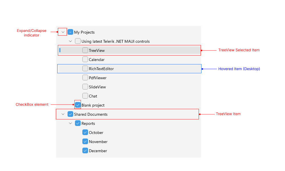
The following image shows the anatomy of the TreeView.

Displayed Elements
- TreeView Item—On mobile devices, the user can expand the item by tapping on it. While on desktop devices, the user has to click the > arrow.
- TreeView Selected Item—Represents the item currently selected within the TreeView.
- (Desktop) Hovered Item—Represents the item currently hovered by the mouse pointer.
- Expand/Collapse Indicator—The indicator used for expanding/collapsing an item. On desktop devices, the user clicks the > arrow to expand an item. By default, on mobile, the user can tap on the item to expand it.
- CheckBox element—Represents a Checkbox element in the TreeView item.