.NET MAUI ToggleButton Visual States
This article describes the visual states the ToggleButton provides. You can use the visual states to change the visual appearance of the control depending on the state the control is set—whether it's disabled, or pressed, or has the mouse pointer over and more.
The ToggleButton provides the following CommonStates visual states:
| Visual State | Description |
|---|---|
Normal | Applies when the button is in normal state. |
Pressed | Applies when the button is pressed. |
MouseOver | (Desktop-only) Applies when the mouse pointer hovers over the control. |
Disabled | Applies when the button is disabled. |
Toggled | Applies when the button is toggled. |
ToggledMouseOver | (Desktop-only) Applies when the button is toggled and the mouse is over the button. |
ToggledPressed | Applies when the button is toggled and pressed. |
ToggledDisabled | Applies when the button is toggled and disabled. |
Indeterminate | Applies when the button is in an indeterminate state. |
IndeterminateMouseOver | (Desktop-only) Applies when the button is in an indeterminate state and the mouse is over the button. |
IndeterminatePressed | Applies when the button is in an indeterminate state and pressed. |
IndeterminateDisabled | Applies when the button is in an indeterminate state and disabled. |
Focused | (Desktop-only) Applies when the button is focused with the keyboard. |
FocusedMouseOver | (Desktop-only) Applies when the button is focused with the keyboard and the mouse pointer hovers over it. |
FocusedPressed | (Desktop-only) Applies when the button is focused with the keyboard and pressed. |
FocusedToggled | (Desktop-only) Applies when the button is focused with the keyboard and toggled. |
FocusedToggledMouseOver | (Desktop-only) Applies when the button is focused with the keyboard and toggled, and the mouse pointer hovers over it. |
FocusedToggledPressed | (Desktop-only) Applies when the button is focused with the keyboard and toggled, and pressed. |
FocusedIndeterminate | (Desktop-only) Applies when the button is focused with the keyboard and in an indeterminate state. |
FocusedIndeterminateMouseOver | (Desktop-only) Applies when the button is focused with the keyboard and in an indeterminate state, and the mouse pointer hovers over it. |
FocusedIndeterminatePressed | (Desktop-only) Applies when the button is focused with the keyboard and in an indeterminate state, and pressed. |
The ToggleButton provides the following FocusStates visual states:
| Visual States | Description |
|---|---|
Unfocused | Applies when the button is in normal state. |
Focused | Applies when the button is pressed. |
Using the Visual States
The following example demonstrates how to use the ToggleButton Visual States.
1. Define the ToggleButton in XAML:
<VerticalStackLayout HorizontalOptions="Center" Spacing="20">
    <HorizontalStackLayout Spacing="5">
        <telerik:RadCheckBox x:Name="checkBox"
                             IsChecked="True"
                             IsThreeState="False"
                             CheckedSymbolColor="White"
                             CheckedColor="#00897B" />
        <Label Text="IsEnabled?"
               VerticalTextAlignment="Center"
               telerik:RadCheckBox.ToggleOnTap="{x:Reference checkBox}" />
    </HorizontalStackLayout>
    <telerik:RadToggleButton IsEnabled="{Binding IsChecked, Source={x:Reference checkBox}}"
                             IsThreeState="False"
                             Content="ToggleButton"
                             Style="{StaticResource ToggleButtonFlatStyle}" />
</VerticalStackLayout>
2. Define the visual states in the page's resources:
<Style x:Key="ToggleButtonFlatStyle" TargetType="telerik:RadToggleButton">
    <Setter Property="FontAttributes" Value="Bold" />
    <Setter Property="HeightRequest" Value="32" />
    <Setter Property="TextColor" Value="#000000" />
    <Setter Property="Background" Value="#EAEAEA" />
    <Setter Property="BorderBrush" Value="#00897B" />
    <Setter Property="BorderThickness" Value="6, 0, 0, 0" />
    <Setter Property="CornerRadius" Value="0" />
    <Setter Property="Padding" Value="12, 0" />
    <Setter Property="VisualStateManager.VisualStateGroups">
        <VisualStateGroupList>
            <VisualStateGroup Name="CommonStates">
                <VisualState Name="Normal" />
                <VisualState Name="Focused" />
                <VisualState Name="MouseOver">
                    <VisualState.Setters>
                        <Setter Property="Background" Value="#D2D2D2" />
                    </VisualState.Setters>
                </VisualState>
                <VisualState Name="FocusedMouseOver">
                    <VisualState.Setters>
                        <Setter Property="Background" Value="#D2D2D2" />
                    </VisualState.Setters>
                </VisualState>
                <VisualState Name="Pressed">
                    <VisualState.Setters>
                        <Setter Property="Background" Value="#D2D2D2" />
                        <Setter Property="TextColor" Value="#99000000" />
                    </VisualState.Setters>
                </VisualState>
                <VisualState Name="FocusedPressed">
                    <VisualState.Setters>
                        <Setter Property="Background" Value="#D2D2D2" />
                        <Setter Property="TextColor" Value="#99000000" />
                    </VisualState.Setters>
                </VisualState>
                <VisualState Name="Disabled">
                    <VisualState.Setters>
                        <Setter Property="TextColor" Value="#61000000" />
                    </VisualState.Setters>
                </VisualState>
                <VisualState Name="Toggled">
                    <VisualState.Setters>
                        <Setter Property="TextColor" Value="#FFFFFF" />
                        <Setter Property="Background" Value="#00897B" />
                    </VisualState.Setters>
                </VisualState>
                <VisualState Name="FocusedToggled">
                    <VisualState.Setters>
                        <Setter Property="TextColor" Value="#FFFFFF" />
                        <Setter Property="Background" Value="#00897B" />
                    </VisualState.Setters>
                </VisualState>
                <VisualState Name="ToggledMouseOver">
                    <VisualState.Setters>
                        <Setter Property="TextColor" Value="#FFFFFF" />
                        <Setter Property="Background" Value="#32A095" />
                        <Setter Property="BorderBrush" Value="#32A095" />
                    </VisualState.Setters>
                </VisualState>
                <VisualState Name="FocusedToggledMouseOver">
                    <VisualState.Setters>
                        <Setter Property="TextColor" Value="#FFFFFF" />
                        <Setter Property="Background" Value="#32A095" />
                        <Setter Property="BorderBrush" Value="#32A095" />
                    </VisualState.Setters>
                </VisualState>
                <VisualState Name="ToggledPressed">
                    <VisualState.Setters>
                        <Setter Property="TextColor" Value="#99000000" />
                        <Setter Property="Background" Value="#4CACA2" />
                        <Setter Property="BorderBrush" Value="#4CACA2" />
                    </VisualState.Setters>
                </VisualState>
                <VisualState Name="FocusedToggledPressed">
                    <VisualState.Setters>
                        <Setter Property="TextColor" Value="#99000000" />
                        <Setter Property="Background" Value="#4CACA2" />
                        <Setter Property="BorderBrush" Value="#4CACA2" />
                    </VisualState.Setters>
                </VisualState>
                <VisualState Name="ToggledDisabled">
                    <VisualState.Setters>
                        <Setter Property="TextColor" Value="#61FFFFFF" />
                        <Setter Property="Background" Value="#00897B" />
                    </VisualState.Setters>
                </VisualState>
                <VisualState Name="Indeterminate" />
                <VisualState Name="IndeterminateMouseOver" />
                <VisualState Name="IndeterminatePressed" />
                <VisualState Name="IndeterminateDisabled" />
            </VisualStateGroup>
        </VisualStateGroupList>
    </Setter>
</Style>
3. Add the telerik namespace:
xmlns:telerik="http://schemas.telerik.com/2022/xaml/maui"This is the result on WinUI:
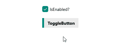
For a runnable example demonstrating the ToggleButton visual state, see the SDKBrowser Demo Application and go to the ToggleButton > Features category.