.NET MAUI ToggleButton Overview
Updated over 1 year ago
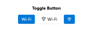
The Telerik UI for .NET MAUI ToggleButton component represents a button that can be toggled between two states: toggled and untoggled. It allows end users to select or toggle an option or a state in an application's user interface.
The ToggleButton is commonly used in scenarios to capture and represent a binary choice, such as enabling or disabling a feature, activating or deactivating a setting, or toggling between two different modes or views.

Key Features of the .NET MAUI ToggleButton
- Toggled states—The ToggleButton delivers options for setting its state to toggled and untoggled, and provides an additional indeterminate state which indicates the control is neither toggled nor untoggled.
- Setting three states—You can apply an indeterminate state through the UI by setting the
IsThreeStateproperty. - Content and ContentTemplate—The ToggleButton allows you to define a
Content. In addition, there is an option for settingContentTemplate. - Text alignment—The ToggleButton enables you to control the horizontal and vertical positioning of the text inside the content.
- Visual states—You can change the ToggleButton appearance for different visual states like,
Normal,Pressed,MouseOver(desktop-only),Toggled,Disabled, and more. - Exhaustive number of events—You can use the events exposed by the ToggleButton to execute various operations on user interaction such as click, press, release, and changing toggle state.
- Command—The ToggleButton provides a command, that executes when the button is clicked.
- Styling—You can apply different styling options to the button such as changing its background color, border color, border thickness and more.
- Ripple effect—You can apply a ripple effect on Android when pressing the ToggleButton.