.NET MAUI TimePicker DropDown Styling
By using the DropDownSettings property (of type Telerik.Maui.Controls.PickerDropDownSettings) of the TimePicker, you can modify the appearance of the dropdown. The PickerDropDownSettings class exposes the following Style properties:
DropDownViewStyle(of typeStylewith target typetelerik:PickerDropDownContentView)—Defines the dropdown view style.FooterStyle(of typeStylewith target typetelerik:PickerPopupFooterView)—Defines the dropdown footer style.AcceptButtonStyle(of typeStylewith target typeButton)—Defines the Accept button style.CancelButtonStyle(of typeStylewith target typeButton)—Defines the Cancel button style.
The DropDownSettings also provides the following properties for dropdown customization:
Placement(of typePlacementMode)—Specifies the position of the dropdown, can be set to Bottom, Right, Left, Top, Center or Relative.HorizontalOffset\VerticalOffset—Specifies the horizontal\vertical distance between the dropdown and the TimePicker.IsFooterVisible(bool)—Specifies whether the DropDown footer is currently visible. By default, the value isTrue.AcceptButtonText(string)—Defines the text visualized for the Accept button. By default, the text isOK.CancelButtonText(string)—Defines the text visualized for the Cancel button. By default, the text isCancel.
DropDownSettings provides styling options for the dropdown, its footer and position, and other. If you need to customize the look&feel of the spinner controls that show the available date values, please refer to
SpinnerStyle,SpinnerHeaderStyleandSelectionHighlightStyleproperties of the TimePicker. For more detailed information on them go to TimePicker Styling topic.
Example
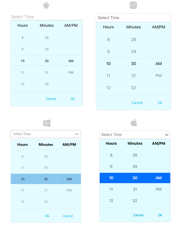
The following example shows how the styling properties are applied.
Define the RadTimePicker
<telerik:RadTimePicker PickerMode="DropDown"
                       DefaultHighlightedTime="10:30"
                       DisplayStringFormat="HH:mm"
                       AutomationId="timePicker">
    <telerik:RadTimePicker.DropDownSettings>
        <telerik:PickerDropDownSettings DropDownViewStyle="{StaticResource dropDownViewStyle}"
                                        FooterStyle="{StaticResource footerStyle}"
                                        AcceptButtonStyle="{StaticResource acceptButtonStyle}"
                                        CancelButtonStyle="{StaticResource cancelButtonStyle}"
                                        AcceptButtonText="{StaticResource acceptButtonText}"
                                        CancelButtonText="{StaticResource cancelButtonText}"/>
    </telerik:RadTimePicker.DropDownSettings>
</telerik:RadTimePicker>
Define the DropDownViewStyle
<Style TargetType="telerik:PickerDropDownContentView" x:Key="dropDownViewStyle">
    <Setter Property="BackgroundColor" Value="#E4FCFF"/>
</Style>
Define the FooterStyle
<Style TargetType="telerik:PickerPopupFooterView" x:Key="footerStyle">
    <Setter Property="BackgroundColor" Value="Transparent"/>
</Style>
Define the AcceptButtonStyle
<Style TargetType="Button" x:Key="acceptButtonStyle">
    <Setter Property="BackgroundColor" Value="Transparent"/>
    <Setter Property="TextColor" Value="#00B5DC"/>
</Style>
Define the CancelButtonStyle
<Style TargetType="Button" x:Key="cancelButtonStyle">
    <Setter Property="BackgroundColor" Value="Transparent"/>
    <Setter Property="TextColor" Value="#00B5DC"/>
</Style>
Namespaces
In addition, add the following namespace:
xmlns:telerik="http://schemas.telerik.com/2022/xaml/maui"The following image shows how the TimePicker control looks when the styles described above are applied.