New to Telerik UI for .NET MAUI? Start a free 30-day trial
.NET MAUI TimePicker Templates
Updated over 1 year ago
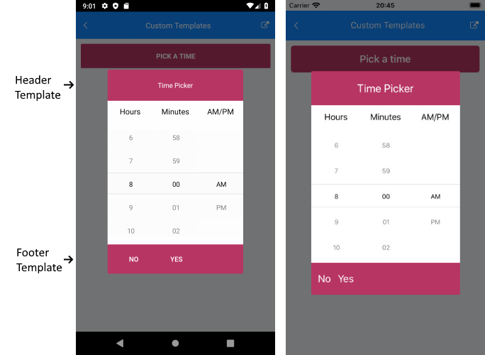
In case the default templates of the TimePicker control do not suit your needs, you can define a custom template.
The available templates for customization are:
PlaceholderTemplate(ControlTemplate)—Defines the template visualized for the placeholder.DisplayTemplate(ControlTemplate)—Defines the template visualized when the picked time is displayed.HeaderTemplate(ControlTemplate)—Defines what will be displayed inside the dialog (popup) header.FooterTemplate(ControlTemplate)—Defines what will be displayed inside the dialog (popup) footer.
The example below shows a sample TimePicker definition with the listed above template properties applied:
1. Define the TimePicker:
XAML
<telerik:RadTimePicker SpinnerFormat="H:mm"
                       PlaceholderTemplate="{StaticResource placeholderTemplate}"
                       DisplayTemplate="{StaticResource displayTemplate}"
                       AutomationId="timePicker">
    <telerik:RadTimePicker.PopupSettings>
        <telerik:PickerPopupSettings HeaderTemplate="{StaticResource headerTemplate}"
                                     FooterTemplate="{StaticResource footerTemplate}"/>
    </telerik:RadTimePicker.PopupSettings>
    <telerik:RadTimePicker.DropDownSettings>
        <telerik:PickerDropDownSettings FooterTemplate="{StaticResource footerTemplate}"/>
    </telerik:RadTimePicker.DropDownSettings>
</telerik:RadTimePicker>
2. Add the following namespace:
XAML
xmlns:telerik="http://schemas.telerik.com/2022/xaml/maui"For the example, the template definitions are added to the page resources as follows.
Placeholder Template
XAML
<ControlTemplate x:Key="placeholderTemplate">
    <Button Text="Pick a time"
            FontAttributes="Bold"
            TextColor="White"
            BackgroundColor="#B73562"
            HeightRequest="50" Command="{TemplateBinding ToggleCommand}" />
</ControlTemplate>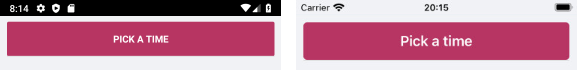
Display Template
XAML
<ControlTemplate x:Key="displayTemplate">
    <Button Text="{TemplateBinding DisplayString}"
            TextColor="White"
            BackgroundColor="#7BAEFF"
            HeightRequest="50"
            Command="{TemplateBinding ToggleCommand}" />
</ControlTemplate>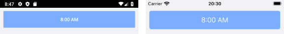
Header Template
XAML
<ControlTemplate x:Key="headerTemplate">
    <Grid>
        <Label Text="Time Picker"
               Padding="20"
               TextColor="White"
               VerticalTextAlignment="Center"
               HorizontalTextAlignment="Center"
               BackgroundColor="#B73562"/>
    </Grid>
</ControlTemplate>
Footer Template
XAML
<ControlTemplate x:Key="footerTemplate">
    <StackLayout Orientation="Horizontal" Spacing="0" HorizontalOptions="FillAndExpand" BackgroundColor="#B73562">
        <telerik:RadButton Text="No"
                           WidthRequest="75"
                           TextColor="White"
                           BackgroundColor="Transparent"
                           Command="{TemplateBinding CancelCommand}" />
        <telerik:RadButton Text="Yes"
                           WidthRequest="75"
                           TextColor="White"
                           BackgroundColor="Transparent"
                           Command="{TemplateBinding AcceptCommand}" />
    </StackLayout>
</ControlTemplate>