.NET MAUI TemplatedPicker Popup Styling
By using the PopupSettings property (of type Telerik.Maui.Controls.PickerPopupSettings) of the TimePicker, you can modify the appearance of the dialog (popup).
The PickerPopupSettings class exposes the following Style properties:
PopupViewStyle(of typeStylewith target typetelerik:PickerPopupContentView)—Defines the popup view style.HeaderStyle(of typeStylewith target typetelerik:PickerPopupHeaderView)—Defines the popup header style.HeaderLabelStyle(of typeStylewith target typeLabel)—Defines the popup header label style.FooterStyle(of typeStylewith target typetelerik:PickerPopupFooterView)—Defines the popup footer style.AcceptButtonStyle(of typeStylewith target typeButton)—Defines the Accept button style.CancelButtonStyle(of typeStylewith target typeButton)—Defines the Cancel button style.
The PickerPopupSettings also provides the following properties for popup customization:
-
PopupOutsideBackgroundColor—Defines the color outside of the popup. -
IsPopupModal(bool)—Defines a boolean value indicating if the popup will be closed when users click outside of the popup.- When
IsPopupModal="True", the UI behind the popup gets inactive and cannot be used until the popup is closed. - When
IsPopupModal="False", the popup can be closed when clicking outside the popup. By default, the value of theIsPopupModalisFalse.
- When
-
HeaderLabelText(string)—Specifies the text visualized in the popup header. -
IsHeaderVisible(bool)—Specifies whether the Popup header is currently visible. By default, the value isTrue. -
IsFooterVisible(bool)—Specifies whether the Popup footer is currently visible. By default, the value isTrue. -
AcceptButtonText(string)—Defines the text visualized for the accept button. By default, the text isOK. -
CancelButtonText(string)—Defines the text visualized for the cancel button. By default, the text isCancel.
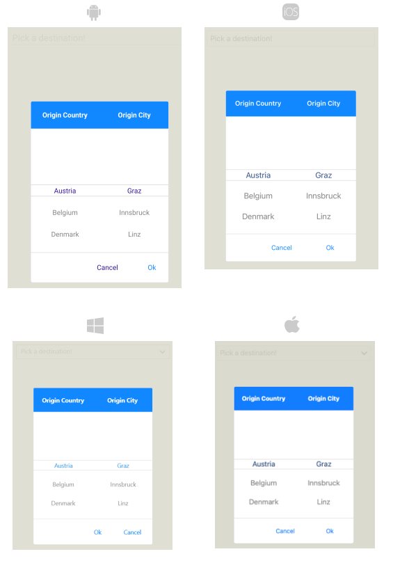
Example
The following example shows how the styling properties are applied.
Define the RadTemplatedPicker
<telerik:RadTemplatedPicker x:Name="picker"
                            BorderColor="#8660C5"
                            Placeholder="Pick a destination!"
                            DisplayStringFormat="Destination: {0}"
                            DisplayLabelStyle="{StaticResource displayLabelStyle}"
                            PlaceholderLabelStyle="{StaticResource defaultPlaceholderLabelStyle}"
                            ClearButtonStyle="{StaticResource clearButtonStyle}"
                            ToggleButtonStyle="{StaticResource toggleButtonStyle}"
                            IsClearButtonVisible="True"
                            IsToggleButtonVisible="True"
                            SelectedValue="{Binding FromCity, Mode=TwoWay}"
                            DisplayMemberPath="Name"
                            AutomationId="templatedPicker">
    <telerik:RadTemplatedPicker.SelectorTemplate>
        <ControlTemplate>
            <Grid ColumnDefinitions="*,*" HeightRequest="250">
                <Grid.Style>
                    <OnPlatform x:TypeArguments="Style">
                        <On Platform="WinUI">
                            <Style TargetType="Grid">
                                <Setter Property="WidthRequest" Value="{Binding Width, Source={x:Reference picker}}" />
                            </Style>
                        </On>
                    </OnPlatform>
                </Grid.Style>
                <telerik:RadBorder Grid.ColumnSpan="2"
                                   Style="{StaticResource defaultRadBorderStyle}" />
                <telerik:RadSpinner x:Name="countriesSpinner"
                                    Grid.Column="0"
                                    ItemsSource="{Binding Countries}"
                                    ItemStyle="{StaticResource itemStyle}"
                                    SelectedItemStyle="{StaticResource selectedItemStyle}"
                                    DisplayMemberPath="Name" />
                <telerik:RadSpinner x:Name="citiesSpinner"
                                    Grid.Column="1"
                                    ItemsSource="{Binding SelectedItem.Cities, Source={x:Reference countriesSpinner}}"
                                    SelectedItem="{TemplateBinding SelectedValue}"
                                    ItemStyle="{StaticResource itemStyle}"
                                    SelectedItemStyle="{StaticResource selectedItemStyle}"
                                    DisplayMemberPath="Name" />
            </Grid>
        </ControlTemplate>
    </telerik:RadTemplatedPicker.SelectorTemplate>
</telerik:RadTemplatedPicker>
Define the PopupViewStyle
<Style TargetType="telerik:PickerPopupContentView" x:Key="popupViewStyle">
    <Setter Property="BackgroundColor" Value="White"/>
    <Setter Property="WidthRequest" Value="270"/>
</Style>
Define the HeaderStyle
<Style TargetType="telerik:PickerPopupHeaderView" x:Key="headerStyle">
    <Setter Property="BackgroundColor" Value="#00B5DC"/>
    <Setter Property="HeightRequest" Value="60"/>
    <Setter Property="Margin" Value="0"/>
    <Setter Property="Padding" Value="0"/>
    <Setter Property="HorizontalOptions" Value="FillAndExpand"/>
    <Setter Property="VerticalOptions" Value="FillAndExpand"/>
</Style>
Define the HeaderLabelStyle
<Style x:Key="pickerHeaderLabelStyle" TargetType="Label">
    <Setter Property="TextColor" Value="White" />
    <Setter Property="FontAttributes" Value="Bold" />
    <Setter Property="HorizontalOptions" Value="Center" />
    <Setter Property="VerticalOptions" Value="Center" />
</Style>
Define the FooterStyle
<Style x:Key="pickerFooterButtonStyle" TargetType="Button">
    <Setter Property="BackgroundColor" Value="Transparent"/>
    <Setter Property="TextColor" Value="#1188FF"/>
    <Setter Property="VerticalOptions" Value="Center"/>
    <Setter Property="Margin">
        <OnPlatform x:TypeArguments="Thickness">
            <On Platform="iOS, MacCatalyst">0, 0, 20, 0</On>
        </OnPlatform>
    </Setter>
</Style>
Define the AcceptButtonStyle
<Style x:Key="pickerAcceptButtonStyle" BasedOn="{StaticResource pickerFooterButtonStyle}"
       TargetType="Button">
    <Setter Property="HorizontalOptions" Value="End"/>
</Style>
Define the CancelButtonStyle
<Style x:Key="pickerCancelButtonStyle" BasedOn="{StaticResource pickerFooterButtonStyle}"
       TargetType="Button">
    <Setter Property="HorizontalOptions" Value="EndAndExpand"/>
</Style>
Namespaces
In addition, add the following namespace:
xmlns:telerik="http://schemas.telerik.com/2022/xaml/maui"The following image shows how the TimePicker control looks when the styles described above are applied.