New to Telerik UI for .NET MAUI? Start a free 30-day trial
Styling a Navigation Item
Updated over 1 year ago
Style the navigation items by setting the Style property to the NavigationViewItem or using an implicit style:
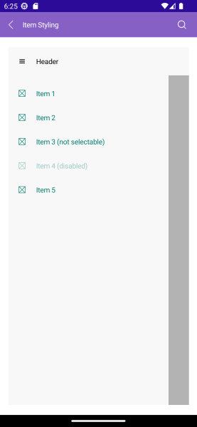
The image below shows sample navigation item styling:
- Explicit style:
XAML
<ContentView.Resources>
    <ResourceDictionary>
        <Style TargetType="telerik:NavigationViewItemView" x:Key="NavigationItemStyle">
            <Setter Property="Spacing" Value="10"/>
        </Style>
    </ResourceDictionary>
</ContentView.Resources>

<telerik:NavigationViewItem Text="Item 1" Style="{StaticResource NavigationItemStyle}" />- Implicit style:
XAML
<Style TargetType="telerik:NavigationViewItemView">
   <Setter Property="Spacing" Value="10"/>
</Style>
The available properties are described in the table below:
| Property | Description |
|---|---|
Command (ICommand) | Executed when the navigation item is clicked. |
CommandParameter (object) | Specifies a parameter to command which is executed when the navigation item is clicked. |
IsSelectable (bool) | Specifies whether the navigation item is selectable. |
IsSelected (bool) | Specifies whether the navigation item is selected. |
ImageSource (ImageSource) | Specifies the source of the image that is displayed in the navigation item. |
ImageAspect (Microsoft.Maui.Aspect) | Specifies the aspect ratio of the image that is displayed in the navigation item. |
ImageWidth (double) | Specifies the width in pixels of the image that is displayed in the navigation item. |
ImageHeight (double) | Specifies the height in pixels of the image that is displayed in the navigation item. |
Spacing (double) | Specifies the spacing in pixels between the image area and the content of the navigation item. |
Example
Here is an example how to define visual states to the navigation item and style the elements:
1. Define the RadNavigationView:
XAML
<telerik:RadNavigationView x:Name="navigationView"
                           HeaderText="Header">
    <telerik:RadNavigationView.Items>
        <telerik:NavigationViewItem Text="Item 1" />
        <telerik:NavigationViewItem Text="Item 2" />
        <telerik:NavigationViewItem Text="Item 3 (not selectable)" IsSelectable="False" />
        <telerik:NavigationViewItem Text="Item 4 (disabled)" IsEnabled="False" />
        <telerik:NavigationViewItem Text="Item 5" />
    </telerik:RadNavigationView.Items>
    <Label HorizontalOptions="Center"
           VerticalOptions="Center"
           Text="{Binding SelectedItem.Text, Source={x:Reference navigationView}}" />
</telerik:RadNavigationView>
2. Define the VisualStates for the NavigationViewItem:
XAML
<Style TargetType="telerik:NavigationViewItemView">
    <Setter Property="TextColor" Value="#00796B" />
    <Setter Property="VisualStateManager.VisualStateGroups">
        <VisualStateGroupList>
            <VisualStateGroup Name="CommonStates">
                <VisualState Name="Normal" />
                <VisualState Name="PointerOver">
                    <VisualState.Setters>
                        <Setter Property="BackgroundColor" Value="#B2DFDB" />
                        <Setter Property="TextColor" Value="#000000" />
                    </VisualState.Setters>
                </VisualState>
                <VisualState Name="Selected">
                    <VisualState.Setters>
                        <Setter Property="BackgroundColor" Value="#80CBC4" />
                        <Setter Property="TextColor" Value="#000000" />
                        <Setter Property="FontAttributes" Value="Bold" />
                    </VisualState.Setters>
                </VisualState>
                <VisualState Name="Disabled">
                    <VisualState.Setters>
                        <Setter Property="TextColor" Value="#6100796B" />
                    </VisualState.Setters>
                </VisualState>
            </VisualStateGroup>
        </VisualStateGroupList>
    </Setter>
</Style>
3. Add the telerik namespace:
XAML
xmlns:telerik="http://schemas.telerik.com/2022/xaml/maui"For the runnable NavigationView Item Styling example, see the SDKBrowser Demo Application and go to NavigationView > Styling category.