.NET MAUI NavigationView Overview
Updated over 1 year ago
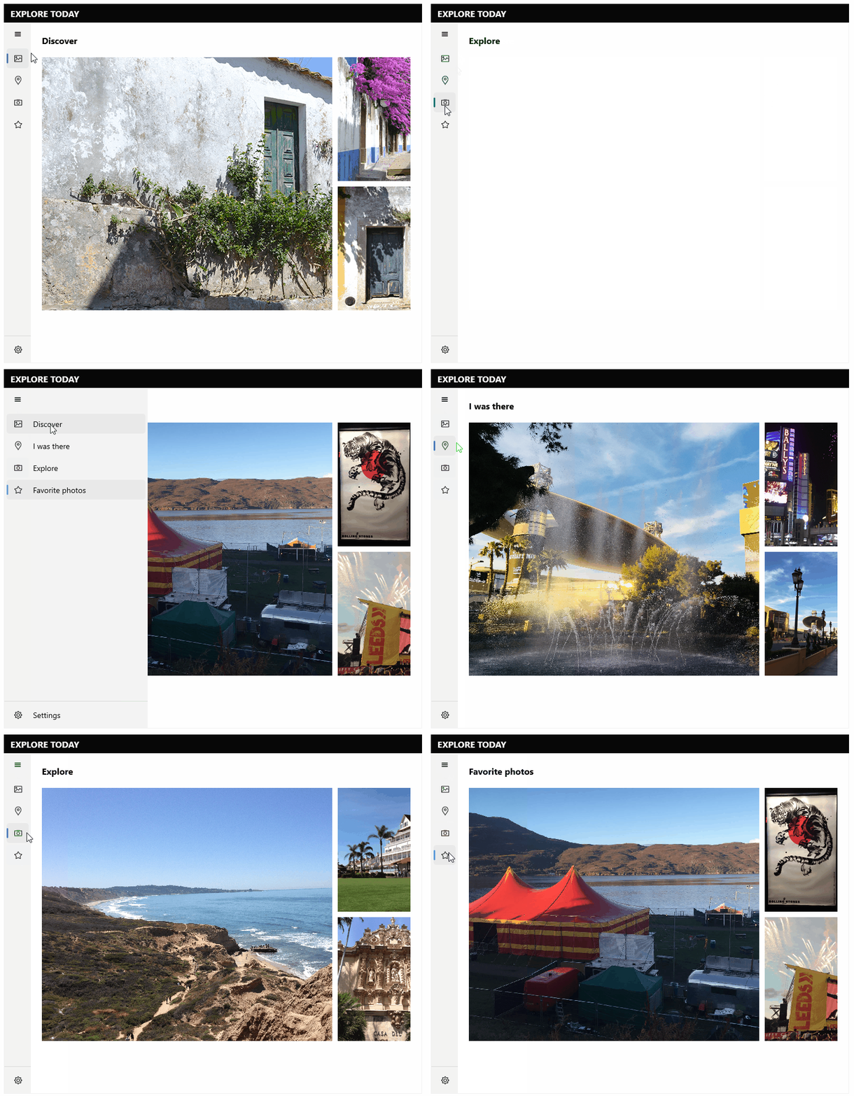
The Telerik UI for .NET MAUI NavigationView is an adaptive control used to build a consistent navigational experience in .NET MAUI applications. The navigation items are rendered in a vertical layout. You can take advantage of the different options for displaying the navigation pane: adding header and footer to the pane and customizing its look.

Key Features of the .NET MAUI NavigationView
- Display modes—You can use different modes to display the navigation pane—Compact, Expanded and Minimal.
- Auto-changing the Display mode—NavigationView provides an option for automatically changing the display mode depending on the threshold width.
- Data Binding—NavigationView has a support for binding to a complex object through the
ItemsSourceproperty. - Complex Object Support—NavigationView control provides you a way to specify which properties of your complex business object to be displayed as a text in the pane by setting the
DisplayMemberPathproperty and as an image by setting theImageSourcePathproperty. - Navigation Header—NavigationView has a navigation header that contains label and toggle navigation button that opens/closes the pane.
- Navigation Pane—The component has a pane that holds the navigation items, pane header, and footer.
- Pane Header and Footer—NavigationView allows you to add navigation items in the header, and in the footer.
- Selection—You can set selection through the
SelectedItemproperty. - Customizable items—You can customize the visual appearance of the Navigation items.
- Styling options—NavigationView allows you to style the navigation header, pane header, pane footer, navigation toggle button and navigation items.
- Events—NavigationView emits a set of events that allow you to configure the component's behavior in response to specific user actions like clicking on item, changing the selection, opening/closing the pane and more.
- Commands support—NavigationView provides commands that for opening, closing and toggling the pane.