.NET MAUI ListPicker Popup Styling
By using the PopupSettings property (of type Telerik.Maui.Controls.PickerPopupSettings) of the ListPicker, you can modify the appearance of the dialog (popup). The PickerPopupSettings class exposes the following Style properties:
PopupViewStyle(of typeStylewith target typetelerik:PickerPopupContentView)—Defines the popup view style.HeaderStyle(of typeStylewith target typetelerik:PickerPopupHeaderView)—Defines the popup header style.HeaderLabelStyle(of typeStylewith target typeLabel)—Defines the popup header label style.FooterStyle(of typeStylewith target typetelerik:PickerPopupFooterView)—Defines the popup footer style.AcceptButtonStyle(of typeStylewith target typeButton)—Defines the Accept button style.CancelButtonStyle(of typeStylewith target typeButton)—Defines the Cancel button style.
The PickerPopupSettings also provides the following properties for popup customization:
-
PopupOutsideBackgroundColor—Defines the color outside of the popup. -
IsPopupModal(bool)—Defines a Boolean value indicating if the popup will be closed when tapped outside of the popup. By default, the value of theIsPopupModalisfalse.When
IsPopupModal="True", the UI behind the popup gets inactive and cannot be used until the popup is closed.When
IsPopupModal="False", the popup can be closed when clicking outside the popup. -
HeaderLabelText(string)—Specifies the text visualized in the popup header. -
IsHeaderVisible(bool)—Specifies whether the Popup header is currently visible. By default, the value isTrue -
IsFooterVisible(bool)—Specifies whether the Popup footer is currently visible. By default, the value isTrue. -
AcceptButtonText(string)—Defines the text visualized for the Accept button. By default, the text isOK. -
CancelButtonText(string)—Defines the text visualized for the Cancel button. By default, the text isCancel.
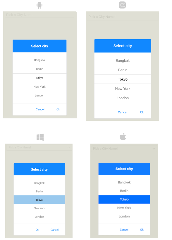
Styling Examples
The following examples demonstrate how to define use the styling properties of the ListPicker.
Define the RadListPicker
<telerik:RadListPicker PickerMode="Popup"
                       Placeholder="Pick a City Name!"
                       ItemsSource="{Binding Items}"
                       DisplayMemberPath="Name"
                       IsLooping="True"
                       DisplayStringFormat="You have picked: {0}"
                       AutomationId="listPicker">
    <telerik:RadListPicker.BindingContext>
        <local:CitiesViewModel/>
    </telerik:RadListPicker.BindingContext>
    <telerik:RadListPicker.PopupSettings>
        <telerik:PickerPopupSettings PopupOutsideBackgroundColor="#D9D9D9CC"
                                     PopupViewStyle="{StaticResource popupViewStyle}"
                                     HeaderStyle="{StaticResource headerStyle}"
                                     HeaderLabelText="Select city"
                                     HeaderLabelStyle="{StaticResource headerLabelStyle}"
                                     FooterStyle="{StaticResource footerStyle}"
                                     AcceptButtonStyle="{StaticResource acceptButtonStyle}"
                                     CancelButtonStyle="{StaticResource cancelButtonStyle}"
                                     AcceptButtonText="{StaticResource acceptButtonText}"
                                     CancelButtonText="{StaticResource cancelButtonText}"/>
    </telerik:RadListPicker.PopupSettings>
</telerik:RadListPicker>
Define the PopupViewStyle
<Style TargetType="telerik:PickerPopupContentView" x:Key="popupViewStyle">
    <Setter Property="BackgroundColor" Value="White"/>
    <Setter Property="WidthRequest" Value="270"/>
</Style>
Define the HeaderStyle
<Style TargetType="telerik:PickerPopupHeaderView" x:Key="headerStyle">
    <Setter Property="BackgroundColor" Value="#1188FF"/>
    <Setter Property="HeightRequest" Value="64"/>
    <Setter Property="Margin" Value="0"/>
    <Setter Property="Padding" Value="0"/>
    <Setter Property="HorizontalOptions" Value="FillAndExpand"/>
    <Setter Property="VerticalOptions" Value="FillAndExpand"/>
</Style>
Define the HeaderLabelStyle
<Style TargetType="Label" x:Key="headerLabelStyle">
    <Setter Property="TextColor" Value="White"/>
    <Setter Property="HorizontalOptions" Value="Center"/>
    <Setter Property="VerticalOptions" Value="Center"/>
    <Setter Property="FontSize" Value="18"/>
    <Setter Property="FontAttributes" Value="Bold"/>
</Style>
Define the FooterStyle
<Style TargetType="telerik:PickerPopupFooterView" x:Key="footerStyle">
    <Setter Property="BackgroundColor" Value="Transparent"/>
    <Setter Property="HeightRequest" Value="60"/>
</Style>
Define the AcceptButtonStyle
<Style TargetType="Button" x:Key="acceptButtonStyle">
    <Setter Property="BackgroundColor" Value="Transparent"/>
    <Setter Property="TextColor" Value="#1188FF"/>
</Style>
Define the CancelButtonStyle
<Style TargetType="Button" x:Key="cancelButtonStyle">
    <Setter Property="BackgroundColor" Value="Transparent"/>
    <Setter Property="TextColor" Value="#1188FF"/>
</Style>
In addition, add the following namespace:
xmlns:telerik="http://schemas.telerik.com/2022/xaml/maui"The following image shows what the DateTimePicker control looks like when the styles described above are applied: