.NET MAUI DateTimePicker Overview
The Telerik UI for .NET MAUI DateTimePicker provides a way to pick a date, time or date and time depending on the used format string Its items are visualized inside a popup or a drop-down. The DateTimePicker control has a number of features which enable you to set a date range, date and time format and customize the dialog appearance by setting, for example, its header and footer.
 Start Free Trial
Key Features of the .NET MAUI DateTimePicker
-
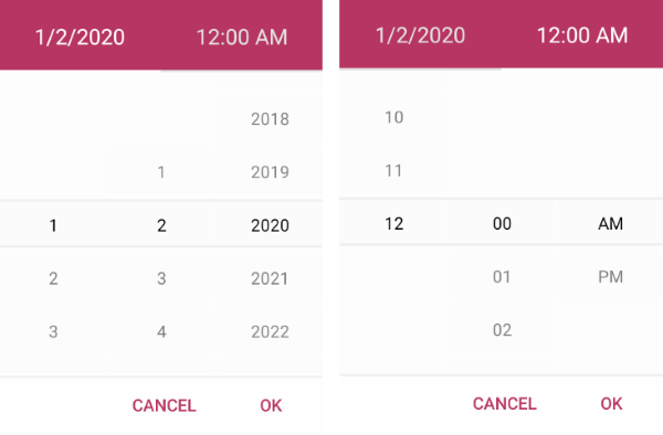
Spinner format—The DateTimePicker for .NET MAUI allows you to use a standard or custom date format string through its
SpinnerFormatproperty. Depending on what format is set, the picker visualizes spinner controls with the prepopulated values ready to be picked. -
Picker mode—You can choose between
PopupandDropDownUI for showing the spinner controls with the available date and time values. For Desktop the default picker mode isDropDownwhile for mobile it'sPopup. -
Templates—The DateTimePicker provides templates for its header and footer as well as exposes templates for its placeholder and display text.
-
DisplayString format—You can choose what text that will be displayed when a date is selected by using the
DisplayStringFormatproperty of the DateTimePicker. -
Date ranges—You can also define date ranges by setting minimum and maximum date values, and choose a date within that range.
-
Flexible styling API—The DateTimePicker provides a number of styling capabilities, which enable you to style its spinners, popup and popup header and footer, the displayed text displayed after a date is selected, and more.
-
Commands support—The DateTimePicker exposes commands that allow you to clear the selected date and to open and close the popup.
-
Localization support—Translate the used across the Date and Time Picker texts to other languages, so that your app can be adapted to different regions.