.NET MAUI DateTimePicker Styling
The DateTimePicker control for .NET MAUI provides styling options for customizing its appearance. You can style the DateTimePicker itself, as well as its popup or dropdown depending on the PickerMode setting.
The control supports the following styling properties:
BackgroundColor—Defines the background color of the picker.BorderColor—Defines the border color of the picker.BorderThickness—Specifies the border thickness of the picker. Its default value isnew Thickness(0,0,0,1).CornerRadius—Specifies the corner radius of the picker.ClearButtonStyle(of typeStylewith target typeRadButton)—Defines the style applied to the Clear button.ToggleButtonStyle(of typeStylewith target typeRadButton)—Specifies the style of the Toggle button.PlaceholderLabelStyle(of typeStylewith target typeLabel)—Specifies the style applied to the label defined in the default PlaceholderTemplate.DisplayLabelStyle(of typeStylewith target typeLabel)—Defines the style applied to the label, which is visualized when a date is selected.TabStripItemStyle(of typeStylewith target typetelerik:TabViewHeaderItem)—Specifies the style applied to the separate tab items.
The following Style properties are related to the spinner controls inside the popup/dropdown:
SpinnerStyle(of typeStylewith target typetelerik:RadSpinner)—Defines the style applied to the spinner item and the selected item.SpinnerHeaderStyle(of typeStylewith target typeLabel)—Specifies the style applied to each spinner header label.SelectionHighlightStyle(of typeStylewith target typetelerik:RadBorder)—Specifies the style applied to the border that highlights the selection.
Namespaces
When you use SelectionHighlightStyle, you need to add the following namespace:
xmlns:telerik="http://schemas.telerik.com/2022/xaml/maui"The same namespace can also be used for the SpinnerStyle.
Styling Examples
The following examples demonstrate how to define use the styling properties of the DateTimePicker.
Define the RadDateTimePicker
<telerik:RadDateTimePicker BorderColor="#8660C5"
                           SpinnerHeaderStyle="{StaticResource spinnerHeaderStyle}"
                           SpinnerStyle="{StaticResource spinnerStyle}"
                           SelectionHighlightStyle="{StaticResource selectionHighlightStyle}"
                           DisplayLabelStyle="{StaticResource displayLabelStyle}"
                           PlaceholderLabelStyle="{StaticResource placeholderLabelStyle}"
                           ClearButtonStyle="{StaticResource clearButtonStyle}"
                           ToggleButtonStyle="{StaticResource toggleButtonStyle}"
                           AreSpinnerHeadersVisible="True"
                           IsClearButtonVisible="True"
                           IsToggleButtonVisible="True"
                           AutomationId="dateTimePicker"/>
Define the Spinner Style
<Style TargetType="telerik:RadSpinner" x:Key="spinnerStyle">
    <Setter Property="ItemStyle">
        <Setter.Value>
            <Style TargetType="telerik:SpinnerItemView">
                <Setter Property="TextColor" Value="#4A4949"/>
            </Style>
        </Setter.Value>
    </Setter>
    <Setter Property="SelectedItemStyle">
        <Setter.Value>
            <Style TargetType="telerik:SpinnerItemView">
                <Setter Property="TextColor" Value="Black"/>
                <Setter Property="FontAttributes" Value="Bold"/>
            </Style>
        </Setter.Value>
    </Setter>
    <Setter Property="HeightRequest" Value="240"/>
</Style>
Define the SpinnerHeader Style
<Style TargetType="Label" x:Key="spinnerHeaderStyle">
    <Setter Property="TextColor" Value="Black"/>
    <Setter Property="FontAttributes" Value="Bold"/>
    <Setter Property="HorizontalOptions" Value="FillAndExpand"/>
    <Setter Property="VerticalOptions" Value="FillAndExpand"/>
    <Setter Property="HorizontalTextAlignment" Value="Center"/>
    <Setter Property="VerticalTextAlignment" Value="Center"/>
</Style>
Define the SelectionHighlight Style
<Style TargetType="telerik:RadBorder" x:Key="selectionHighlightStyle">
    <Setter Property="BorderColor" Value="#8660C5"/>
    <Setter Property="BorderThickness" Value="2"/>
    <Setter Property="VerticalOptions" Value="Center"/>
    <Setter Property="BackgroundColor" Value="Transparent"/>
</Style>
Define the PlaceholderLabel Style
<Style TargetType="Label" x:Key="placeholderLabelStyle">
    <Setter Property="TextColor" Value="#4A4949"/>
    <Setter Property="VerticalTextAlignment" Value="Center"/>
    <Setter Property="HorizontalTextAlignment" Value="Center"/>
    <Setter Property="Margin" Value="10"/>
</Style>
Define the DisplayLabel Style
<Style TargetType="Label" x:Key="displayLabelStyle">
    <Setter Property="TextColor" Value="#151950"/>
    <Setter Property="VerticalTextAlignment" Value="Center"/>
    <Setter Property="HorizontalTextAlignment" Value="Center"/>
    <Setter Property="Margin" Value="20"/>
</Style>
Define the ClearButtonStyle
<Style TargetType="telerik:RadButton" x:Key="clearButtonStyle">
    <Setter Property="TextColor" Value="#8660C5"/>
</Style>
Define the ToggleButtonStyle
<Style TargetType="telerik:RadButton" x:Key="toggleButtonStyle">
<Setter Property="TextColor" Value="#7C59B6"/>
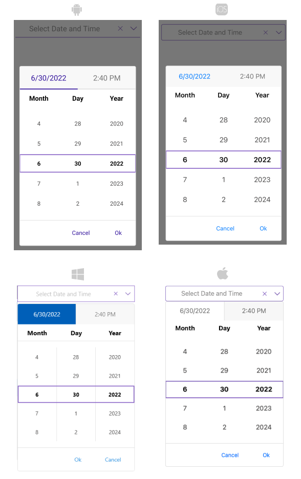
</Style>The following image shows what the DateTimePicker control looks like when the styles described above are applied: