New to Telerik UI for .NET MAUI? Start a free 30-day trial
.NET MAUI DatePicker Visual Structure
Updated on Dec 29, 2025
The visual structure of the .NET MAUI DatePicker represents the anatomy of the UI control. Being familiar with the visual elements of the DatePicker allows you to quickly find the information required to configure them.
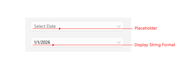
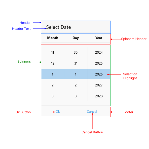
The images in this article show the anatomy of the DatePicker and its building blocks.
DatePicker Structure

- Placeholder—The text that is visualized before picking a date. You can customize the placeholder through the
PlaceholderTemplateproperty. - Display String Format—The text that is visualized after a date is picked.
Popup Structure

- Header—The text that is displayed in the popup header. You can set it to a text input through the
HeaderLabelTextproperty, or customize it by using theHeaderTemplateproperty. - Header Text—The text that is visualized in the header of the popup.
- Spinners Header—The text that is visualized for each spinner header. For example, if the
SpinnerFormatStringisd, the visualized text for the spinner header will beMonthDayYear. - Spinners—Displays items in a list. For
dformat, three spinners will be visualized: one for month, one for day, and one for year. - SelectionHighlight—Highlights the current selected date when the popup is open.
- Footer—The footer of the popup. By default, it contains the OK and Cancel buttons. You can customize it through the
FooterTemplateproperty.