Customize DatePicker Templates in .NET MAUI
Use the Telerik UI for .NET MAUI DatePicker templates to customize the placeholder area, selected date display, and the popup header and footer. This article helps you choose the correct template for each part of the control and shows how to apply them together.
Which DatePicker Template Should You Use
Use the following templates depending on the part of the control you want to customize:
| Template | Type | Use It When |
|---|---|---|
PlaceholderTemplate | ControlTemplate | You want to change what the control shows before the user picks a date. |
DisplayTemplate | ControlTemplate | You want to customize how the selected date appears in the input area. |
HeaderTemplate | ControlTemplate | You want to replace or extend the content in the popup header. |
FooterTemplate | ControlTemplate | You want to replace or extend the content in the popup footer. |
Placeholder Template
Use PlaceholderTemplate when you want to replace the default placeholder content before the user selects a date.
The following example shows how to use the default PlaceholderTemplate:
<ControlTemplate x:Key="Picker_PlaceholderView_ControlTemplate">
    <Grid>
        <Grid.GestureRecognizers>
            <TapGestureRecognizer Command="{TemplateBinding ToggleCommand}" />
        </Grid.GestureRecognizers>
        <Label Text="{TemplateBinding Placeholder}"
               Style="{TemplateBinding PlaceholderLabelStyle}"
               AutomationId="PickerPlaceholderLabel"/>
    </Grid>
</ControlTemplate>
Display Template
Use DisplayTemplate when you want to change how the selected date is rendered after the user picks a value.
The following example shows how to use the default DisplayTemplate:
<ControlTemplate x:Key="Picker_DisplayView_ControlTemplate">
    <Grid>
        <Grid.GestureRecognizers>
            <TapGestureRecognizer Command="{TemplateBinding ToggleCommand}" />
        </Grid.GestureRecognizers>
        <Label Text="{TemplateBinding DisplayString}"
               Style="{TemplateBinding DisplayLabelStyle}"
               AutomationId="PickerDisplayLabel"/>
    </Grid>
</ControlTemplate>
Header Template
Use HeaderTemplate when you want to customize the popup header area.
The following example shows how to use the default HeaderTemplate:
<ControlTemplate x:Key="PopupView_Header_ControlTemplate">
    <telerik:RadBorder BackgroundColor="{TemplateBinding BackgroundColor}"
                       BorderColor="{TemplateBinding BorderColor}"
                       BorderThickness="{TemplateBinding BorderThickness}"
                       CornerRadius="{TemplateBinding CornerRadius}"
                       HeightRequest="{TemplateBinding HeightRequest}">
        <Label Text="{TemplateBinding HeaderLabelText}"
               Style="{TemplateBinding HeaderLabelStyle}"
               AutomationId="PickerPopupHeaderLabel"/>
    </telerik:RadBorder>
</ControlTemplate>
Footer Template
Use FooterTemplate when you want to customize the popup footer area.
The following example shows how to use the default FooterTemplate:
<ControlTemplate x:Key="PopupView_Footer_ControlTemplate">
    <telerik:RadBorder BackgroundColor="{TemplateBinding BackgroundColor}"
                       BorderColor="{TemplateBinding BorderColor}"
                       BorderThickness="{TemplateBinding BorderThickness}"
                       CornerRadius="{TemplateBinding CornerRadius}">
        <OnPlatform x:TypeArguments="View">
            <On Platform="Android, iOS, MacCatalyst">
                <HorizontalStackLayout Spacing="0" HorizontalOptions="End">
                    <telerik:RadButton Text="{TemplateBinding CancelButtonText}"
                                       Style="{TemplateBinding CancelButtonStyle}"
                                       Command="{TemplateBinding CancelCommand}"
                                       AutomationId="PickerPopupCancelButton"/>
                    <telerik:RadButton Text="{TemplateBinding AcceptButtonText}"
                                       Style="{TemplateBinding AcceptButtonStyle}"
                                       Command="{TemplateBinding AcceptCommand}"
                                       AutomationId="PickerPopupOkButton"/>
                </HorizontalStackLayout>
            </On>
            <On Platform="WinUI">
                <HorizontalStackLayout Spacing="0" HorizontalOptions="End">
                    <Button Text="{TemplateBinding AcceptButtonText}"
                            Style="{TemplateBinding AcceptButtonStyle}"
                            Command="{TemplateBinding AcceptCommand}"
                            AutomationId="PickerPopupOkButton"/>
                    <Button Text="{TemplateBinding CancelButtonText}"
                            Style="{TemplateBinding CancelButtonStyle}"
                            Command="{TemplateBinding CancelCommand}"
                            AutomationId="PickerPopupCancelButton"/>
                </HorizontalStackLayout>
            </On>
        </OnPlatform>
    </telerik:RadBorder>
</ControlTemplate>
Example with Default Templates
After you define the templates in your page resources, assign them to the DatePicker and its selector settings:
<telerik:RadDatePicker MinimumDate="2020,01,1"
					   MaximumDate="2025,12,31"
					   DisplayTemplate="{StaticResource Picker_DisplayView_ControlTemplate}"
					   PlaceholderTemplate="{StaticResource Picker_PlaceholderView_ControlTemplate}">
	<telerik:RadDatePicker.SelectorSettings>
		<telerik:PickerPopupSelectorSettings HeaderTemplate="{StaticResource PopupView_Header_ControlTemplate}"
										   HeaderLabelText="Date Picker"
										   FooterTemplate="{StaticResource PopupView_Footer_ControlTemplate}" />
	</telerik:RadDatePicker.SelectorSettings>
</telerik:RadDatePicker>
Customization Example
The following example builds a customized DatePicker step by step.
- Define a simple DatePicker:
<telerik:RadDatePicker MinimumDate="2020,01,1"
                       MaximumDate="2025,12,31"
                       SpinnerFormat="MMM/dd/yyyy"
                       PlaceholderTemplate="{StaticResource placeholderTemplate}"
                       DisplayTemplate="{StaticResource displayTemplate}"
                       AutomationId="datePicker">
    <telerik:RadDatePicker.PopupSettings>
        <telerik:PickerPopupSettings HeaderTemplate="{StaticResource headerTemplate}"
                                     HeaderLabelText="This is the Header Template"
                                     FooterTemplate="{StaticResource footerTemplate}"/>
    </telerik:RadDatePicker.PopupSettings>
    <telerik:RadDatePicker.DropDownSettings>
        <telerik:PickerDropDownSettings FooterTemplate="{StaticResource footerTemplate}"/>
    </telerik:RadDatePicker.DropDownSettings>
</telerik:RadDatePicker>- Add the templates to the page resources.
Define a Custom PlaceholderTemplate
<ControlTemplate x:Key="placeholderTemplate">
    <Button Text="{TemplateBinding Placeholder}"
            FontAttributes="Bold"
            TextColor="White"
            BackgroundColor="#B73562"
            HeightRequest="50"
            Command="{TemplateBinding ToggleCommand}" />
</ControlTemplate>
The following image shows the custom placeholder template:

Define a Custom DisplayTemplate
<ControlTemplate x:Key="displayTemplate">
    <Button Text="{TemplateBinding DisplayString}"
            TextColor="White"
            BackgroundColor="#7BAEFF"
            HeightRequest="50"
            Command="{TemplateBinding ToggleCommand}" />
</ControlTemplate>
The following image shows the custom display template:

Define a Custom HeaderTemplate
<ControlTemplate x:Key="headerTemplate">
<Grid>
<Label Text="Date Picker"
Padding="20"
TextColor="White"
VerticalTextAlignment="Center"
HorizontalTextAlignment="Center"
BackgroundColor="#B73562"/>
</Grid>
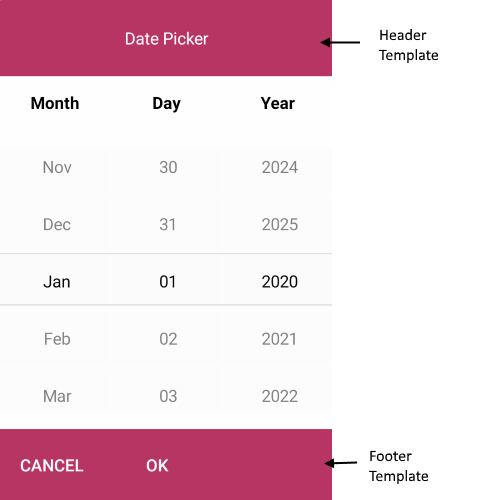
</ControlTemplate>Define a Custom FooterTemplate
<ControlTemplate x:Key="footerTemplate">
    <HorizontalStackLayout Spacing="0" HorizontalOptions="FillAndExpand" BackgroundColor="#B73562">
        <telerik:RadButton Text="Cancel"
                           WidthRequest="80"
                           TextColor="White"
                           BackgroundColor="Transparent"
                           Command="{TemplateBinding CancelCommand}" />
        <telerik:RadButton Text="OK"
                           WidthRequest="80"
                           TextColor="White"
                           BackgroundColor="Transparent"
                           Command="{TemplateBinding AcceptCommand}" />
    </HorizontalStackLayout>
</ControlTemplate>- Add the
teleriknamespace if it is not already declared in your XAML page:
xmlns:telerik="http://schemas.telerik.com/2022/xaml/maui"The following image shows customized header and footer templates: