New to Telerik UI for .NET MAUI? Start a free 30-day trial
.NET MAUI DataForm Validation Styling
Updated over 1 year ago
You can customize the validation look using the following styling properties:
ValidationSummaryStyle(of typeStylewith target typeDataFormValidationSummaryView)—Defines the style of the validation summary view.ValidationSummaryLabelStyle(of typeStylewith target typeLabel)—Defines the validation summary label style.ValidationSummaryImageStyle(of typeStylewith target typeImage)—Defines the validation summary image style.
Example
The following examples demonstrate how to style the DataForm validation summary.
1. Define the RadDataForm:
XAML
<telerik:RadDataForm x:Name="dataForm"
                     ValidationSummaryLabelStyle="{StaticResource ValidationLabelStyle}"
                     ValidationSummaryImageSource="away.png"
                     ValidationSummaryStyle="{StaticResource ValidationSummaryStyle}"
                     IsValidationSummaryVisible="True"
                     ValidationMode="LostFocus">
    <telerik:RadDataForm.BindingContext>
        <local:EditorsViewModel />
    </telerik:RadDataForm.BindingContext>
</telerik:RadDataForm>
Note that local in the snippet above points to the namespace where the EditorsViewModel is defined.
2. Define the ValidationSummaryStyle:
XAML
<Style x:Key="ValidationSummaryStyle" TargetType="telerik:DataFormValidationSummaryView">
    <Setter Property="BackgroundColor" Value="LightGrey" />
    <Setter Property="BorderThickness" Value="2" />
    <Setter Property="BorderColor" Value="Red" />
    <Setter Property="HorizontalOptions" Value="Center" />
</Style>
3. Define the ValidationLabelStyle:
XAML
<Style x:Key="ValidationLabelStyle" TargetType="Label">
    <Setter Property="TextColor" Value="Red" />
    <Setter Property="VerticalTextAlignment" Value="Center" />
    <Setter Property="HorizontalTextAlignment" Value="Center" />
    <Setter Property="HorizontalOptions" Value="Center" />
</Style>
4. Add the following namespace:
XAML
xmlns:telerik="http://schemas.telerik.com/2022/xaml/maui"5. Define the ViewModel used as a BindingContext for the RadDataForm:
C#
public class EditorsViewModel : NotifyPropertyChangedBase
{
private string name;
private DateTime? startDate;
private DateTime? endDate;
private double? people;
private bool? visited;
private TimeSpan? duration;
private EnumValue accommodation = EnumValue.Apartment;
public enum EnumValue
{
SingleRoom,
Apartment,
House
}
[Required]
[Display(Name = "Select accomodation")]
public EnumValue Accommodation
{
get
{
return this.accommodation;
}
set
{
if (this.accommodation != value)
{
this.accommodation = value;
this.OnPropertyChanged();
}
}
}
[Required]
[Display(Name = "First Name")]
public string FirstName
{
get => this.name;
set => this.UpdateValue(ref this.name, value);
}
[Required]
[Display(Name = "Start date")]
public DateTime? StartDate
{
get => this.startDate;
set => this.UpdateValue(ref this.startDate, value);
}
[Required]
[Display(Name = "End Date")]
public DateTime? EndDate
{
get => this.endDate;
set => this.UpdateValue(ref this.endDate, value);
}
[Required]
[Display(Name = "Number of People")]
[Range(1, 10)]
public double? People
{
get => this.people;
set => this.UpdateValue(ref this.people, value);
}
[Display(Name = "Visited before")]
public bool? Visited
{
get => this.visited;
set => this.UpdateValue(ref this.visited, value);
}
[Display(Name = "Duration")]
public TimeSpan? Duration
{
get => this.duration;
set => this.UpdateValue(ref this.duration, value);
}
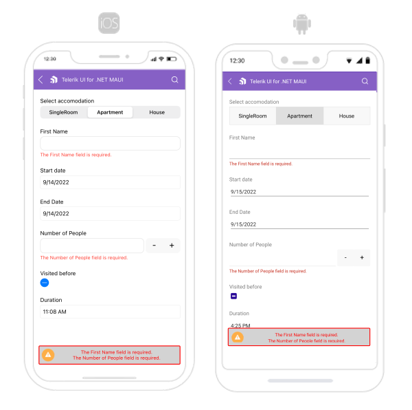
}The following image shows what the DataForm control looks like when the styles described above are applied:
For a runnable example with the DataForm Validation Styling scenario, see the SDKBrowser Demo Application and go to DataForm > Styling category.