.NET MAUI DataForm Editors Styling
The DataForm control for .NET MAUI provides styling options for customizing the appearance of its editors. You have to apply a style to each editor individually.
Each editor provides the following properties:
BackgroundColor—Defines the background color of the editor.BorderColor—Defines the border color of the editor.BorderThickness—Specifies the border thickness of the editor.EditorStyle(StylewithTargetTypedepending on the input control which the editor uses). For example, the target type of theRadCheckBoxEditorisRadCheckBox.
Example
The following example shows how to style the DataForm:
1. Define the RadDataForm and the editors:
<telerik:RadDataForm x:Name="dataForm" AutoGenerateItems="False">
    <telerik:DataFormRadEntryEditor PropertyName="FirstName"
                                HeaderText="Name"
                                BackgroundColor="#8AAAFF" />
    <telerik:DataFormRadNumericEditor PropertyName="People"
                                   HeaderText="People"
                                   Minimum="1"
                                   BorderColor="Navy"
                                   BorderThickness="2" />
    <telerik:DataFormRadTimeSpanPickerEditor PropertyName="Duration"
                                          HeaderText="Duration"
                                          BackgroundColor="BlanchedAlmond"
                                          BorderColor="Orange"
                                          BorderThickness="2" />
    <telerik:DataFormRadCheckBoxEditor PropertyName="Visited"
                                    HeaderText="Visited before"
                                    EditorStyle="{StaticResource CheckBoxStyle}" />
</telerik:RadDataForm>
Note that local in the snippet above points to the namespace where the EditorsViewModel is defined.
2. Define the CheckBoxStyle for the DataFormRadCheckBoxEditor:
<Style x:Key="CheckBoxStyle" TargetType="telerik:RadCheckBox">
    <Setter Property="CheckedColor" Value="DarkSeaGreen" />
    <Setter Property="UncheckedColor" Value="Orange" />
</Style>
3. Add the following namespace:
xmlns:telerik="http://schemas.telerik.com/2022/xaml/maui"4. Define the ViewModel used as a BindingContext for the RadDataForm:
public class EditorsViewModel : NotifyPropertyChangedBase
{
private string name;
private DateTime? startDate;
private DateTime? endDate;
private double? people;
private bool? visited;
private TimeSpan? duration;
private EnumValue accommodation = EnumValue.Apartment;
public enum EnumValue
{
SingleRoom,
Apartment,
House
}
[Required]
[Display(Name = "Select accomodation")]
public EnumValue Accommodation
{
get
{
return this.accommodation;
}
set
{
if (this.accommodation != value)
{
this.accommodation = value;
this.OnPropertyChanged();
}
}
}
[Required]
[Display(Name = "First Name")]
public string FirstName
{
get => this.name;
set => this.UpdateValue(ref this.name, value);
}
[Required]
[Display(Name = "Start date")]
public DateTime? StartDate
{
get => this.startDate;
set => this.UpdateValue(ref this.startDate, value);
}
[Required]
[Display(Name = "End Date")]
public DateTime? EndDate
{
get => this.endDate;
set => this.UpdateValue(ref this.endDate, value);
}
[Required]
[Display(Name = "Number of People")]
[Range(1, 10)]
public double? People
{
get => this.people;
set => this.UpdateValue(ref this.people, value);
}
[Display(Name = "Visited before")]
public bool? Visited
{
get => this.visited;
set => this.UpdateValue(ref this.visited, value);
}
[Display(Name = "Duration")]
public TimeSpan? Duration
{
get => this.duration;
set => this.UpdateValue(ref this.duration, value);
}
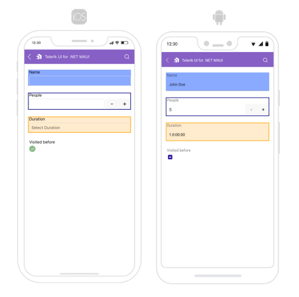
}The following image shows what the DataForm control looks like when the styles described above are applied:
For a runnable example with the DataForm Editors Styling scenario, see the SDKBrowser Demo Application and go to DataForm > Styling category.